
*CONTENT WARNING at 01:23 — this section may affect people with visual sensitivities. Viewer discretion is advised.
Setting the background on an element gives you control over appearance and legibility. In the Backgrounds section of the Style panel, you can add a background image, gradient, or color to most elements (except media elements like video and image).

In this lesson:
Background color
You can set a background color on any element except for images and videos (although you can use images and videos as backgrounds). You can apply a background color on any element by entering a color value (e.g., hex, rgba, or color name) or by choosing a color using the color picker. A background color can also be added to text elements or specific text content inside of a text element.
There are times you want background colors to be consistent throughout your site. This is where the Body (All pages) tag comes in handy.

You can style the Body (All pages) tag in 2 ways:
- Select the Body element and choose the Body (All pages) tag from the Selector field dropdown in the Style panel
- Select any element and choose the Body (All pages) tag from the inheritance menu — all elements inherit styles from the Body (All pages) tag
Once you set the background on the Body (All pages), any element you add will default to this background style. And you can make changes not just to background color, but any style property. Learn more about styling tag elements in our lesson on HTML tags.
Most elements have a transparent background by default. Some elements, like the Slider component, have a default background color you can override by setting a background color on the main slider element.
Background image
Webflow offers many options to customize your background image.

To add or change the background image:
- Scroll to Backgrounds in the Style panel
- Click Choose image to select an image from the Asset panel.
- Check the box for @2x (to set the image width to half its original size so it renders sharply on HiDPI devices)
To use a background video instead, replace the element with a background video component in the Add panel.
Background image size

To specify the size of the background image, use custom dimensions or one of the presets:
- Custom determines the width and/or height of the background image. You can also use percentage values. To set the background image to scale larger than the element, use any percentage higher than 100%.
- Cover scales the image to fill and cover the whole background of the element, overriding any set width and height. The image may be trimmed, depending on the aspect ratio of the element, the screen size, and the image.
- Contain scales your background image to stay contained inside the element. This value also overrides any set width and height.

Background image position
By default, a background image is placed at the top-left corner of an element. Change the position of the background to adjust how the image looks across screen sizes.
You can align the image vertically and horizontally.

To manually adjust the position of the background image, you can enter a position value for the horizontal position (left) and the vertical position (top). You can also change the unit of the values between the px, % (default), VW, and VH.
Tile
By default, a background image is repeated both vertically and horizontally.

You can choose to repeat the background horizontally, vertically, or not at all.

Fixed or scroll
You can choose the behavior of the background image on scroll in the Background settings:
- Not fixed: the image scrolls with the page
- Fixed: the image stays in place on scroll
All background images are Not fixed by default. Setting a background image to Fixed forces the image width to be contained by the viewport instead of by the element bounds.
Gradients
Gradients can be used on their own or on top of an existing background color or image.

There are 2 types of gradients:
- Linear gradients
- Radial gradients
Both gradient types have stops (or points) along the gradient where colors fade from one to another.

Note: Safari interprets (and interpolates) gradients to a transparency as “transparent black”. Therefore, the transparent color will look black for Safari users.
Linear gradient
A linear gradient creates a gradient of color in one direction, directed by the angle. To adjust the angle of the gradient, you can:
- Click and drag the dot on the direction dial, clicking anywhere on the dial to set the angle position
- Click the arrows to rotate the angle in 45-degree increments
- Enter the desired angle in the input field

Gradient stops
With gradient stops, you can edit the color and opacity of the gradient by choosing the gradient stops from the gradient bar. If there’s a background image layer underneath the gradient, it will become visible once the opacity is lowered.
To add additional colors to the gradient, add a stop to the gradient bar. You can add more than one stop by clicking anywhere on the gradient bar.

You can adjust the stop positions by clicking and dragging along the gradient bar.
To delete a stop:
- Long click on the stop
- Drag the stop out of the gradient bar until the edges of the stop become transparent
- Let go to remove the stop
Repeat
Toggling Repeat will cause the position and angle of the existing gradient to repeat.

This is set by the position of the first and last stops. To create a more obvious repeating gradient, drag the first or last stop away from the edge of the gradient bar.
Reverse
The reverse icon reverses the position of the stops.

Radial gradient
Radial gradients create a gradient in the shape of a circle.

The color stop on the left will be the color that appears in the center of the radial gradient.
Position
You can choose the focal point of the gradient by clicking one of the dots in the position control. For example, you can click the center dot to justify your image content.

You can also manually adjust the positioning by typing values for the horizontal position (left) and the vertical position (top). You can also change the unit of the values between the px, % (default), vw, and vh.
Size
How the gradient works with the element’s boundary is controlled by the size preset. The presets are:
- Closest side: the gradient starts from the center point to the closest side
- Closest corner: the gradient starts from the center point to the closest corner
- Farthest side: the gradient starts from the center point and continues until it reaches the farthest side
- Farthest corner: the default preset. The gradient starts from the center point and continues until it reaches the farthest corner
Color overlay
You can add a color overlay to any of your backgrounds. Use the color picker to choose a color, then set an opacity value.

Layering images and gradients
Add and stack multiple background images, gradients, and color overlays to create layered effects. To reorder background layers, hover over the layer and click the dotted vertical line on the left.
Click the eye icon to toggle the visibility of the layers. To delete any layer, click the trash can “delete” icon.

Background video
Background videos are silent, looping videos which serve as the background of a particular section of content. These can be helpful for engaging site visitors and grabbing attention, or adding a cinematic flair to your site.
However, it’s important to note that autoplaying and looping background videos can be distracting and even disabling for people with cognitive disabilities, vestibular disorders, or motion sickness. If you use background videos on your site, it’s important to provide controls for your site visitors to pause background videos that play automatically.
Need to know: Webflow provides a built-in play/pause button on background videos by default to improve accessibility and ensure you can give your site visitors the control they need to pause or play your background video content. Additionally, background videos won’t play for site visitors who have Prefers reduced motion enabled in their operating system settings.

Add a Background video using Quick find (CMD/CTRL+E) or from the Add panel > Components section. You’ll be prompted to upload a video as soon as you drop the Background video on the canvas.
Next, upload a video from your computer.
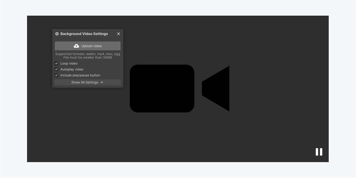
Video settings
The Background video component has three settings enabled by default: Loop video, Autoplay video, and Include play/pause button. You can toggle the checkbox on each of these settings to disable them.

Loop video
When enabled, the Loop video setting makes your background video loop (i.e., repeat) continuously.
Important: WCAG Success Criterion 2.2.2: Pause, Stop, Hide states that if any moving, blinking, or scrolling information starts moving automatically and moves for more than five seconds, controls must be provided for a user to pause, stop, or hide the movement. If you’ve enabled the Loop video setting, make sure the Include play/pause button setting is enabled as well to provide an accessible experience for your site visitors.
Autoplay video
When enabled, the Autoplay video setting makes your background video begin to play as soon as the page is loaded.
Important: WCAG Success Criterion 2.2.2: Pause, Stop, Hide states that if any moving, blinking, or scrolling information starts moving automatically and moves for more than five seconds, controls must be provided for a user to pause, stop, or hide the movement. If you’ve enabled the Autoplay video setting, make sure the Include play/pause button setting is enabled as well to provide an accessible experience for your site visitors.
Include play/pause button
When enabled, the Include play/pause button setting provides a built-in play/pause button on your background video that your site visitors can use to start and stop the video. Your background video will automatically pause if a site visitor has the Prefers reduced motion setting enabled in their operating system, regardless of whether Include play/pause button is enabled or disabled.
Important: If you’ve disabled the Include play/pause button setting, site visitors with Prefers reduced motion enabled in their operating system will not be able to play your background video.
Good to know: Autoplaying video with no clear way to pause it is among the top 10 reasons site visitors will leave without accomplishing their task on your site. Giving visitors clear video control will lower the site bounce rate.
You can also style and customize the play/pause button to your liking. For more information, check out our lesson on toggling play/pause on background videos.
Supported video formats
The Background video component accepts video files smaller than 30MB with the following formats: webm, mp4, mov, ogg.
Note: Background video filenames should not include spaces or special characters (except dashes) and videos should be optimized for the web for best performance.
Video transcoding

After the video file is uploaded, it is transcoded to other video file types (mp4 & webm) for maximum browser support. While this is happening, you can keep working in the Designer.
Previewing the Background video
There are 3 ways to preview the video you just uploaded:
- Hover over the video thumbnail in the background video settings
- Click the open in new tab icon next to the video file name to preview the video in a new tab
- Click the Preview icon in the top bar to see how the background video will appear in your design

Replacing the background video
To replace the Background video, open the Background video settings by either double-clicking on the video or by going to the Settings panel.

You can also access the Background video settings by selecting the element and pressing Enter. Once the settings window is open, click Replace Video to upload and transcode a new video.
Using the background video as a section
You can use a Background video as a section. Just drop any content inside the Background video element. Positioning and styling content inside the section is the same as other elements — all style properties are available in the Style panel.
Note: Background videos may not autoplay on touch devices if a site visitor has enabled data saver or low power mode.
Background video overlay

You can add some contrast using a gradient or a solid color overlay on your Background video. With the Color picker - choose your colors and change the opacity to adjust the visibility. The overlay will sit on top of the Background video but beneath the section’s content.

And that’s using backgrounds in Webflow!