
You can add an Add to cart element to Collection lists that are connected to your “products” Collection. This allows shoppers to quickly add products to their cart from any of your product collection lists on your homepage and other pages.
You can also place an Add to cart element on your products template page.
In this lesson
- Place an Add to cart element in a Collection list
- Style and customize the different states
- Paste the customized add to cart in your product page
Lesson prerequisite
Make sure to check out the following guides before proceeding with this lesson:
- Add to cart
- Collection list
- Collection page
Add an add to cart element
Make sure you’ve created a product showcase grid — a collection list connected to the products collection. Add an Add to cart element in this collection list from the Add panel or using Quick find (CMD/CTRL+E).

Hide the Buy now button (optional)
For a simple add to cart button, you may also hide the Buy now button in the default state. With the add to cart element selected, you can disable the Buy now button in the Add to cart settings panel
Hide the quantity field (optional)
For an even more simple add to cart button, you may want to hide the quantity field in the default state. So with the add to cart element selected, disable the quantity field in the Add to cart settings panel.
If you hide the quantity field in an “add to cart” component, when a shopper adds a product to their cart, the default quantity of 1 item will be added. They can update the quantity later from within the cart.

Style and customize the different states
There are many elements within the add to cart component. You can style and customize most of them. You can customize the look and feel of elements such as the “submit button”, the “out of stock” state message, and the “error” state message.
If your product has variants, you can style any labels and the option fields to some extent. You can also style the label and input field of the quantity field if it’s enabled for an “add to cart” component.
You can change the default error messages from the Error message settings.
Learn all about: Add to cart
Paste the customized add to cart in your product page
Now that your Add to cart component is styled and customized, you can add it to other product collection lists or the product template page. To do that, make sure to select the main Add to cart wrapper and copy it. Then, go to the product page or select any collection list that is connected to the “products” category and paste your fully customized add to cart component.
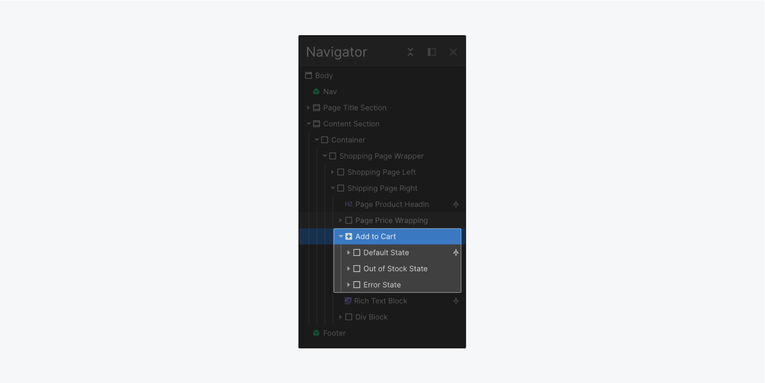
Select the main Add to cart wrapper to copy it to other pages and lists.
At the moment, you cannot save the Add to cart component as a symbol. You can still copy and paste it between the product page and product collection lists. However, changing any settings in the Elements panel will only affect the selected instance. As for styles, updating the style of any element with a class will update all elements with the same class, so make sure to assign a class to each element in your cart even if you don’t want to style it now. Your future self will thank you for it.