A special element that you can add to a product page or within a Collection list connected to the products category is the Add to cart element. This element consists of 2 buttons allowing users to either add a product to their shopping cart, or go immediately to checkout.
In this lesson:
Add to cart element
The Add to cart element lives in the Add panel under Ecommerce. You can add an Add to cart element onto your product page or in a Collection list connected to the products Collection from the Add panel or using Quick find (CMD/CTRL+E).

Add to cart settings
You can customize the Add to cart element in the element settings panel.

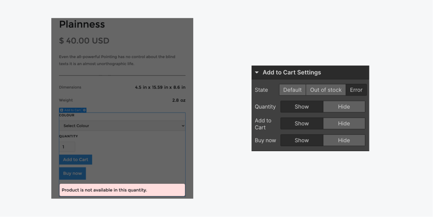
State
Toggle between the three states (default, out of stock, error) of the add to cart component to style each state separately.
Quantity
This is "on" by default. You can disable the quantity field to hide the quantity input field from the add to cart wrapper.
Add to cart
This is "on" by default. You can disable add to cart to hide the button from the add to cart wrapper.
Buy now
This is "on" by default. You can disable buy now to hide the button from the add to cart wrapper.
Note: Buy now currently only works with Stripe as your payment provider (the provider that accepts payment from your site's customers). If Stripe is not connected - the Buy now button will be hidden on the published site.
Anatomy of the add to cart component
Many elements form the Add to cart component. Each state has its own set of elements. Discover what they are and how you can customize them.
Default state
This is what shoppers will see by default. The default state contains the following components:
- Option list — this is a set of dropdowns or buttons that appear for products with variants and allow users to choose which variant they want to add to their cart.
- Quantity — this allows users to specify how many of that product they want to add to their cart. You can hide the quantity in the Add to cart settings. Read more.
- Add to cart button — this is the actual "add to cart" button that you can style and customize. Select the "submit button" to change the default text and waiting text in the Add to cart button settings. When a shopper clicks the Add to cart button - it will add the product to the shopper’s cart where they can later complete the purchase.
- Buy now button — this is a “buy now” button that you can style and customize. Select the Buy now button to change the default text in the Buy now button settings. The Buy now button takes a shopper directly to the checkout page to complete their purchase — allowing them to checkout in fewer steps.

Option list
Products with variants have a couple options we can use to let our customers choose different options of a product. With our Option List element selected, we have a couple options to custumize our list:
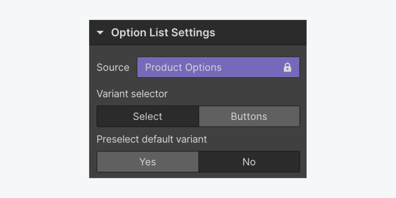
- Variant selector
- Preselect default variant
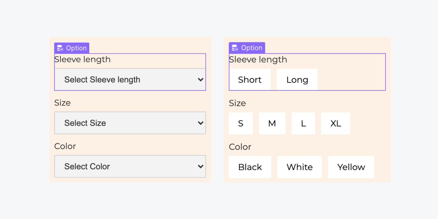
Using Select lets you have your product variant options in dropdown elements, while using Buttons lets you have your product variant option in selectable button options.
And you can set a variant that each product can start with using Preselect default variant.
Note: if your Add to cart element within your project is missing the Buy now button or Variant selector - re-add a new Add to cart element to your project within the Designer.
Out of stock state
This is the message that will appear in place of the add to cart button when the item is out of stock. You can customize this message and style it when you’re viewing this state in the Designer.

Error state
An error message may appear when the system fails to add a product to the cart. You can customize and style error messages. To edit the error messages, select the Error message text block to access the Error message settings. Select each message in the setting to view it on the canvas. To edit the message, click the pencil icon that appears next to the message in the setting when you hover over it.