Triggers and animations
Triggers and animations are the two primary aspects of any interaction.
The Interactions panel in the Designer is where you can build simple and complex interactions using triggers and animations. A trigger — like clicking an element or scrolling down the page — starts an animation or can even continuously animate 1 or more elements on the page.
In this lesson, you’ll learn:
- Different types of triggers
- How to configure a trigger
- How to set up an animation
- About action targets
- How to delete and remove unused triggers and animations
Different types of triggers
The Interactions panel is divided into two primary sections: Element triggers and Page triggers.
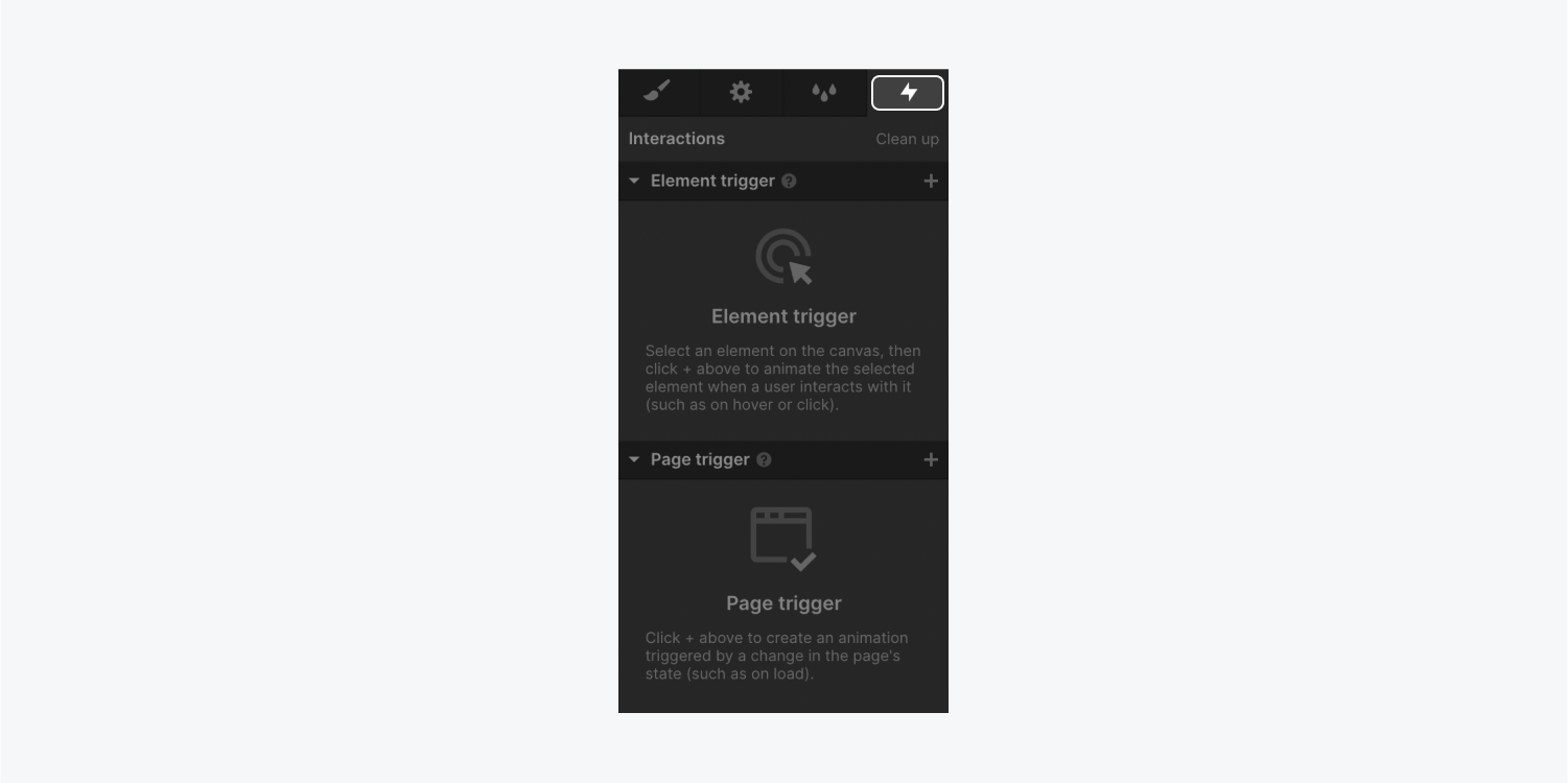
Element triggers
You can add element triggers in the Element triggers section of the Interactions panel. These triggers start an animation when a site visitor interacts with an element — like hovering over or clicking.
To add an element trigger:
- Select the element (e.g., section, button, div block, etc.) on the canvas you want to use as the element trigger
- Click the “plus” to the right of Element trigger
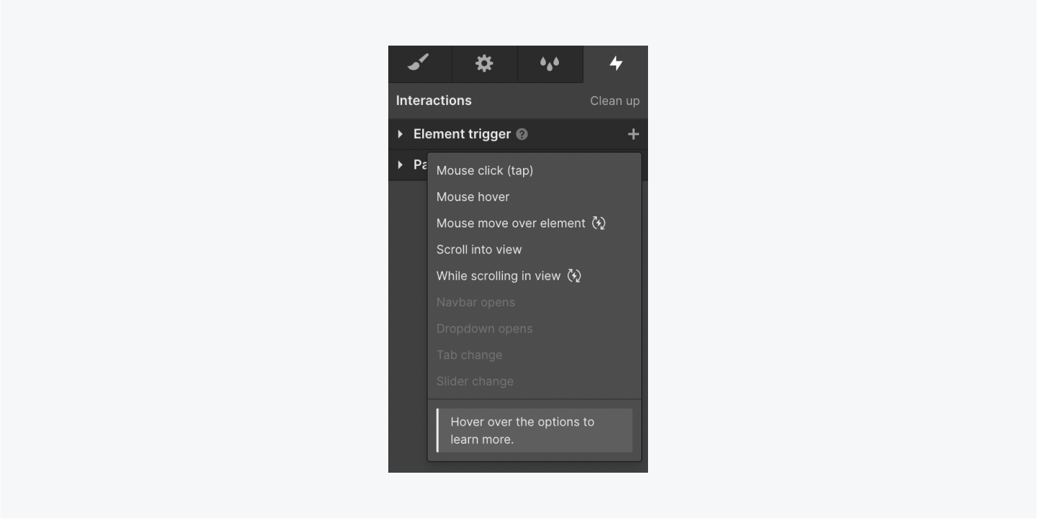
Then, you can choose an element trigger from the list. You can also hover over each option to learn more.
The available element triggers are:
- Mouse click (tap)
- Mouse hover
- Mouse move over element (continuous)
- Scroll into view
- While scrolling in view (continuous)
Note that element triggers can animate 1 or many element(s) on the canvas. In other words, an element serving as the trigger doesn’t always have to be the target of an action — it can be the trigger that animates a different element. For example, you can set a button element as the trigger element that, when clicked, makes an image element spin in a circle.
Custom element triggers
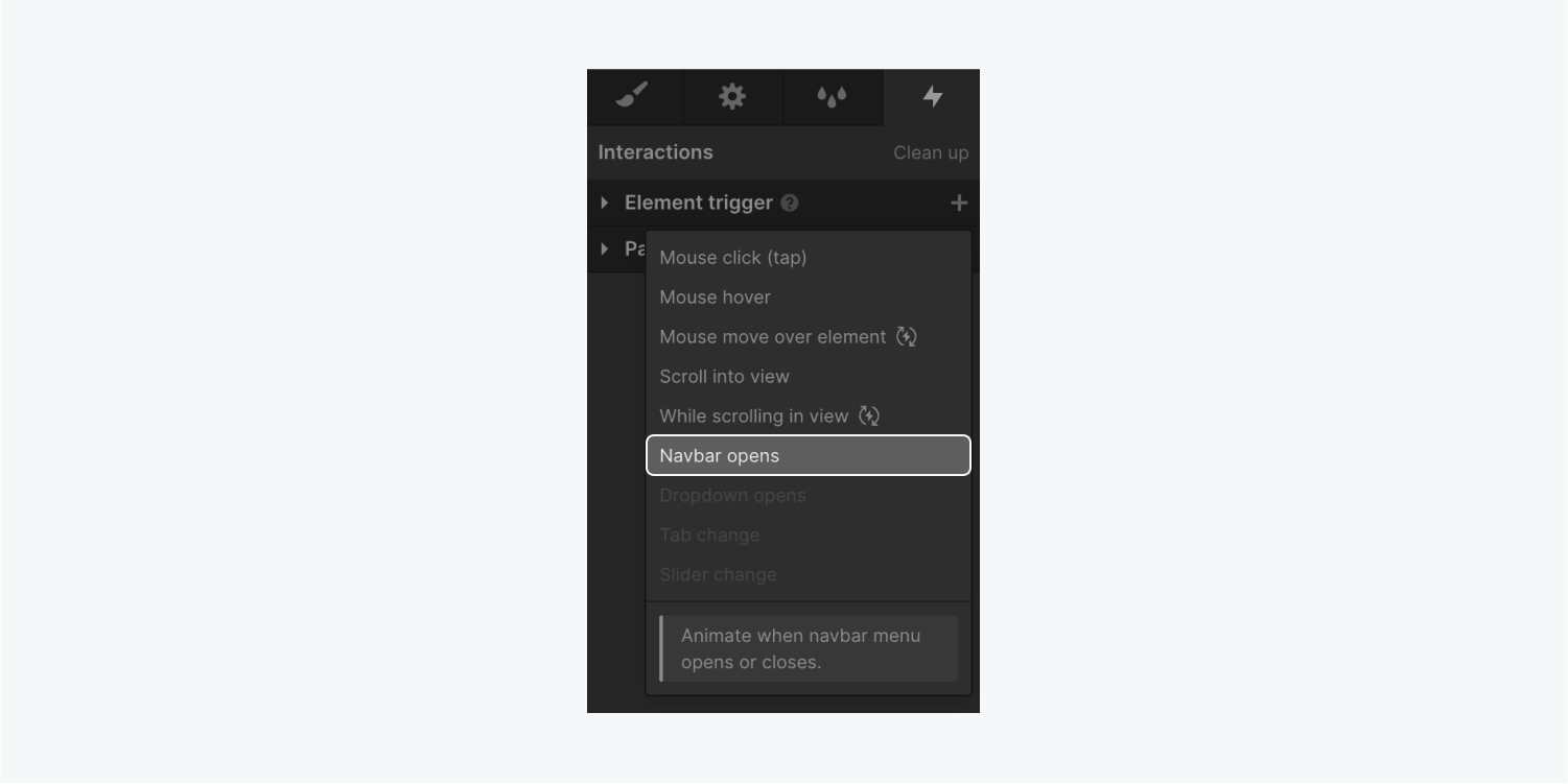
You can also add custom animations for when site visitors interact with navbars, dropdowns, tabs, and sliders. You can access these trigger types when you select the corresponding element (e.g., navbar, dropdown, etc.) on the canvas.
- Navbar opens — Select the Navbar in the Navbar element. The animation performs when the navbar menu opens/closes
- Dropdown opens — Select the Dropdown in the Dropdown element. The animation performs when the dropdown menu opens/closes
- Tab change — Select the tab link inside the Tabs element. The animation performs when the tab link is in view (active) or out of view (inactive)
- Slider change — Select 1 of the slides in a Slider element. The animation performs when a slider slide comes into view or goes out of view
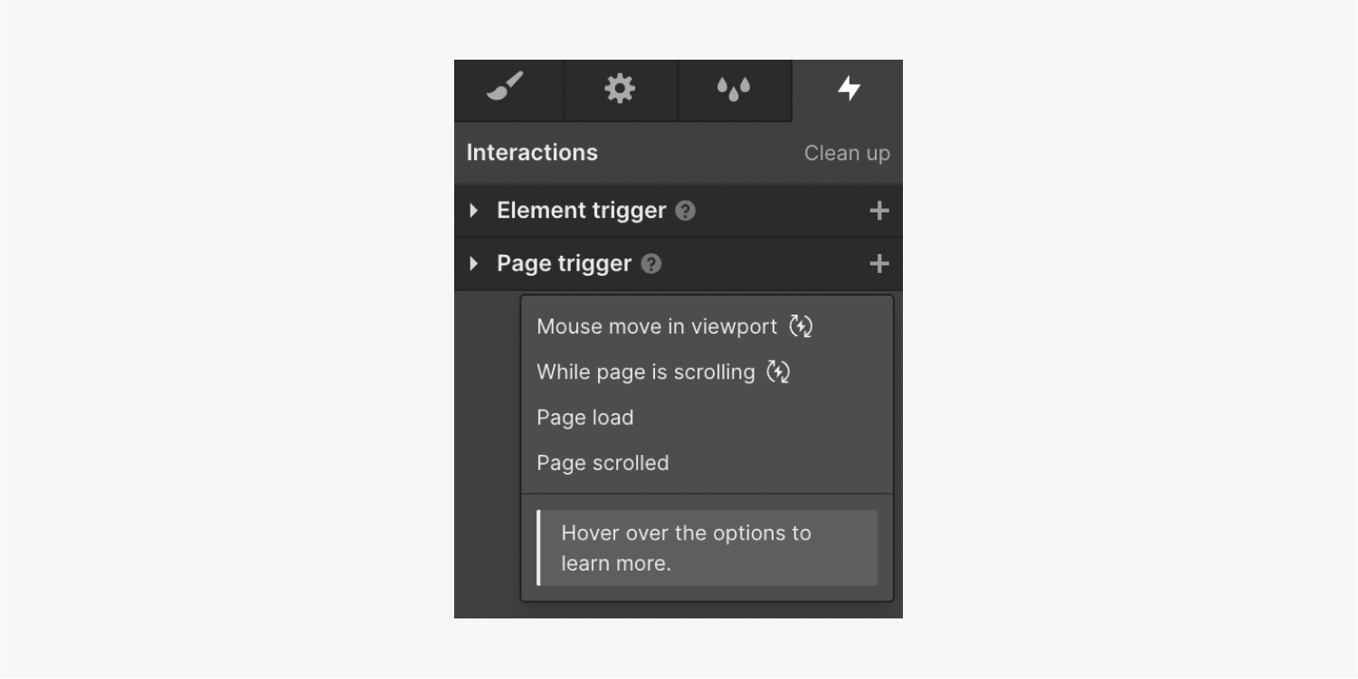
Page triggers
You can add element triggers in the Element triggers section of the Interactions panel. These triggers start an animation when there’s a change in the page state — like when the page loads.
To add a page trigger, click the “plus” to the right of Page trigger.
The page triggers are:
- Mouse move in viewport (continuous)
- While page is scrolling (continuous)
- Page load
- Page scrolled
How to configure a trigger
After you select the type of trigger in the Interactions panel, you can specify the action you want to happen after the trigger. The action options you have depend on the type of trigger you have chosen. For instance, if you choose the “Mouse click (tap)” element trigger, you can choose the actions that happen on 1st and 2nd click.

Trigger settings
By default, when you set a trigger on an element, the interaction only occurs when you interact with that specific element. The interaction will occur on all device breakpoints.

How to trigger an animation on specific breakpoints
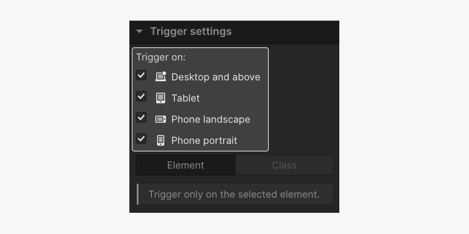
To trigger an animation on specific devices, you can check the device breakpoints on which you want the animation to occur. By default, an animation triggers on all breakpoints (Desktop and above, tablet, phone landscape, and phone portrait).
For example, this can be useful if you want mouse click interactions to occur only on Desktop and above breakpoints. Then, site visitors will be able to trigger the interaction with their mouse.
How to trigger an animation on all elements with the same class
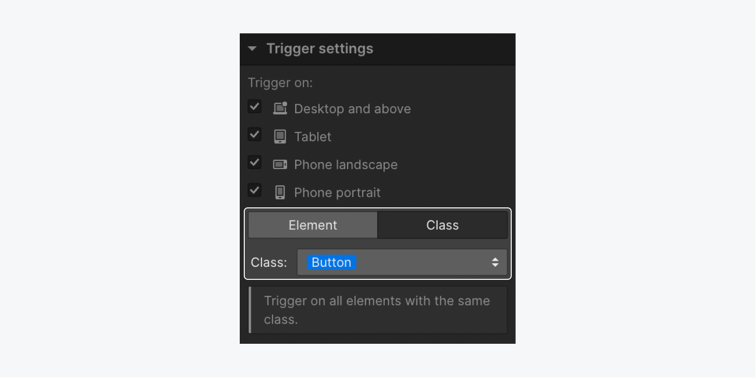
If you want to trigger an animation on all elements with the same class, you can set an interaction on one element with that class, then apply it to the entire class.
To set an animation on all elements with that class:
- Set an animation on an element
- Got to Trigger settings and select Class
- Choose the class you want to set the animation on from the Class dropdown
Learn more about reusing interactions.
Other animation settings
Scroll offset
On many page scrolling triggers (e.g., “Scroll into view,” “While scrolling in view (continuous),” etc.), you have the option to set an offset. This delays the interaction from starting until it reaches a certain scroll percentage of the page — the longer your scroll offset, the longer a site visitor scrolls before the interaction starts.
Delay
You can set an animation delay, so the animation occurs only after the allotted time delay has passed.
Smoothing
You can also change the smoothing of an animation. Smoothing defines how quickly the animation responds to mouse movement.
How to set up an animation
To set up an animation based on the trigger you just created, you can create a custom animation or you can choose a pre-built animation (e.g., fade, shrink, jello, etc.).
How to set a pre-built animation
Pre-built animations are the appear & disappear and emphasis animations that are pre-set in the Designer. You can choose these for a quicker alternative than having to build each aspect of an animation.
Note: You can only set pre-built animations for element triggers — not page triggers.
To set a pre-built animation:
- Set an Element trigger (e.g., mouse hover, scroll into view, etc.)
- Open the Action dropdown from the starting action section (i.e., if you chose the mouse hover element trigger, you’d open the Action dropdown from the On hover section)
- Choose an action from either the Appear & disappear section or the Emphasis section
Then, you can adjust the direction and delay on Appear & disappear animations, or adjust the direction on Emphasis animations.
How to set a custom animation
To set a custom animation:
- Set an Element trigger (e.g., mouse hover, scroll into view, etc.) or Page trigger (e.g., Page load, page scrolled, etc.)
- Open the Action dropdown from the starting action section (i.e., if you chose the mouse hover element trigger, you’d open the Action dropdown from the On hover section)
- Click “Start an animation” under Custom animation
- Click the “plus” next to Timed animations
- Name your animation in the top field of the Interactions panel
- Click the “plus” to the right of Actions
- Choose a Global variables, Transform, Style, or Miscellaneous animation from the dropdown
Next, you’ll adjust the animation’s timing in the animation timeline.
How to use the animation timeline
Whether you’re creating a new animation or editing an existing animation, the animation timeline is where you can use keyframes to animate different elements.
To add an action to the animation timeline, first go to the animation timeline. Then, you can add an action 1 of 2 ways:
- Click the “plus” icon at the top of the timeline
- Press the “plus” icon inside the timeline before, on, between, or after existing actions to add actions inline
Example
For example, let’s create an animation for the “While page is scrolling” page trigger. As you scroll down the page, you can make your hero section text move horizontally and decrease in opacity. The green playhead in the animation timeline shows the current position of the page (0% – 100%).
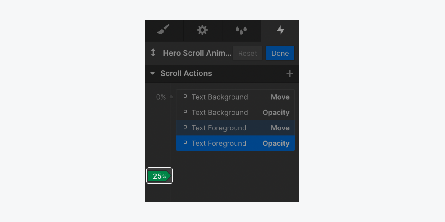
Timed animations often use other triggers (milliseconds, seconds, etc.) but this example uses percentages to indicate the page’s current scroll position. In this case, 0% indicates a scroll position at the top of the page, and 100% indicates a scroll position at the bottom of the page.
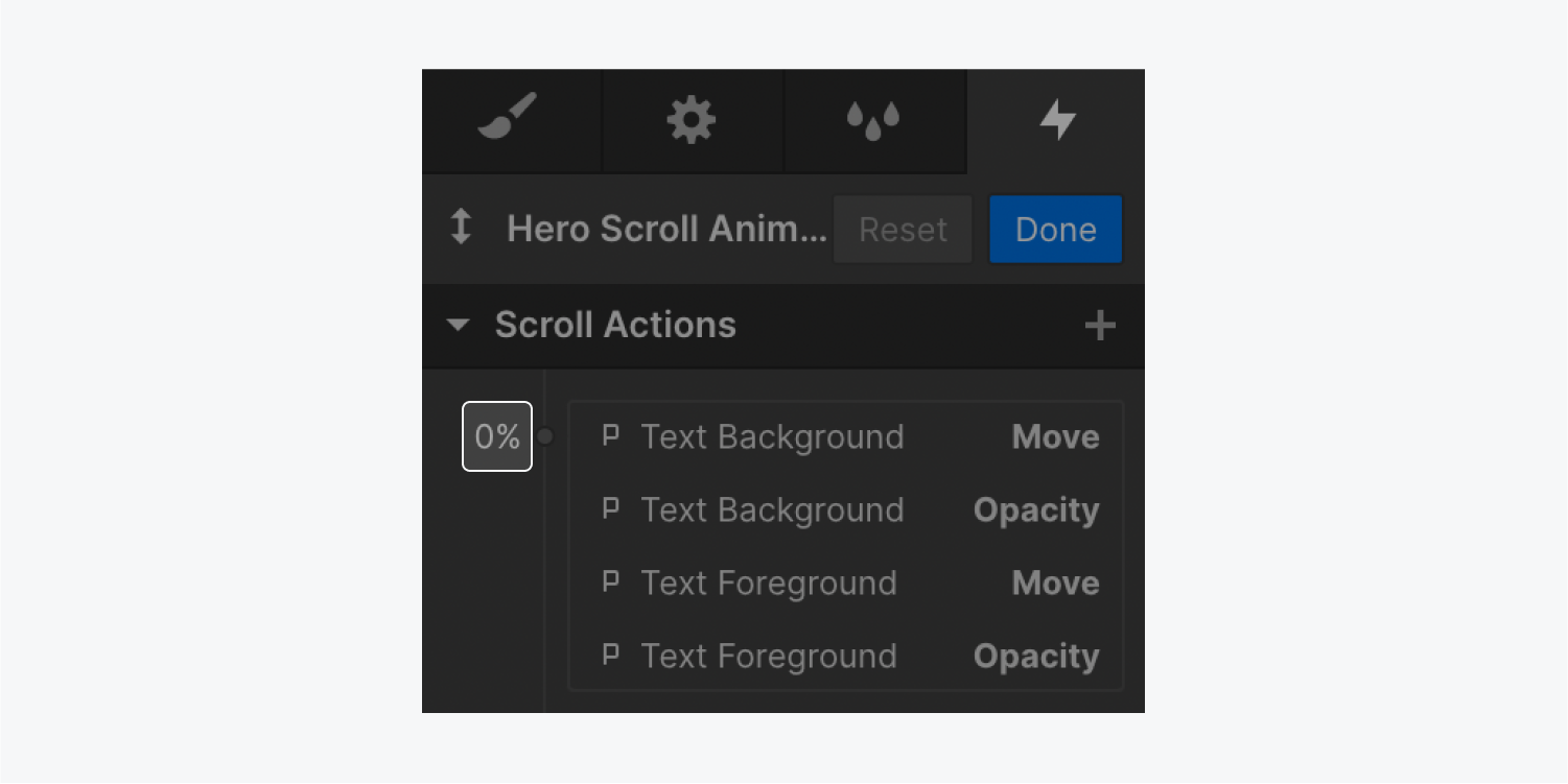
Now, you can add various actions at points in the page. For instance, you can add 4 actions at 0% scroll position:
- Text background — Move 0px
- Text background — Opacity 100% (fully opaque)
- Text foreground — Move 0px
- Text foreground — Opacity 100%
These actions set the Text background’s and text foreground’s position to 0px (no movement) and their opacity to 100% (fully opaque). When a site visitor is at the top of the page, the text background and foreground will be fully opaque and set in their original position on the page.
You can also add 4 actions at 100% scroll position:
- Text background — Move 900px
- Text background — Opacity 0% (fully transparent)
- Text foreground — Move 900px
- Text foreground — Opacity 0%
In this case, each element is moved 900px in either direction, and the opacity is set to 0%. Let's take a look at our ending actions for the scroll animation:
These actions set the Text background’s and text foreground’s position to 900px (movement 900px to each side) and their opacity to 0% (fully transparent). When a site visitor is at the bottom of the page, the text background and foreground will be fully transparent and moved 900px from their starting positions to the right or left of the site page.
Pro tip: There are 2 ways to select multiple actions on the animation timeline. To select multiple consecutive actions on the animation timeline, press and hold Shift and select the actions. To select multiple, non-consecutive actions on the animation timeline, press Command (on Mac) or Control (on Windows) and select the actions.
About action targets
By default, any action you add to your animation timeline affects the selected element. However, you can change the target of an action in 1 of 2 ways:
- Replace the target element the action affects
- Choose whether the action affects only the selected element, all elements with the same class, or the interaction trigger itself
How to replace a target element
To replace the element an action affects:
- Right-click an action in the animation timeline
- Click Change target
- Select a different element on the canvas to add the action to
Important: Changing any settings within the animation timeline will affect all interactions that trigger the animation sequence.

How to choose whether the action affects the individual element, class of the element, or the interaction trigger
After creating an action, you can choose whether this action affects:
- Only the selected element
- All elements with the same class as the selected element
- The interaction trigger itself
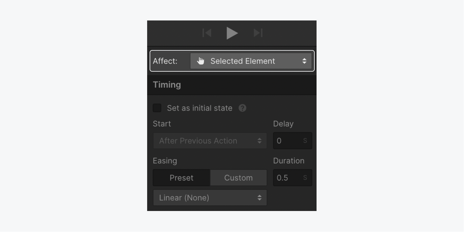
How to target only the selected element
The selected element is the default target of any animation action you create. Any action that you set to affect the selected element will always affect that specific element. So, if you reuse an animation with an action that affects the selected element, the action will affect that element, no matter what element is set to trigger the interaction.
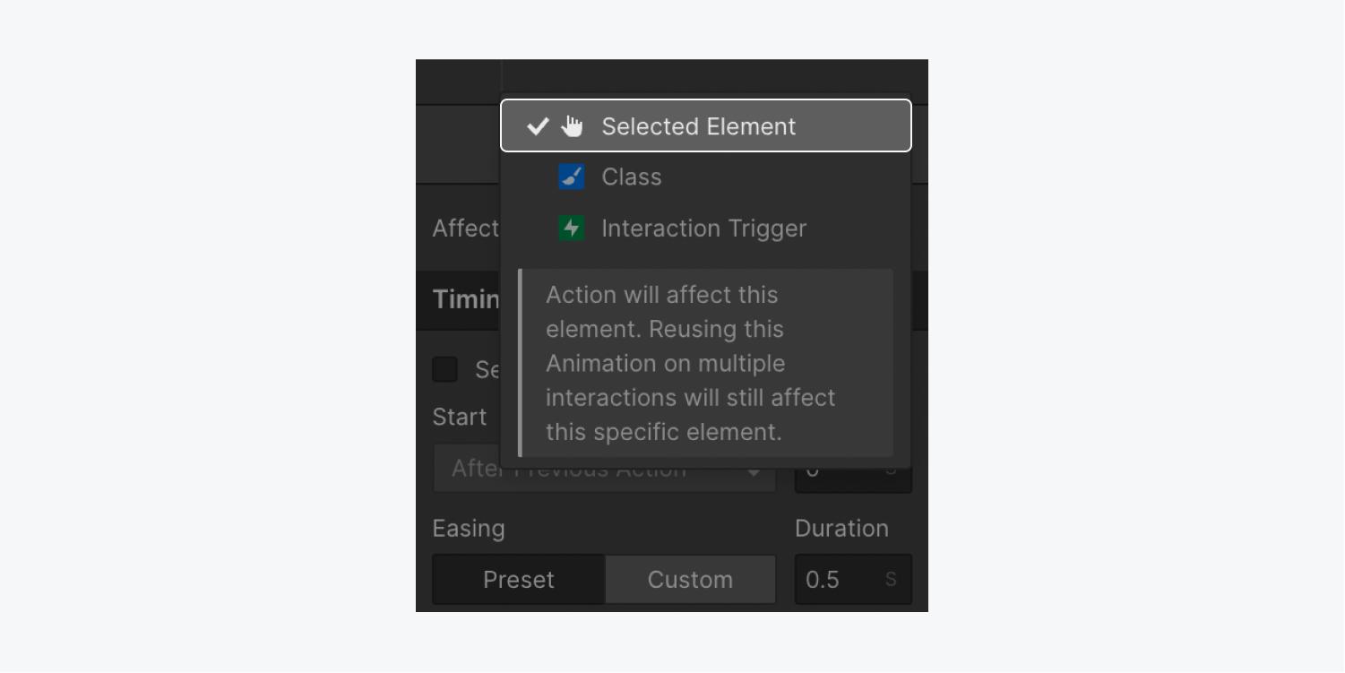
How to target all elements with the same class as the selected element
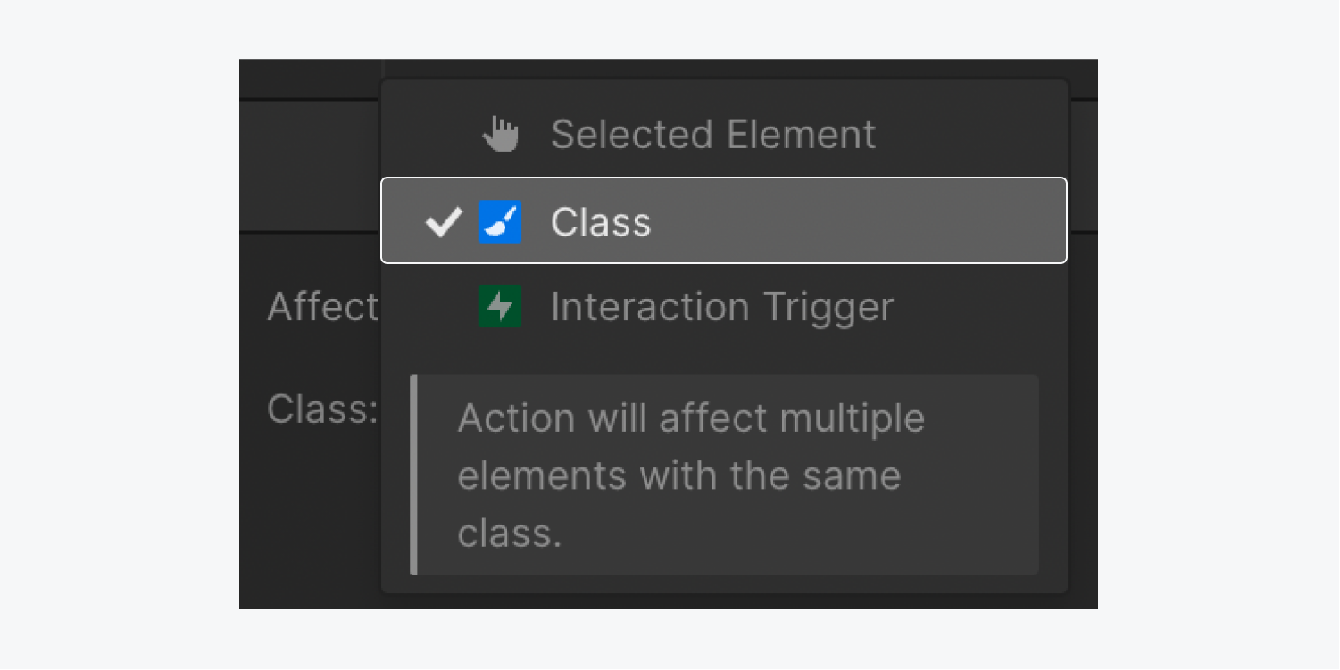
You can also choose to target the class of the selected element. This makes the animation action affect all elements with the same class as the selected element.
This option is useful if you want a number of elements to move in the same pattern when the page loads. To do so, assign the same class to all elements and use combo classes to move them to different positions on the page. Then, you can apply the same animation action to the base class so each element moves in the same pattern, but from different original positions.
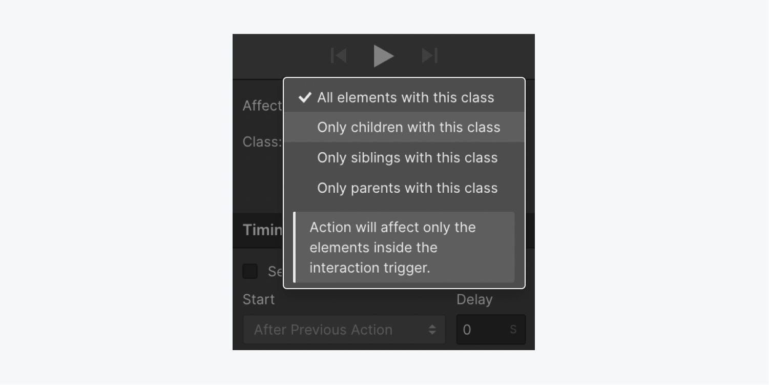
You can also limit the affected elements to only children, siblings, or parents that have the same class as the interaction trigger.
How to target children, siblings, or parents that have the same class as the selected element
You can choose to limit the classes that are affected by an action by specifying whether they are children, siblings, or parents of the trigger element.
This option is useful, for instance, if you want all arrows in button elements with the same class to animate on hover. If you add the animation action to all elements with the same class, you’ll notice that hovering over 1 button will animate all arrows within all buttons on that page. To limit the animation action to the button that you’re immediately hovering over, go to the Affect menu and choose “Class.” Then, click the Class dropdown and choose “Only children with this class.”
The “Only siblings with this class” option is useful when the element you want to animate is a sibling of your trigger element, such as a menu dropdown or a popup modal. You can also use the “Only parents with this class” option when the element you want to animate is the parent of your trigger element.
Note: Make sure you apply a class to your element(s) before you create class-based animation. The “class” option won't be available for actions applied to elements that don’t have a class.
How to target the Interaction trigger
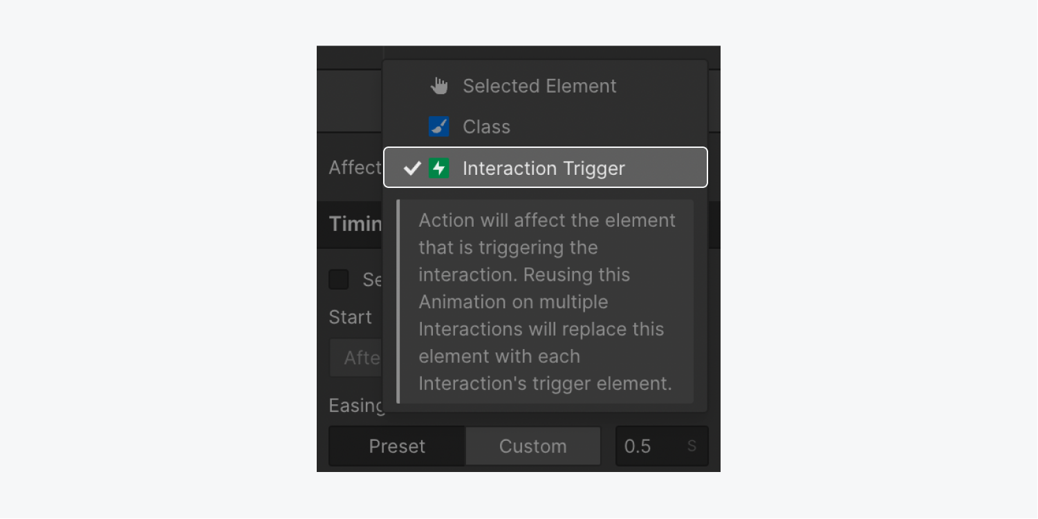
You can also create actions that only affect the Interaction trigger. Then, if you reuse the animation in any other interaction, the animation will replace the action’s previous target element(s) with the trigger element of the new interaction. This helps you quickly apply the same animation to any element without the need to create new animations.
Note: The “Interaction trigger” option is only available when an action is applied to the interaction trigger element. As a result, this option isn’t available in animations triggered by a Page trigger.
How to edit an existing animation
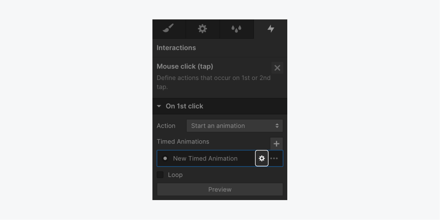
You can edit an existing animation by going to the Interactions panel and clicking on the animation to open its settings. Then, hover over the animation’s name and click the settings “cog” icon to the right of the animation name. This will open the animation timeline for that animation.
Other resources
- Learn more about reusing interactions
- Learn about interpolation, easing, and smoothing
- Learn how to set a continuous animation that moves and fades elements horizontally on scroll
How to delete and remove unused triggers and animations
How to delete triggers and animations
You can delete triggers or animations from the Interactions panel. This removes the trigger or animation from its target element or page action. To delete a trigger or animation:
- Go to the Interactions panel
- Hover over the animation or trigger you want to delete
- Click the “trash” icon next to the trigger name
Note: Deleting a trigger from the Interactions panel doesn’t delete the animation to which it was previously linked. It only deletes the animation from that particular trigger. You’ll still be able to use the animation when configuring new triggers.
How to remove triggers and animations from your site
If you delete an animation, or a trigger that didn’t have an animation linked to it, from the Interactions panel, this won’t fully remove the trigger or animation from your site. This is because you can reuse previously created animations on other element or page triggers. However, you may want to clean up unused triggers or animations, to increase site optimization and performance.
When you clean up unused interactions, you won’t be able to decide which triggers are removed but you can choose which animations to remove or keep. All unused triggers are deleted when you clean up unused interactions.
Note: You’ll only be able to fully remove (clean up) an animation when the animation isn’t connected to an element or page trigger. Remove the animation from any element or page triggers in the Interaction panel first, then remove the animation from your site.
To clean up unused triggers and animations:
- Go to Interactions panel
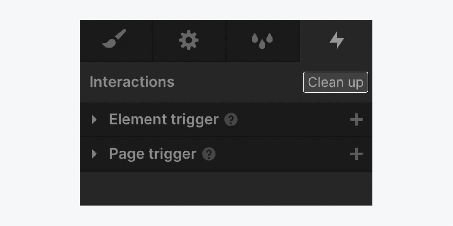
- Click Clean up at the top of the panel
- Select/deselect the animations you want to delete/keep
- Click Delete
