
But, here’s the secret — it’s not horizontal scrolling. It’s vertical scrolling with an interaction that moves elements in our viewport as we scroll.
In this lesson you’ll learn how to create a horizontal scroll interaction doing the following:
- Create the “Track” Section
- Set up the “Camera” Div block
- Structure the “Frame” Div block
- Add items
- Configure the interaction
- Configure for mobile devices
Create the “Track” Section
Let’s create the primary structure of the horizontal scroll section — a Section element that holds all the elements inside it:
- Drag a Section element from the Add panel onto the page (the Section is 100% width by default)
- Click into the Selector field in the Style panel
- Give the Section a class name in our Selector field (e.g., “Track”, but we can name it anything we like)

In our example, we’re going to horizontally scroll through 4 things. The number of items is important because it determines the height of the "Track" Section.
Set the “Track” Section’s height
Let’s set a height on our Section:
- Open Style panel > Size
- Set the height to 400vw

Note: we’re using VW (viewport width) because we’re scrolling horizontally across 4 items. Each item equals 100vw in height (e.g., 4 items equals 400vw).
Set up the “Camera” Div block
Now let’s add an element that we’ll use to view our items as they scroll by:
- Drag a Div block from the Add panel into the “Track” Section
- Click into the Selector field in the Style panel
- Give the Div block a class name (e.g., “Camera”, but we can name it anything we like)
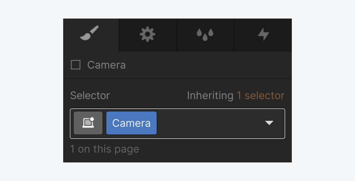
Pro tip: We can also use shortcut keys Command + Enter (on Mac) or Control + Enter (on Windows) to quickly access the Selector field of an element that is selected.
Style the “Camera”
The “Camera” Div block serves as something through which we’re going to see items scrolling by. With the “Camera” Div block selected, let’s set it to be exactly the same dimensions as our viewport, and make it stick to its parent element:
- Open Style panel > Size
- Set the width to 100vw (100% of the viewport width)
- Set the height to 100vh (100% of the viewport height)
- Scroll down to the Position settings in the Style panel
- Change the position from Static to Sticky
- Add a top position of 0 pixels (the distance between the top of the “Track” Section to the top of the “Camera” Div block)

When we set an element to position sticky, we’re automatically defining the parent element as the container its child element will stick to.
Structure the “Frame” Div block
Let’s create our “Frame” Div block to horizontally align our items:
- Drag a Div block from the Add panel into the “Camera” Div block
- Click into the Selector field in the Style panel
- Give the Div block a class name (e.g., “Frame”, but we can name it anything we like)

Style the “Frame”
We’ll use the “Frame” Div block to move items in our scrolling interaction. Let’s style the Frame Div block:
- Open Style panel > Layout
- Select Flexbox (Horizontal direction is set by default)
- Set the height to 100% to make it take up 100% of our parent element (the “Camera” Div block)

Add items
First, we’ll create an element that will hold our image:

- Open the Add panel and select a Div block
- Drag the Div block into the “Frame” Div block in the Navigator
- Click into the Selector field in the Style panel
- Give the Div block a class name (e.g., “Item”, but this can be named whatever you want)
- Open Style panel > Flex child and set the Sizing to Don’t shrink or grow
- Open Style panel > Size and give it a width of 100vw and a height of 100vh

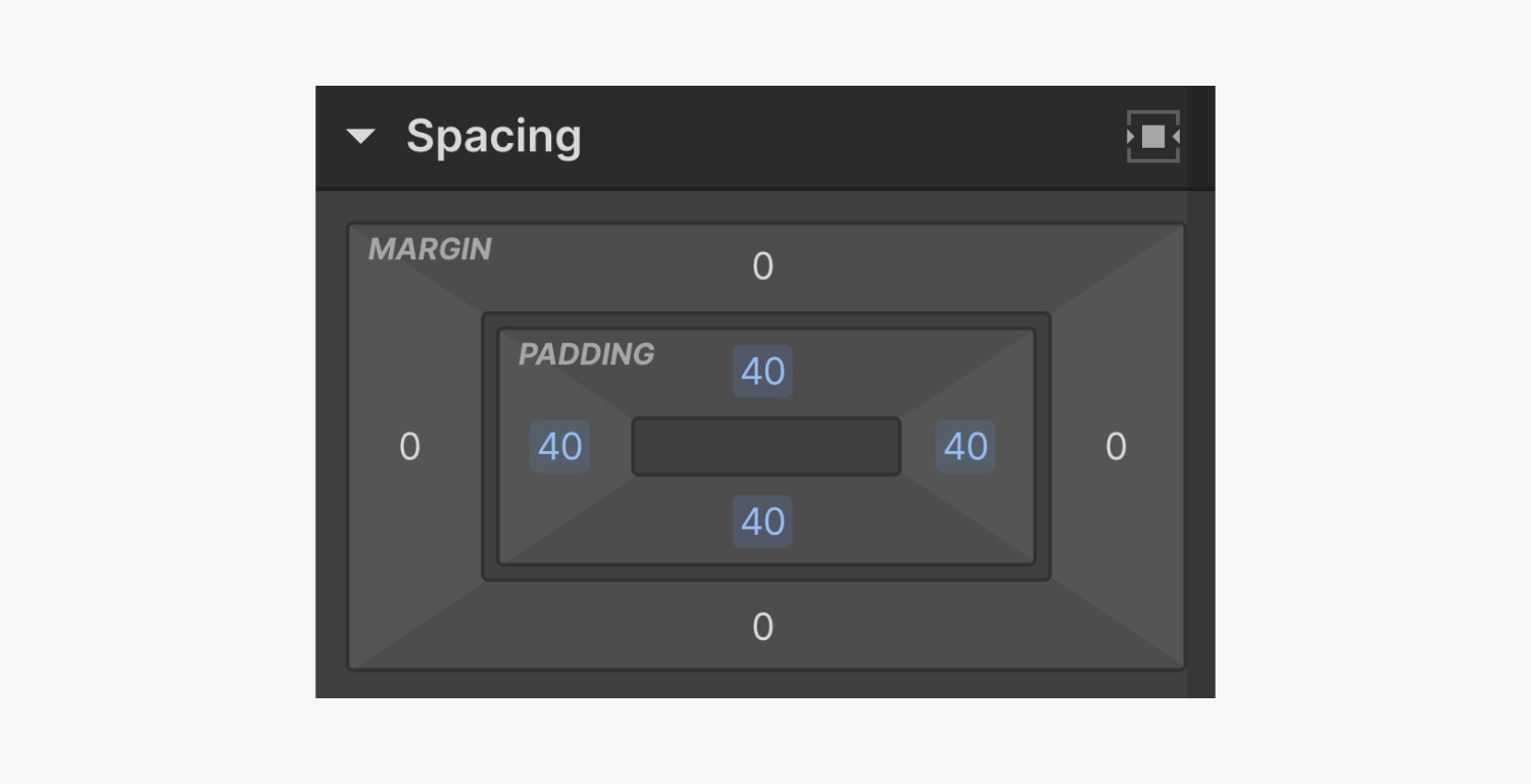
You can also add padding on all sides to give the items breathing room (e.g., 40 pixels of padding on all sides). To do this, open the Style panel > Spacing and set the padding.
Now, we can place an image inside of the “Item” Div block we just created.
Style the images inside the items
For this example, we're using images that take up the full width and height of the “Item” Div block.

Let's also add some padding to all sides of the image to give the images breathing room:
- Open Style panel > Size
- Set the width to 100%
- Set the height to 100%
- Set Fit to Cover

Configure the “Camera” for our items
If we scroll from left to right using our mouse or trackpad (holding SHIFT while scrolling on Windows), we can preview all of our items that are visible in the “Camera” view.
However, the items spill out of the “Camera” view, which isn’t the desired effect. We want to see the items inside that view only when they’re pulled in by the interaction. To keep the images from spilling out:
- Select the “Camera” Div block (or whatever you named it)
- Open Style panel > Size
- Set Overflow to Hidden

With the “Camera” overflow set to hidden, when we try to scroll from left and right, we are unable to. This sets us up to configure our interaction, which will move the “Frame” from right to left.
Configure the interaction
For our example, our elements include the “Track” Section > the “Camera” Div block > the “Frame” Div block > the “Item” Div block > the image element.

Now, the goal of the interaction is to have the "Track" Div block trigger the interaction that moves the “Frame” Div block from right to left.
Create the trigger
Select the “Track” Section and open the Interactions panel:
- Click the plus icon for Element trigger
- Select While scrolling in view
- Click the Action dropdown
- Select Play scroll animation
- Click the plus icon for Scroll animations to create a new animation
- Name the new animation (e.g., “Horizontal scroll animation”)

Move the “Frame” with the interaction
Now that we’ve set the "Track" Section to be our trigger, we need to select the “Frame” Div block in the Navigator. Selecting the “Frame” Div block while creating the interaction lets us add an animation to the “Frame” Div block.
Go back to the Interactions panel, and let’s create our interaction on the “Frame” Div block when the Track Section enters into the viewport:
- Click the plus icon
- Select Move
- Set the movement on the x-axis at 0% to 0vw (because this is where our interaction will start)

The last thing we need to do is set the movement on the x-axis at 100% to -300vw.

How do we get -300vw? The Track Section is 400vw, but we only see the entire viewport's width (100vw) at any given time while we're scrolling.
To move all 4 items to the left, we need to set the movement on the x-axis at 100% to -300vw to move the Frame 400vw to the left. The 400vw also takes into account the first 100vw that we see before we start scrolling.
Offset the interaction
Click the eye icon in the Designer to view a live preview of your site. When testing out our new interaction, we can see that the start of the interaction starts too early, and also moves onto the next Section too soon.
We can offset the interaction in 2 ways:
- Change the start of our animation to begin at 20%
- Change our animation to start when the "Track" Section is fully visible
To change the start of our animation to begin at 20%:
- Open Interactions panel > “Horizontal scroll animation” interaction
- Click the Move action that starts at 0%
- Change the keyframe to 20%

To change our animation to start when the "Track" Section is fully visible:
- Open Interactions panel > Animation boundaries
- Select Is fully visible

Now when we preview our live project, we can see the interaction starts when the first item is fully visible, but it still ends too soon. The interaction reaches the end of the "Track" Section while our interaction is still moving.
Customize the end of the interaction
Reopen the Interactions panel, and Animation boundaries. Let’s offset the animation’s end by about 15%.

Now when we preview our project, we can scroll to the “Track” Section and our interaction horizontally scrolls our items until we reach our fourth and last item.
Configure for mobile devices
When setting up a horizontal scroll animation, one thing to keep in mind is the experience for tablet and mobile users. If someone on a mobile device tries to move left and right, the horizontal scroll interaction won't function as expected because it only works if your user scrolls up and down. Therefore, it’s not a very accessible experience for mobile users.
To set our interaction to happen only for desktop users:
- Select the “Track” Section
- Open the Interactions panel
- Click the While scrolling in view interaction we created (e.g., “Horizontal scroll animation”)
- Deselect the mobile devices we don’t want to experience the interaction (e.g., deselect the Tablet, Phone landscape, and Phone portrait breakpoints)

Now that mobile devices won’t experience the interaction, we’ll need to optimize our layout for vertical scrolling on tablets and smaller devices:
Mobile “Track” Section
- Select the Tablet breakpoint
- Select the “Track” Section on the canvas
- Open Style panel > Size
- Change the height from 400vw to Auto (so that it automatically adjusts its height based on the size of the items inside)
Mobile “Camera” Div block
- Select the “Camera” Div block
- Open Style panel > Size
- Change both the width and height to Auto (to allow the items inside to fill up the space)
- Set Overflow to the Default option of visible (we don't want to hide the items on the smaller breakpoints)
Mobile “Frame” Div block
- Select the “Frame” Div block
- Open Style panel > Layout
- Change the Flexbox direction from Horizontal to Vertical
From here, we can adjust the “Item” Div block’s style properties however we’d like to best fit our design’s vertical scroll experience.
Note: Because we made these changes on the Tablet breakpoint and because changes cascade down, the updates won't affect the Desktop breakpoint but will appear on both Mobile landscape and Mobile portrait breakpoints.

And that’s it! You’ve set up horizontal scrolling in Webflow.