Usability & accessibility
A form only works if people can complete it comfortably and confidently. Many form issues are not technical failures. They’re experience problems. People hesitate, misunderstand what’s being asked, or abandon the form before submitting.
In Webflow, usability and accessibility are closely related. The same decisions that make a form easier to understand often make it more accessible as well. Thinking about both together helps you design forms that work better for more people.
Designing for clarity
Forms are easier to complete when people can quickly understand what’s being asked and why. A few design choices tend to have an outsized impact.
Clear, specific labels
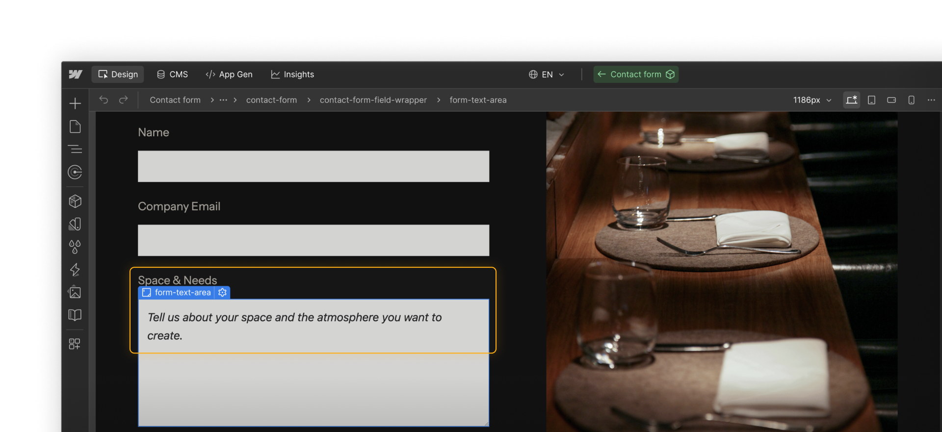
Labels work best when they describe exactly what information is being requested. A label like “Email” can feel ambiguous. A more specific label, such as “Work email,” helps set expectations and reduces second-guessing.
Placeholder text as a supplement to labels
When a field needs guidance, clear placeholder text can support the user and lead to better quality input for your team. Keep in mind, placeholder text disappears once input begins, so it works best as a supplement to a label rather than the only instruction.
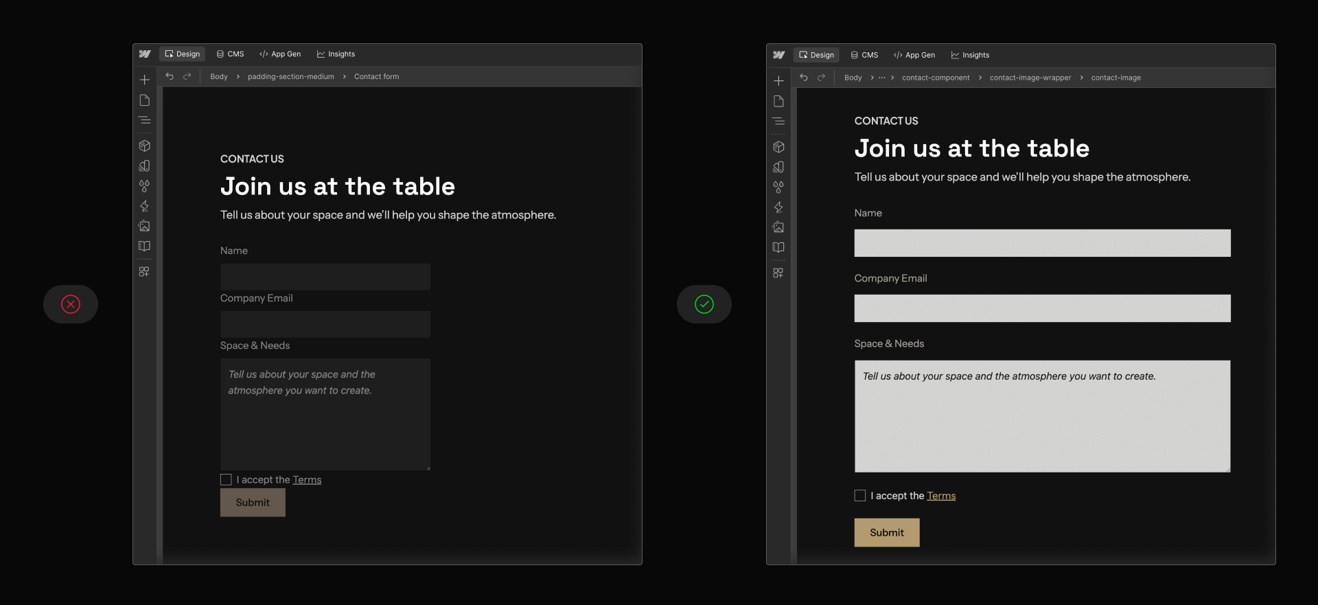
Visual grouping and spacing
Related fields are easier to understand when they’re grouped and spaced consistently. Grouping helps users scan the form and understand how information is organized, which can reduce errors and abandonment.
Supporting different ways of interacting
People don’t all interact with forms in the same way. Some use a mouse, others rely on a keyboard, and some use assistive technologies. Accessibility considerations help ensure the form still works across these different interaction patterns.
Keyboard navigation and order
Some people navigate forms using the keyboard instead of a mouse. Pressing Tab should move through fields in a clear, top-to-bottom order. If it doesn’t, the layout may need to be reorganized.
Quick demo → Moving through form fields with the Tab key and visible focus states.
Visible focus states
Focus states indicate which element is currently active during keyboard navigation. Inputs and buttons benefit from clearly visible focused styles that don’t rely on subtle color changes alone.
Focus styling isn’t decorative. It’s functional feedback that helps users understand where they are as they move through a form.
Feedback that isn’t color-dependent
Error and success messages should be understandable without relying only on color. Pairing visual cues with clear text helps users understand what happened and how to proceed.
Contrast and readability
Input text, placeholder text, focus outlines, and feedback messages should have enough contrast against their backgrounds to remain readable in a variety of viewing conditions. Form labels and input fields should be large enough to read legibly and interact with comfortably.
Designing helpful feedback
Feedback after interaction is part of the form experience, not an afterthought.
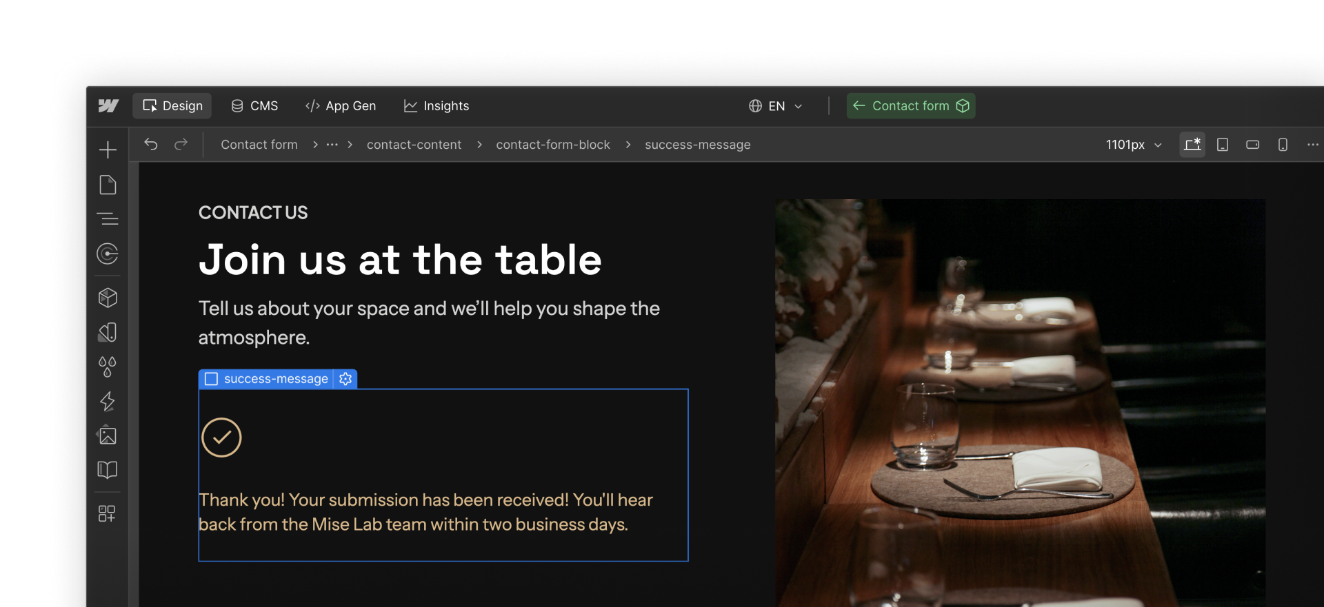
Success messages
Success messages confirm that submission worked and help set expectations about what comes next. Letting users know whether they’ll receive a follow-up email or response builds trust and reduces uncertainty.
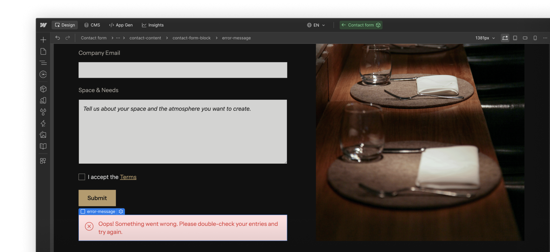
Error messages
In most cases, the browser handles field-level validation for you. If a required field is empty or an email address is formatted incorrectly, it shows a built-in message before the form can be submitted.
The Form block also includes a global error state. This appears if the submission can’t be completed and does not identify a specific field, so keep the message general and focused on what the user should do next.
Testing with real constraints
Testing is a critical part of designing usable and accessible forms. A form that’s easy to follow on desktop may be hard to use on mobile. A form that feels fine when clicked through with a mouse may behave differently when navigated another way.
A few checks go a long way:
- Test the form at smaller breakpoints to make sure fields don’t feel cramped or hard to read
- Navigate the form using only the keyboard to confirm focus moves in a clear, logical order
- Intentionally trigger errors, such as leaving required fields empty, to review the error state experience
These tests often reveal issues that are easy to fix early and frustrating to debug later.
Privacy and trust
Asking for information is an act of trust. Only request personal data that has a clear purpose, and avoid collecting more than you need.
If a form collects sensitive information, keep it focused and limit who receives submissions. Clear intent and respectful data practices help users feel comfortable completing the form. When in doubt, consult with your legal team on what to include or exclude from a form.
Onward
What happens next affects how quickly submissions are reviewed and followed up on. The next section looks at how Webflow stores and organizes form submissions.