Form layout & style
In Webflow, form layout and styling are closely connected. How you group fields, style their containers, and reuse classes affects both how the form looks and how easy it is to update later.
Start with layout
It’s tempting to jump straight into colors, borders, and typography. Forms are much easier to style when the layout is solid first. A clear layout means deciding how the form and nearby elements flow and align on the page.
In practice, this usually means styling a parent container or div that wraps the entire layout. Inside, you’ll nest and style div wrappers that group related elements, such as headings, paragraphs, or sets of inputs. These parent wrappers are often set to flex or grid to give you more control over layout, alignment, and spacing.
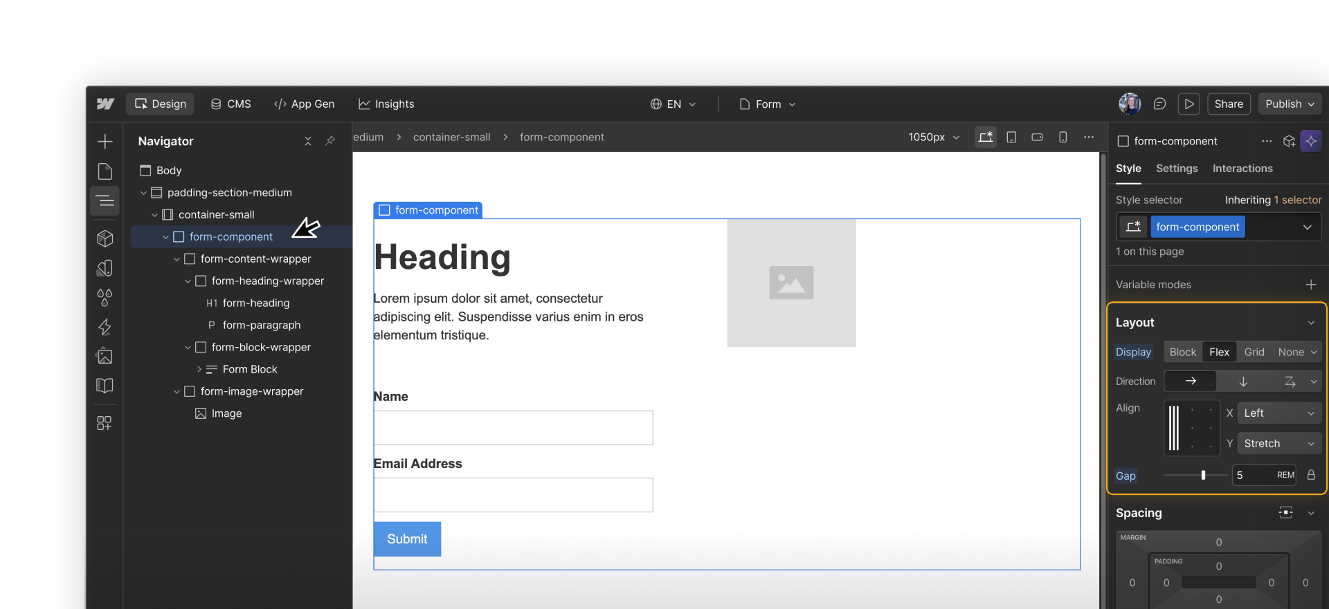
Group fields and labels
By default, form elements stack vertically. When you want multi-column layouts or more control over spacing, you’ll need to make a few layout adjustments.
One thing that’s often helpful is to treat each field and its label as a single layout unit. You can:
- Place the Field label and its related input inside a wrapper element
- Repeat that wrapper pattern for each field
- Apply flex or grid to the parent element that holds those wrappers
Quick demo → Placing a label and input inside a parent wrapper element for more layout control.
This helps keep labels and inputs together, so it’s clearer which label goes with which field and the layout stays more predictable. Using the gap setting on the parent layout also makes spacing easier to manage, since you’re not adjusting margins on each individual element.
Designing for responsiveness
Form layouts often need to adapt across breakpoints. A layout that feels comfortable on desktop can quickly feel cramped on smaller screens, so responsive adjustments are usually part of form design.
A few adjustments tend to make the biggest difference:
- Change the layout to a single column on smaller screens, so fields that sit side by side on desktop stack vertically
- Tighten horizontal spacing at smaller breakpoints, so the layout doesn’t waste space or force extra scrolling
- Let inputs take the full available width on mobile, making them easier to read and tap
- Increase vertical spacing between fields so each input is clearly separated when stacked
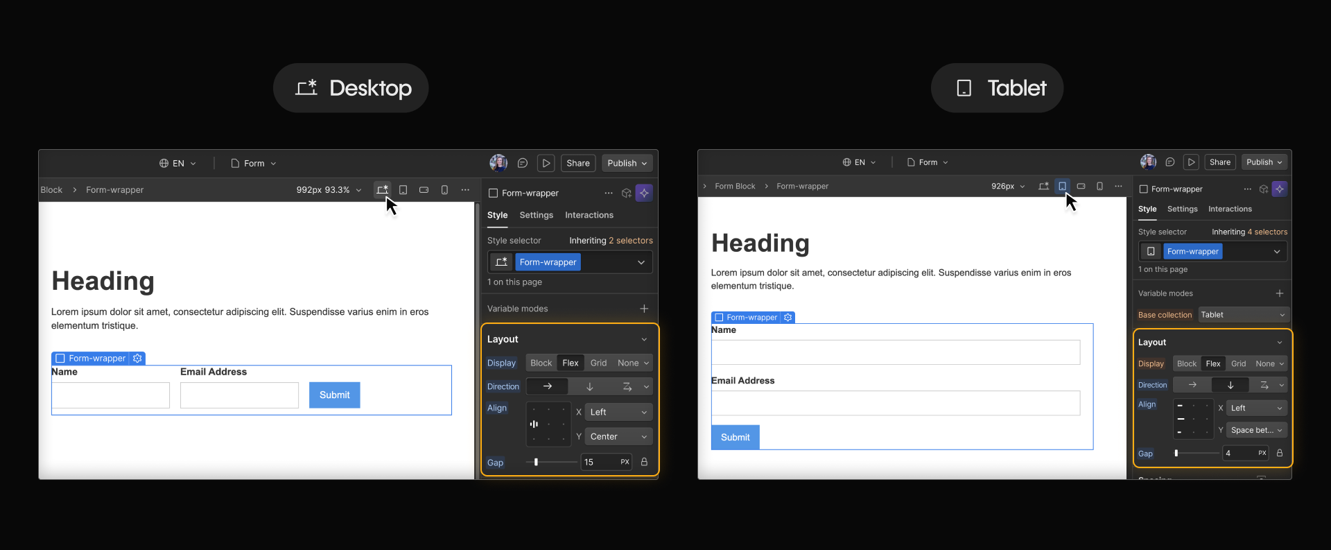
In most cases, these changes should happen at the layout or container level as you move down breakpoints, rather than by tweaking individual fields.
Styling with shared classes
Once layout is in place, styling becomes easier to manage. Forms usually include a mix of text inputs, textareas, selects, and buttons. Shared classes help those elements feel connected and reduce repetitive styling work.
When styling forms, it’s recommended that you create:
- A shared class for field labels
- A shared class for input fields
- A shared class for field wrappers
- A shared class for the submit button
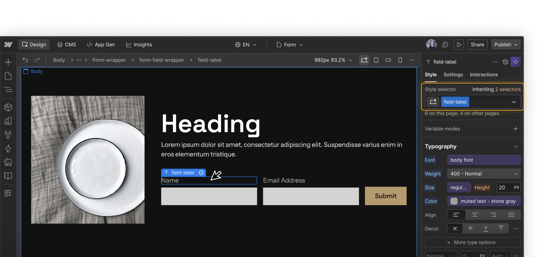
Styling at the class level keeps forms consistent and makes updates easier if designs change later.
Styling form and element states
Forms can change in appearance based on what’s happening, such as after submission or while someone is interacting with a field. These variations are called states, and they’re part of how forms communicate feedback.
Form states
At the form level, Success and Error states are built in parts of a Form block. These states replace the form after submission and can be styled just like other states. They should:
- Fit naturally into the surrounding layout
- Use consistent spacing and alignment
- Clearly communicate what comes next
.png)
Element states
At the element level, individual inputs and buttons also have states that control how they look during use. For example, you could style an input field’s Focused state to appear lighter or brighter while someone is actively interacting with it.
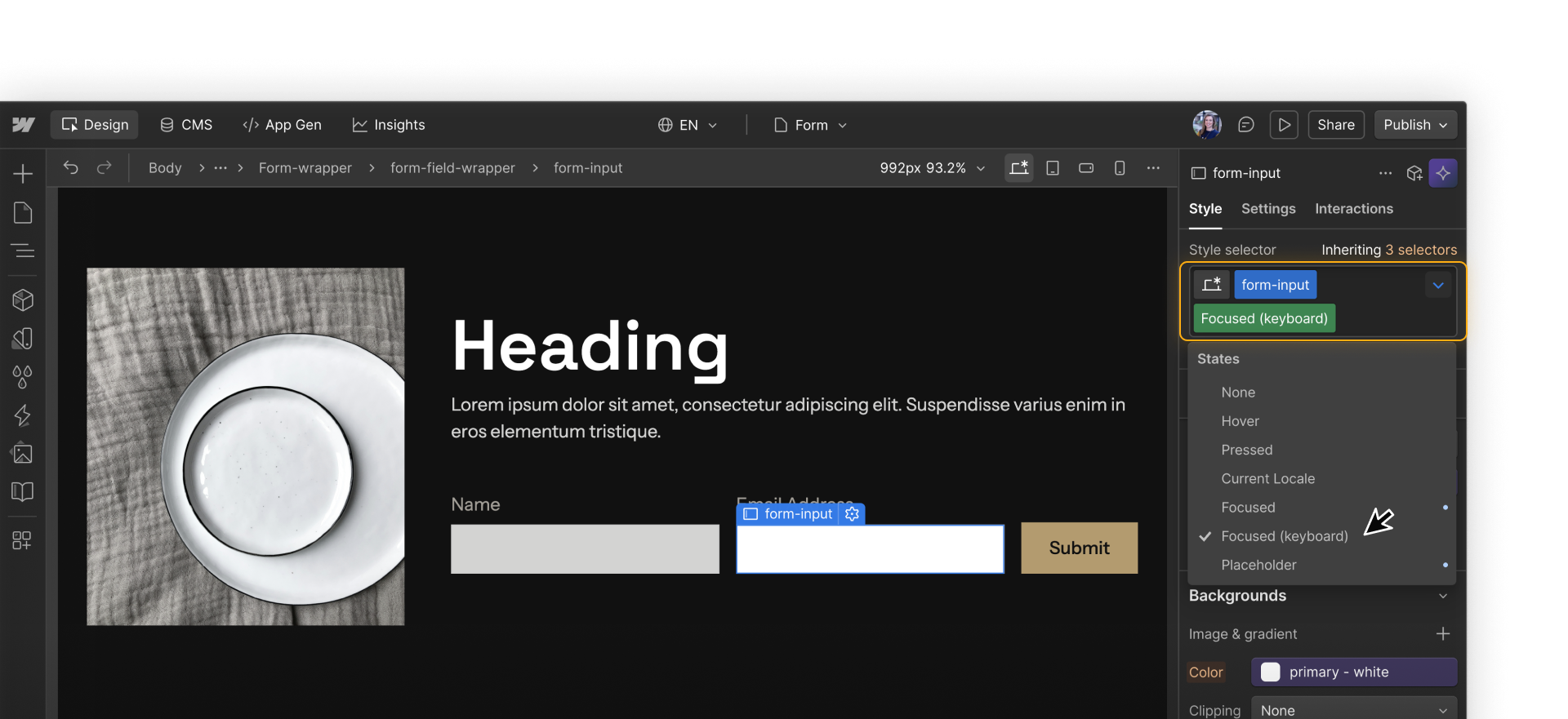
Styling form element states clearly helps people understand where they are in the form and plays an important role in accessibility, which we’ll return to later.
What’s next?
Once the layout is set, the next focus is on the fields themselves. Field types and settings play a big role in validation, submission data, and follow-up.