Fields & settings
Once a form is laid out and styled, the next set of choices lives inside the Form block settings and its nested field settings. These decisions shape how easy a form is for visitors to complete, the form submission experience, and how useful the submission data is once it reaches your team.
Where and why naming matters
At the form level, the form name appears in Site settings and in submission exports. Clear, purpose-driven names make it easier to identify which form a submission came from, especially on sites with multiple forms.
At the field level, each input has:
- A visible label, which users see on the page
- An internal field name, which appears in submission data and notification emails
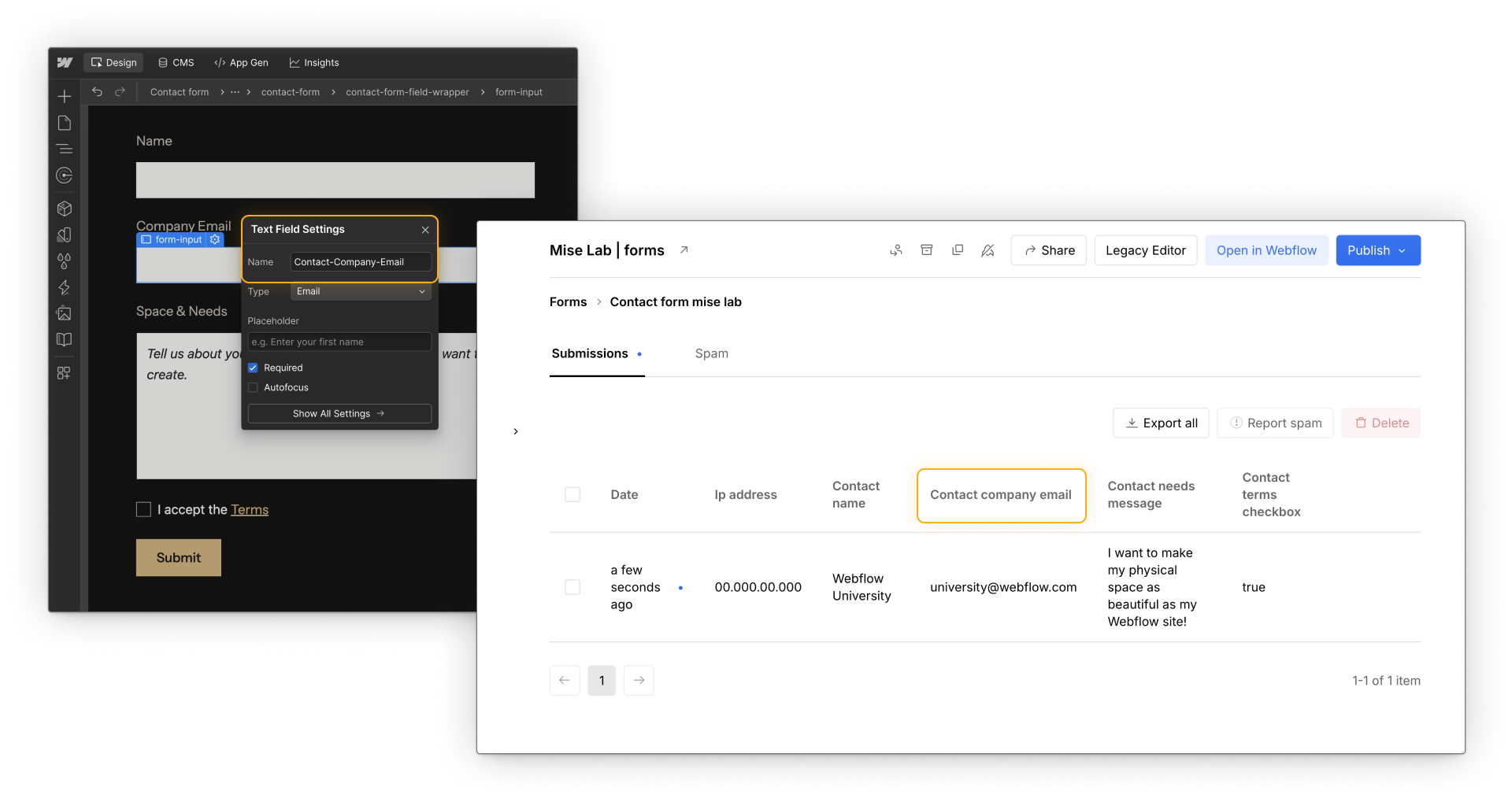
These serve different audiences. Labels help users understand what to enter. Field names help teams understand what was submitted later. A form can feel clear to users but still produce confusing data if field names aren’t thoughtful. Clear naming supports both completion and follow-up.
Field types shape interaction
The type of field you choose affects how people interact with the form and how browsers handle input.
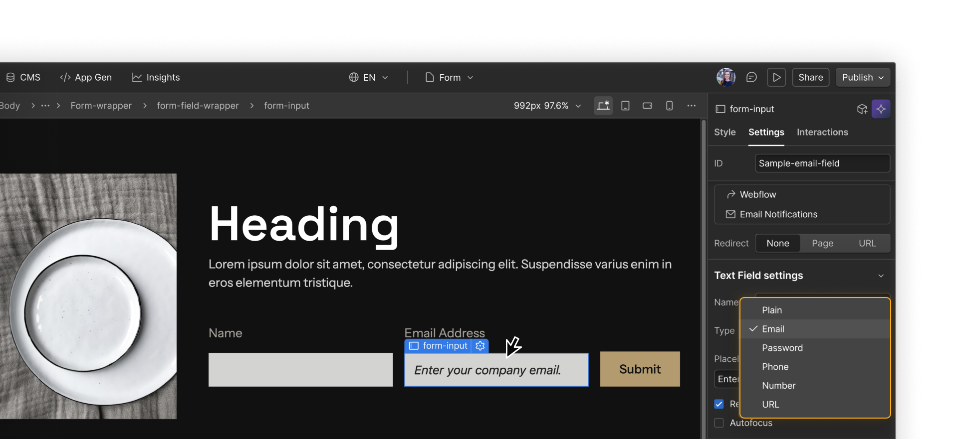
Input fields
Text fields, email fields, and number fields collect short, single-line input. For example, an email field is a good fit for “Work email,” while a number field works well for something like “Number of employees.” Choosing the correct input type enables basic browser validation and, on some devices, shows a more appropriate keyboard.
Textarea fields
Textarea fields are designed for longer, multi-line input. They’re a good fit for open-ended responses like “How can we help?” where users may need more space to explain their request.
Select fields
Select fields are useful when users need to choose from a predefined list. For example, “Company size” might offer options like 1–10, 11–50, 51–200, and 200+. If the first option acts as a prompt, such as “Select one,” it should clearly not be a valid answer.
Radio buttons
Radio buttons work best when only one option can be selected from a small set. For example, “Preferred contact method” could offer Email, Phone, or Either. They make choices visible and reduce ambiguity.
Checkboxes
Checkboxes are a good fit when multiple selections are allowed or when confirming consent. For example, “I agree to receive product updates” works well as a single checkbox, while “Topics you’re interested in” can offer multiple checkboxes such as Pricing, Integrations, and Case studies.
Choosing the right field type helps users answer quickly and reduces validation errors.
Field settings and options
Once field types are chosen, settings determine how those fields behave during submission.
Required
Required fields prevent submission until they’re filled out. For example, a contact form might require an email address so someone can follow up, while making a “Company name” field optional. To reduce friction, mark fields as required only when the information is truly necessary for follow-up.
Placeholder text
Placeholder text can provide short examples or hints, such as “[email protected]” in an email field. Because placeholder text disappears as soon as someone starts typing, it should support a label, not replace it.
Autofocus
Autofocus places the cursor in a field when the page loads. This can be useful on a simple, single-field form, such as a newsletter signup, where you want people to start typing right away. On longer forms, especially on mobile, it can cause unexpected scrolling, so it’s best used sparingly and tested on a published page.
Quick demo → Setting Autofocus automatically places the cursor in an email field when the page loads.
Submit button text and behavior
The submit button communicates intent as much as it triggers submission. Button text should describe the outcome, not just the action. “Request demo,” “Send message,” or “Sign up” sets clearer expectations than a generic “Submit.”
Loading text, such as “Sending…,” reassures users that their submission is being processed and helps prevent repeated clicks.
.png)
Form redirect options
If you leave the Redirect setting set to None, Webflow shows the success message on the same page, and the page doesn't reload.
You also have two redirect options:
- Page sends the user to another published page on the same Webflow site.
- URL sends the user to any specific URL you define, whether that’s another site, a subdomain, or a specific page address.
.png)
If you’re sending form submissions to a third-party tool using an integration or custom embed, any additional redirect behavior would be set up within that tool rather than in Webflow’s form settings.
You got this.
With fields configured, time to look at how people actually experience the form. The next section focuses on form usability and accessibility to support a wider range of users.