Styles, variables, & naming
Variables provide reusable values. Styles put those values to work in your design system, alongside settings for layout, typography, and more.
As you build, you’ll decide whether to reuse existing styles, adapt them, or create something new. Those choices affect how easily your team can make changes later.
Choose which styles to reuse
Tag styles
Use a tag style when elements of the same type should share a default. Add a class for more specific styling.
For example: Set the font and line height for paragraphs across the site.
Classes
Use a class when several elements should share a set of styles.
For example: Buttons might share a background, typography, padding, and border radius. Apply an existing button class or create one rather than recreating those styles.
Combo classes
Use a combo class for a variation of an existing class.
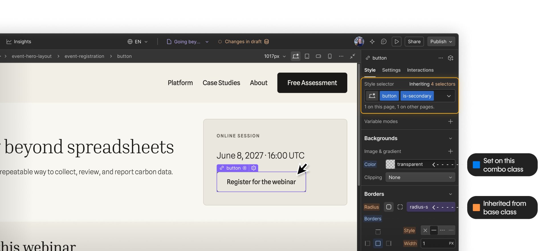
For example: Give a registration button an outlined treatment by changing its background and border color while keeping the base class’s typography, padding, and border radius.
Utility (global) classes
A utility class handles a narrow styling need across different elements.
For example: Reuse a text-alignment utility class to center headings and paragraphs instead of setting alignment separately in multiple classes.
These approaches can work together. A button can use a combo class for its background and inherit its border radius from a base class. That radius can get its value from a variable.
Styles and variables
Classes let you share a set of styles. But what if different classes need to share just one value?
A section heading and a button need different styling, but both can use the same spacing variable. The heading’s class uses space-s for the gap between its text elements. The button’s class uses it for padding.
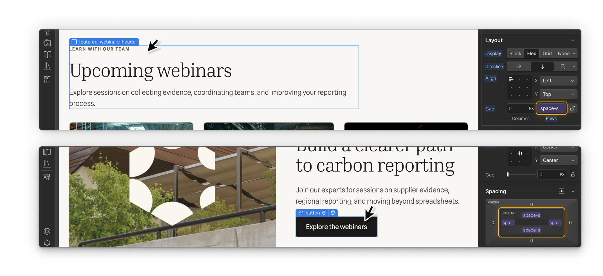
Each class defines how that spacing is applied. Changing the heading’s alignment won’t affect the button. Changing space-s affects both wherever they reference it.
Decide what should change together
But should a button’s padding and a section heading’s text gap share the same spacing variable? Think about what you’d want to happen if your team changed that value later.
- Both follow your spacing scale. To make small spaces larger across the site, update space-s. Both the heading’s text gap and the button’s padding increase.
- Only the heading needs more space. If the button’s padding still looks right, keep space-s unchanged and use a larger spacing variable for the heading’s gap.
Different purposes can still share a spacing value intentionally. But matching values alone aren’t a reason to connect them.
An image’s width and opacity might both be 75%. If they shared one variable, changing it to 100% would make the image both wider and fully opaque. Those are separate design choices, so their values should stay independent.
Naming classes
Choose names that help your team tell where a class belongs and when to reuse it. For example, related names such as card-heading and card-image identify parts of a card, while a prefix in u-text-center identifies a global utility.
The exact punctuation or prefix matters less than agreeing on what it means and using it consistently. Document your convention and note any exceptions so the next person doesn’t have to guess.
Tip. Explore the naming approaches in Mast, Lumos, or Client-First. These frameworks include broader building strategies too, so consider how an approach fits the way your team builds and maintains sites.
Up next
Continue to the next lesson to build a variable system with primitives, semantics, and theme modes.