How the parts work together
The parts of your design system work together to build pages and experiences your team can reuse and adapt. Let’s follow one example to see those connections in practice.
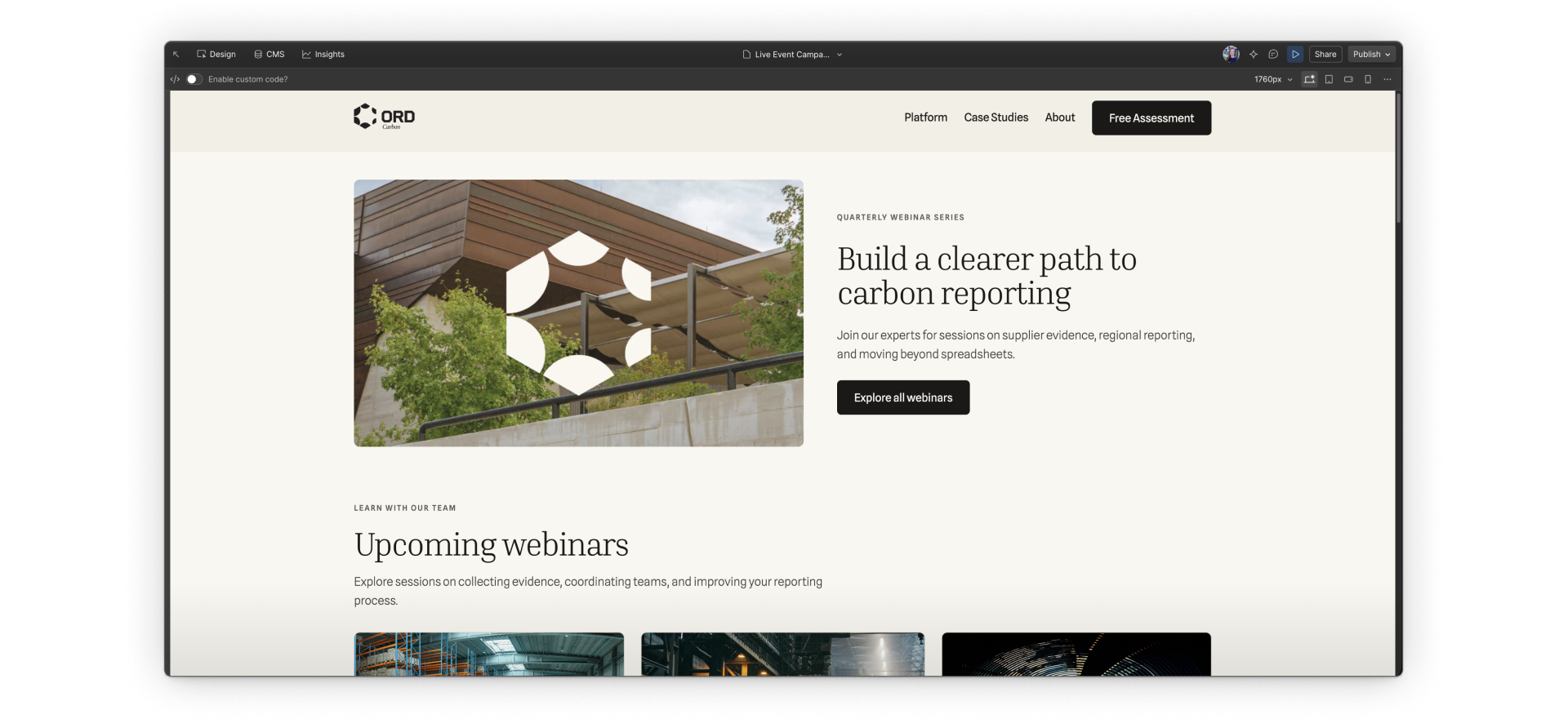
Ordinant Carbon is a fictional company whose marketing team is planning webinars about carbon reporting and governance. The team needs reusable campaign landing pages to promote those webinars, explain what attendees will learn, and link to the event pages.
Variables
Variables store values you can reuse in your styles, such as colors, font families, and sizes. For your campaign pages, they give you a way to use the same approved values across different pieces.
In the campaign example
You set up the brand’s near-black color, black-900, as a variable, then connect it to the campaign button’s background. You can use that same variable for a text color or border color too.
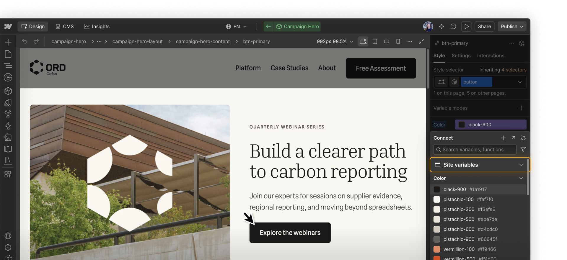
Update the variable, and the styles connected to it use the new value, no matter which element they’re attached to.
Styles
Styles control how elements look, from typography and color to spacing and layout. In Webflow, selectors such as tags, classes, and combo classes determine which elements those styles apply to.
In the campaign example
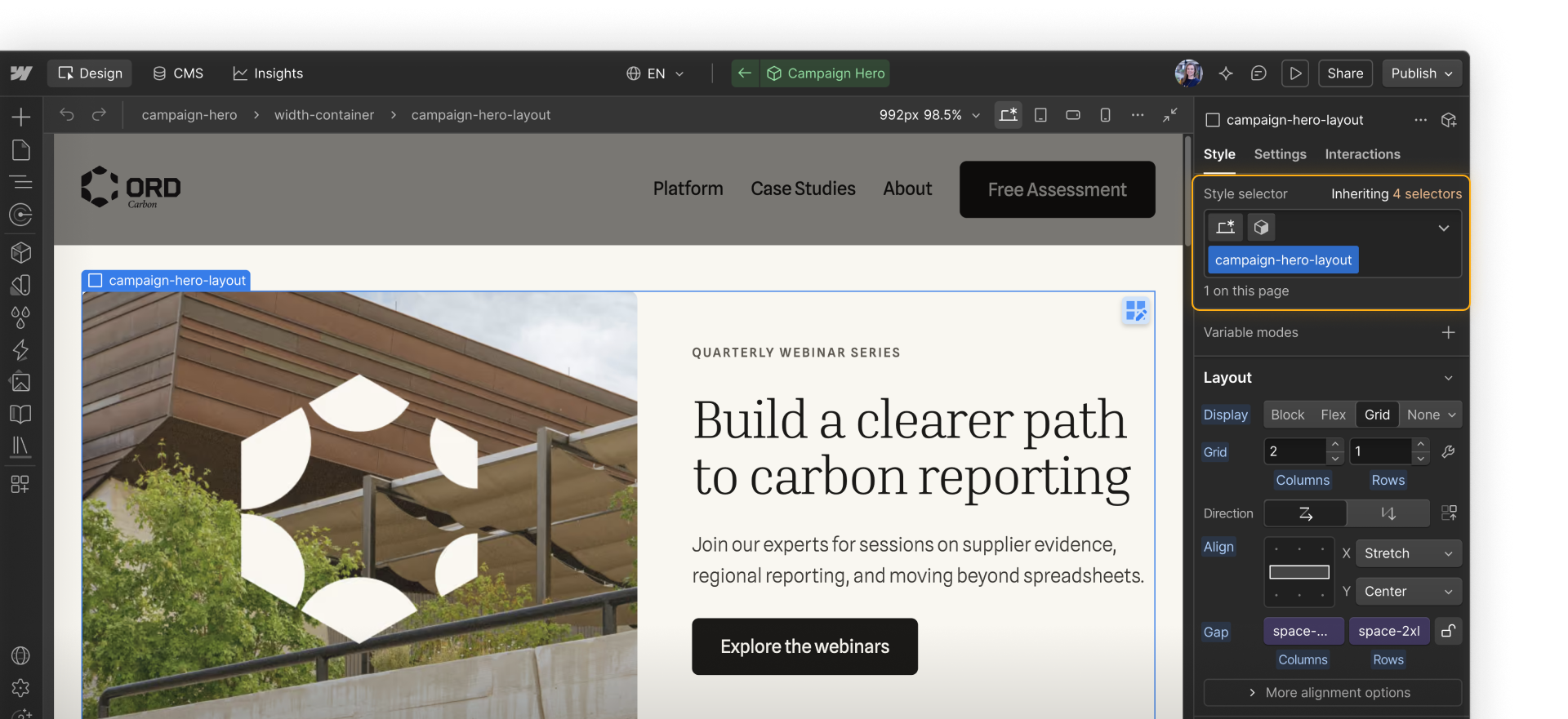
The hero’s layout needs styling too. A class brings together the properties that place its image and text side by side, align them, and set the space between them. Some properties use variables, such as the gap size. Others, like choosing a grid layout, are set directly in the class.
Apply that class to another element, and it shares those styles. Change the class’s spacing, and every element using it receives the update.
Components
Components are reusable elements or groups of elements that share a structure and can have customizable content and settings. Common examples include navbars, footers, hero sections, and cards.
In the campaign example
You build a reusable promotional section with a heading, paragraph, styled button, and image. In Ordinant Carbon, that’s the Campaign Hero component.
Each use of that component is an instance. You can add properties so teammates can customize its heading, supporting copy, button label, and link for each campaign.
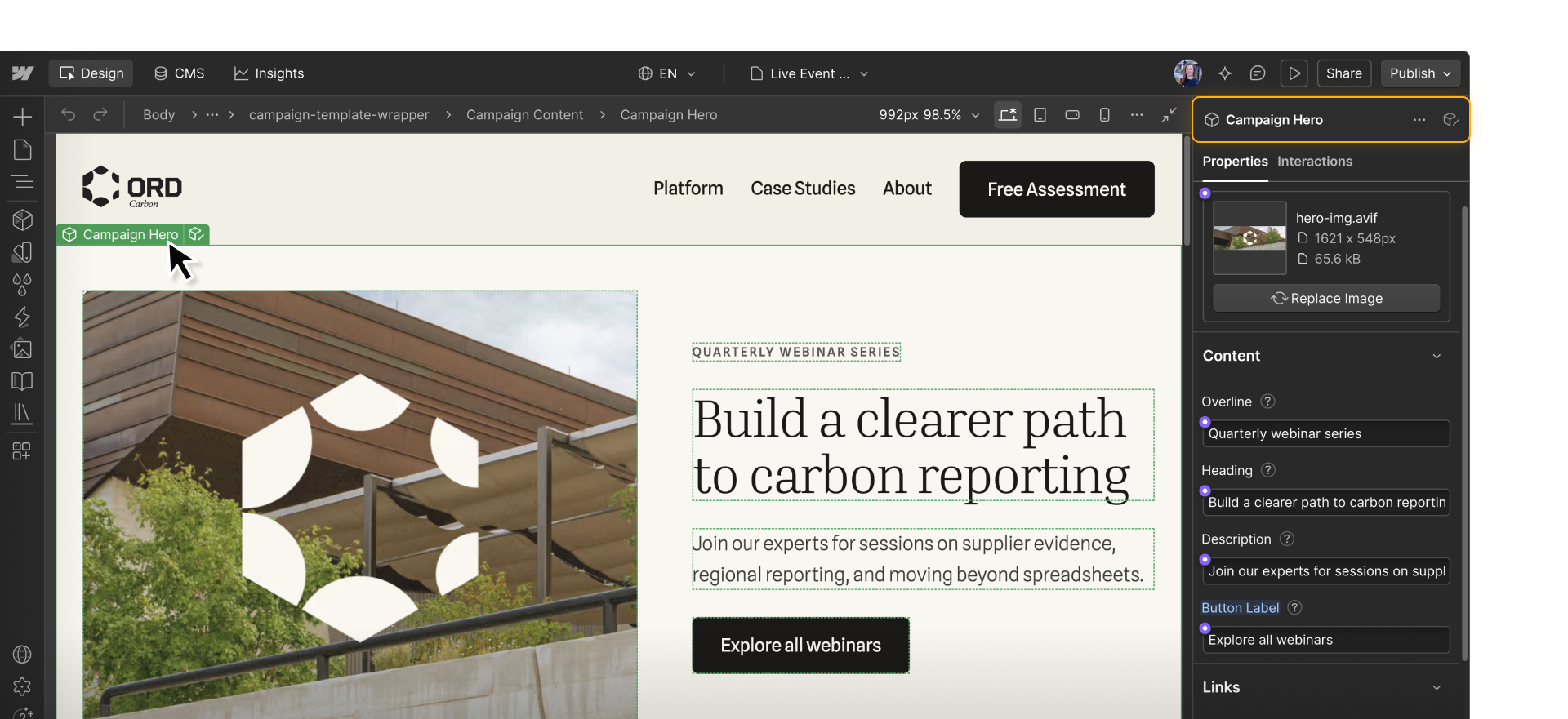
You control the component’s structure, and changes you make to the main component carry through to all its instances.
Page templates
Static page templates give your team a reusable starting design and settings for new pages. Page slots allow teammates to arrange components inside a full page structure that you set up.
In the campaign example
You build a static campaign page template with a shared header and footer, plus page slots where teammates can add and arrange approved components to highlight upcoming webinars, feature related case studies, and link visitors to event details and registration.
A marketer creates a page from the template, adds the components they need to the slots, and customizes their content.
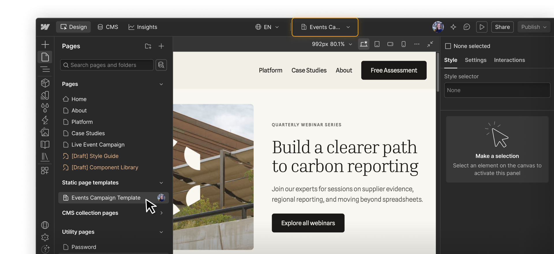
Adding a section to the template later won’t add it to pages already created from it. Updating a main component or shared class can still affect those pages.
The campaign page is static, but it can still display content from the CMS, such as upcoming webinars. You’ll compare static page templates and dynamic Collection page templates later in the course.
Shared Libraries
Shared Libraries make supported resources like variables, components, tag styles, fonts, and assets from a source site available to other sites in your Workspace. Think of them as the vehicle for your design system.
In the campaign example
A regional marketing team needs campaign pages on another site. You share components and their supporting variables and tag styles through a Library so that the team can build with the same system.
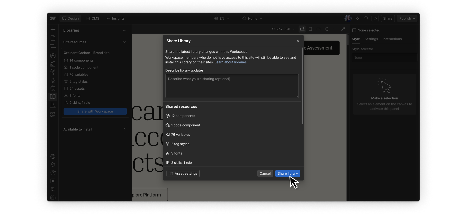
When you update the source resources, you can share those changes through the Library so other teams can apply them to their sites.
Check what you’re changing
These connections determine how far a change reaches. Whether you’re making the change yourself or asking an agent, check:
- Which resource needs to change?
- Where else is it used?
- Should the update affect one instance or the shared system?
A request like “bring the image and text closer together” could involve a class, a variable, or the main component. Ask the agent to check those connections and explain what else would change before it starts.
On the Live Event Campaign page, bring the Campaign Hero’s image and text closer together. First, check which class and spacing variable set that gap, and where else they’re used. Recommend a way to reduce the gap on this page without changing other hero instances or unrelated spacing. Explain what the change would affect before making it.
Then check that the gap changed where intended and that other uses of the shared class or variable stayed unchanged.
Ready to continue?
Continue to the next lesson to start working with variables.