Build a flexible variable system
Your styles can keep using the same variables even when different sections or screen sizes need different values. Naming, aliases, modes, and functions help you set that up.
Name values and their purposes
Variable names can describe a value itself or the job it does. These approaches are called primitive and semantic naming, and they can work together.
Primitive variables
A primitive names a value in your palette or scale. For example, space-3xl holds a spacing size without assigning it to a specific use.
Semantic variables
A semantic variable names a purpose, such as section-padding. It can get its value from a primitive like space-3xl. That reference is called an alias.
Both hero-padding and section-padding can reference space-3xl. To change only the hero’s spacing, connect hero-padding to a different spacing variable. To change both together, update space-3xl.
Adapt spacing with responsive modes
A variable mode supplies different values for a specific context, such as a light or dark theme or a screen size.
For example, section-padding and hero-padding can use the same spacing in Base mode, then use different values in Mobile portrait to give the hero less padding. Each class keeps using its variable while the mode changes the value it receives.
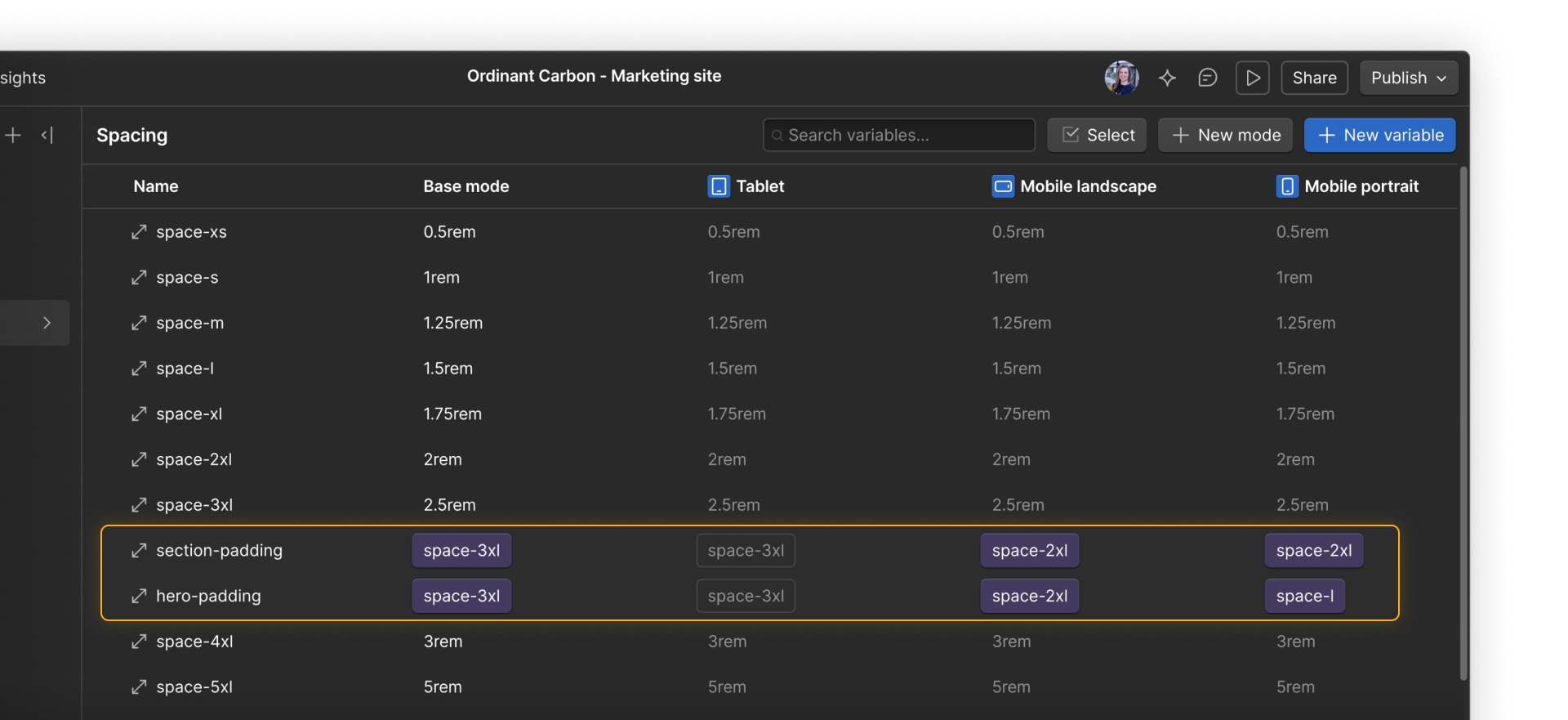
Tip. Mode values can use aliases too. Instead of entering a value like 2rem directly, you could connect section-padding to a smaller spacing variable from the same collection.
Automatic or manual?
An automatic mode applies when a condition is met, like the screen reaching a certain breakpoint. Your sections then use the spacing values set in that mode.
With a manual mode, you choose where it applies in the Style panel. For example, you could give one section a dark theme at any screen size.
Scale heading sizes with functions
Functions let a variable calculate its value instead of holding a fixed number or color. For example, you could:
- Set section padding to twice your standard spacing value. When that spacing value changes, the padding updates too.
- Mix your brand color with white for a pale card background. When the brand color changes, the background’s tint updates too.
- Let a heading grow smoothly as the screen gets wider, within a minimum and maximum size.
For a heading that scales with screen width, clamp() sets three values:
- Minimum: The smallest permitted size.
- Preferred: A calculation that responds to viewport width.
- Maximum: The largest permitted size.
A heading-display-size variable could use clamp(2.5rem, 7vw, 6.25rem). The middle value responds to viewport width, allowing the heading to scale between 2.5rem and 6.25rem.
Your styles can keep using the same variables while modes and functions change the values they receive.
Keep going
Continue to the next lesson to see how elements and styles come together in reusable components.