Build flexible components
Imagine your site explains the steps involved in getting started with your service. Each step appears in a card with a number, graphic, heading, and description. You can turn that card into a component and reuse it throughout the site.
But not every card needs exactly the same content or appearance. You’ll need to decide which differences to build into the component.
Choose what can change
Properties, variants, and slots offer different ways to customize each use of a component, or instance:
Properties
Make specific content or settings editable on each instance. For example, change a card’s heading or choose whether its graphic appears.
Variants
Offer alternate style or layout choices for the same component. For example, choose a card with a dark background or a horizontal layout.
Slots
Leave space for elements or components that can differ between instances. For example, a section could have editable heading text and a slot where you add different numbers of cards.
You can combine these approaches. Start with what needs to change, then choose how someone should make that change.
Customize content with properties
Your Step Cards share a design, but each needs its own content. Create properties for the parts someone should be able to customize:
- Change the step number to show its place in the sequence.
- Change the heading and description to explain the step.
- Choose an image to illustrate the step.
- Show or hide the graphic depending on whether the card needs it.
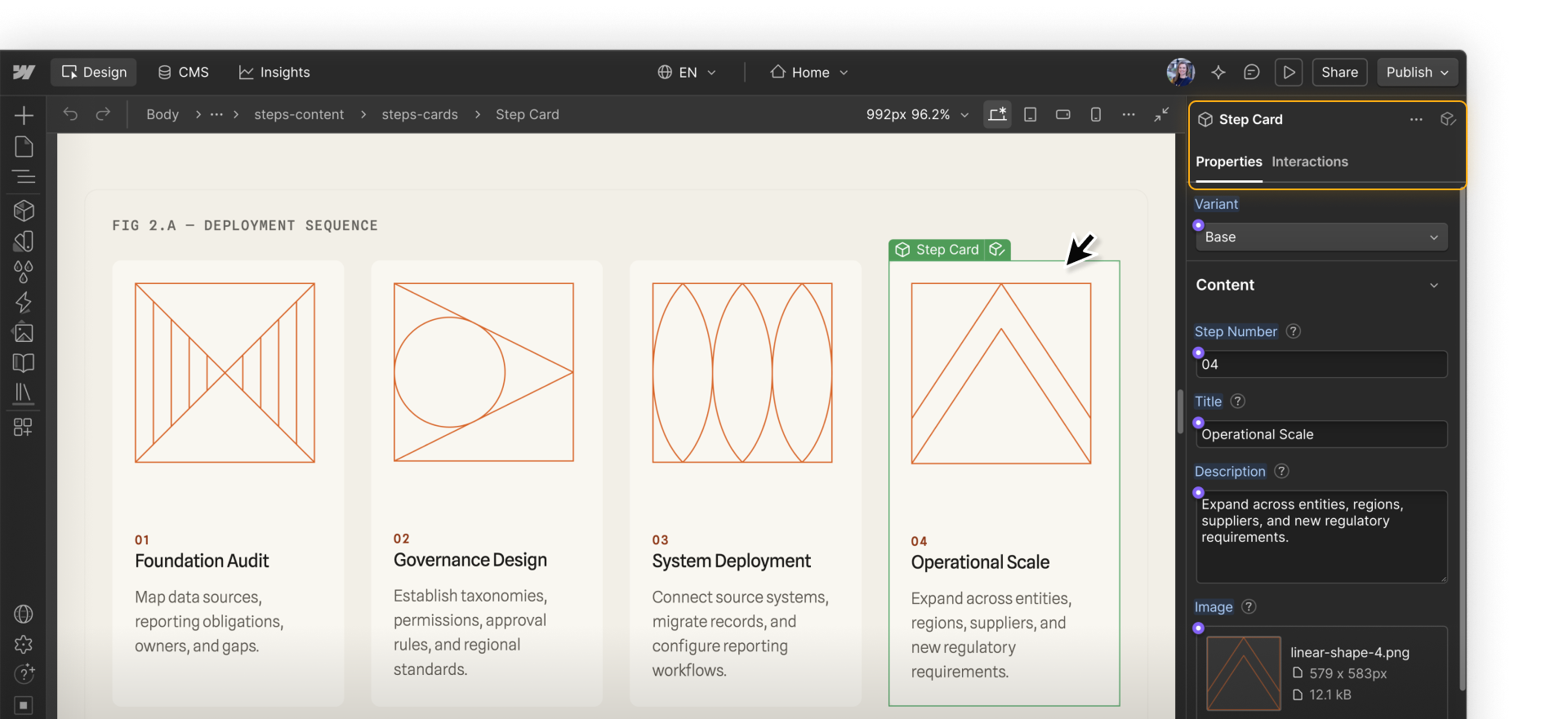
Changing a property value affects that instance without editing the main component.
Offer design choices with variants
Your card might need to fit in a row of three cards on one page and span a full section on another. You might also need a dark version for a different section background. You could create three variants:
- Base (vertical): Place the image above the text so each card fits within a narrow column.
- Horizontal: Place the image beside the text to make use of the wider space when there are only one or two cards.
- Dark: Use a dark background while keeping the base layout.
All three use the same elements and properties. Someone can choose the layout and appearance that fit the space, then customize the card’s content.
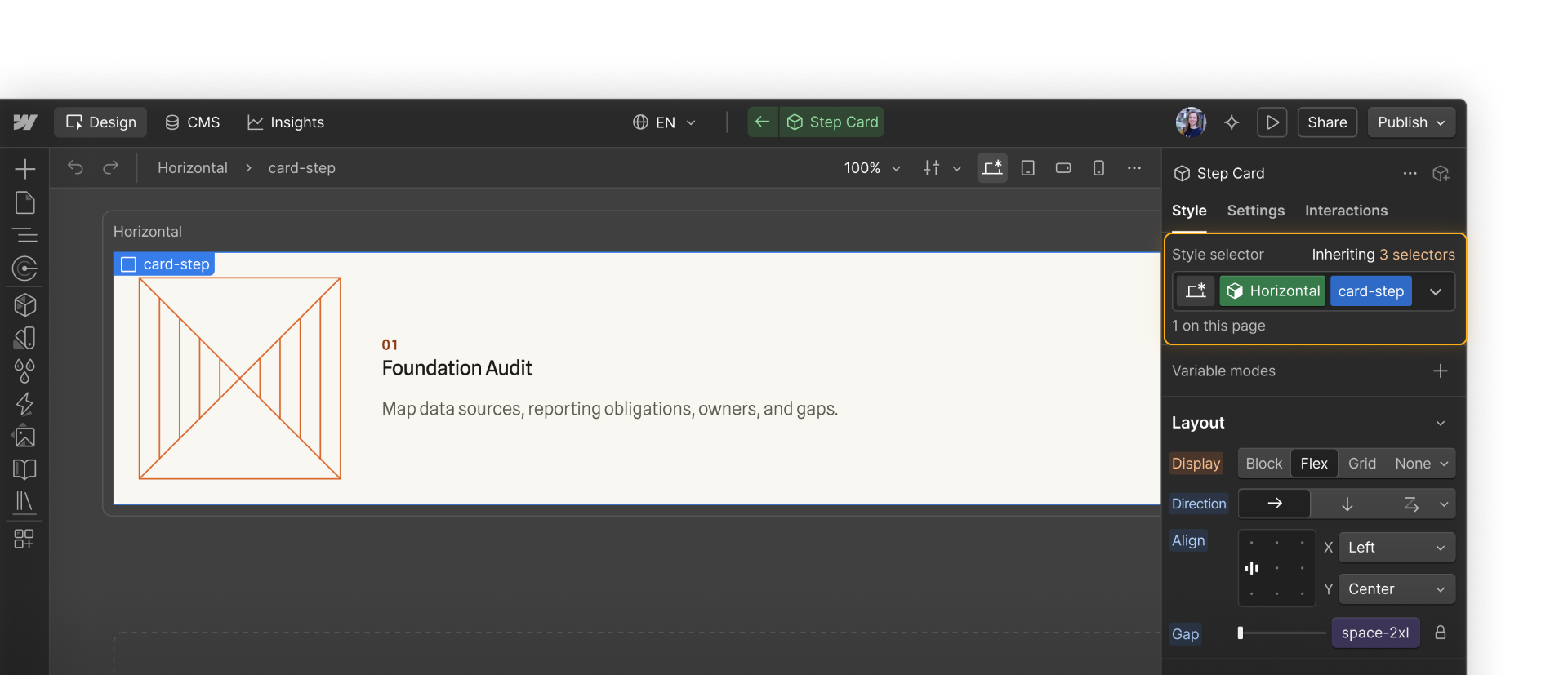
The Component Canvas is a dedicated space for editing a main component outside a page. You can view variants side by side to compare them as you work.
Leave room for different content with slots
Your Step Cards might sit inside a reusable section component. Use properties for its heading and subtitle, then add a slot for the cards.
A slot is a placeholder inside a component where you can add content on each instance. Give it flex or grid settings, then add the cards each section needs. The surrounding structure stays the same.
Slots can accept regular elements, such as images and text, as well as other components. You can also restrict which components marketers can add to a slot, such as allowing only the Step Card component intended for that section.
Know when to create something separate
Properties, variants, and slots help you reuse a component without creating several nearly identical versions. But one component doesn’t need to do everything.
A pricing card with billing options may need a totally different structure from your Step Card. Combining them could add options that make both harder to use.
Up next
Continue to the next lesson to build properties, variants, and slots on a real component.