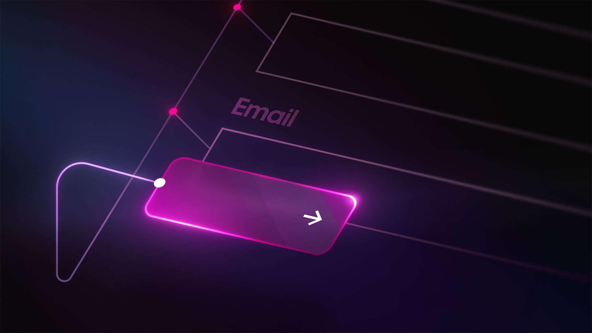
Button
A button is an interactive web element that facilitates user actions. It’s a visual cue that serves as a call-to-action (CTA) on websites and applications. In user experience (UX) and user interface (UI) design, buttons guide visitors toward desired actions — like navigating to another web page, submitting a form, or making a purchase.
Designers meticulously craft buttons to draw attention and encourage clicks. Buttons typically have 3 core elements:
- Text label — provides clear instructions on a website button's purpose, such as "Sign Up,” “Download,” or “Learn More.”
- Icon — a graphical representation reinforcing a button’s intent. For example, a "magnifying glass" icon implies a search function.
- Container — an encapsulating container that houses the text label and/or an icon, often styled to stand out
You can create multiple button types, including text, toggle, radio, checkbox, and multi-select buttons, each catering to a specific interaction.
Visit Webflow University to explore how to add eye-catching buttons to your website and learn how to style buttons to increase engagement from site visitors.