Test & refine
Why testing matters
Testing helps you see how motion behaves in context. An animation can look perfect when you build it, but real sites add new variables. Layouts shift, additional content is added, and individual devices vary in performance.
Preview in context
Start by viewing your animation in Preview mode on the live canvas, not just on the animation timeline. Watch how it moves with real content and scrolling.
Ask yourself:
- Does the animation feel harmonious with the rest of the page?
- Are any elements excessively overlapping or lagging behind others?
- Does the motion still communicate clearly when other content is visible?
If something feels off, adjust timing, delay, or easing until the sequence fits naturally into the flow of the page. What looks great in isolation might need adjusting in the context of the full layout.
Adapt for different breakpoints
An animation that works well on desktop might need adjusting for smaller screens. Different layouts, screen sizes, and touch input can change how motion behaves.
In Webflow, most interaction settings apply across all breakpoints, but you have a few key ways to adjust animations for specific views:
- Hide or motion on smaller screens. If an element is hidden (set to Display: None) on a specific breakpoint, neither the element or its animation will show. You can use this to minimize animation on smaller screens where it could overwhelm the page.
- Use combo-classes to adjust motion per breakpoint. Add a class like is-mobile or is-tablet and adjust movement distance, delay, or easing specifically for that view.
- Duplicate and tweak an animation for mobile. Copy an existing animation, rename it (for example “Hero Load Mobile”), adjust timing or movement for mobile layout, then assign it to the same trigger for the mobile breakpoint.
- Simplify or remove scroll-based effects on mobile. Long scroll sequences or layered motion can be distracting on smaller screens. Consider replacing them with simpler masks like fade-ins or subtle moves that still communicate purpose.
Quick demo --> A banner element set to Display: None on the Mobile Portrait breakpoint to hide it and its animation on the page.
Name and organize your animations
Clear naming helps you and your team find, reuse, and update interactions quickly. Consistent naming keeps your project easy to maintain.
Follow these best practices:
- Use spaces or dashes for readability.
- Include the trigger (if applicable), target element, and action.
- Keep names short but specific enough to describe what the animation does.
Examples:
- Card - scroll reveal
- CTA - hover scale up
- Heading - split text entry
If your team works within a shared system, document your naming convention so everyone is on the same page.
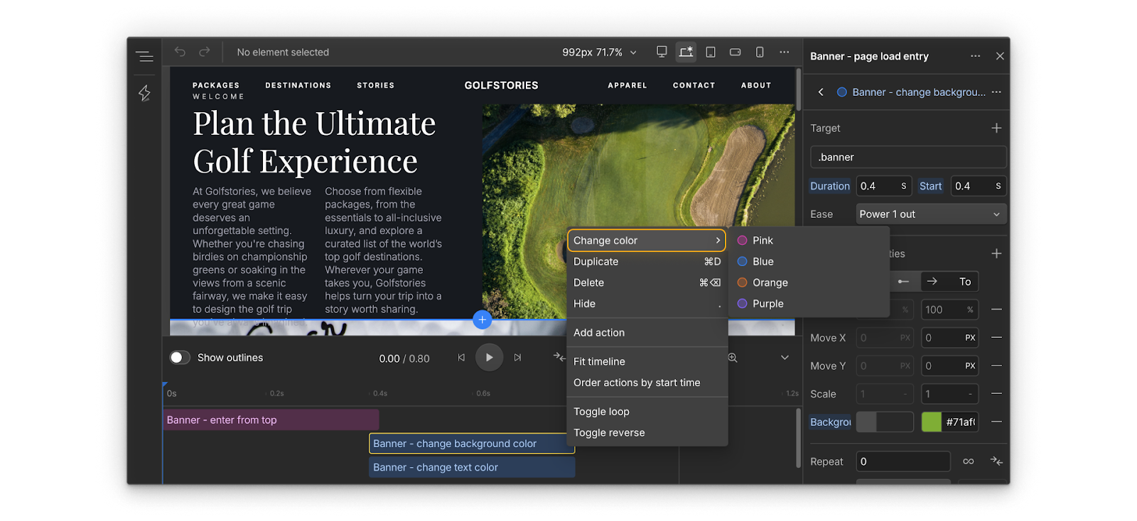
Tip: You can also change the color of an action in the timeline to indicate related actions visually.
Prepare to publish
Here are a few things you can do before publishing your animations to your live site so you can feel confident your animations are ready to share with your visitors.
- Publish to staging to see your animations in the full site environment without affecting the live site. This helps surface performance issues or timing differences that may not appear in Preview mode.
- Test on real devices to understand how animations respond to different screen sizes, refresh rates, and touch input.
- Review performance with reduced motion enabled. Confirm that visitors who prefer less animation still get a clear and complete experience.
- Collect feedback safely. Share the staging link with your team or client for review before publishing live. Ask them to view it on their own devices and share impressions of the motion’s story, clarity, and pacing.
Keep learning
Now that you know how to animate, let’s talk about when and why to animate (or not). Click Complete & continue to move on.