Interpreting visitor behavior
Insights dashboard
Once tracking is enabled and your site is live, data begins populating in the Insights tab. This dashboard gives you a high-level view of how visitors are engaging with your site.
Site overview
Here’s what you can explore in the site overview:
Sessions, unique visitors, and bounce rate
Understand how much traffic you're getting and how much they’re engaging.
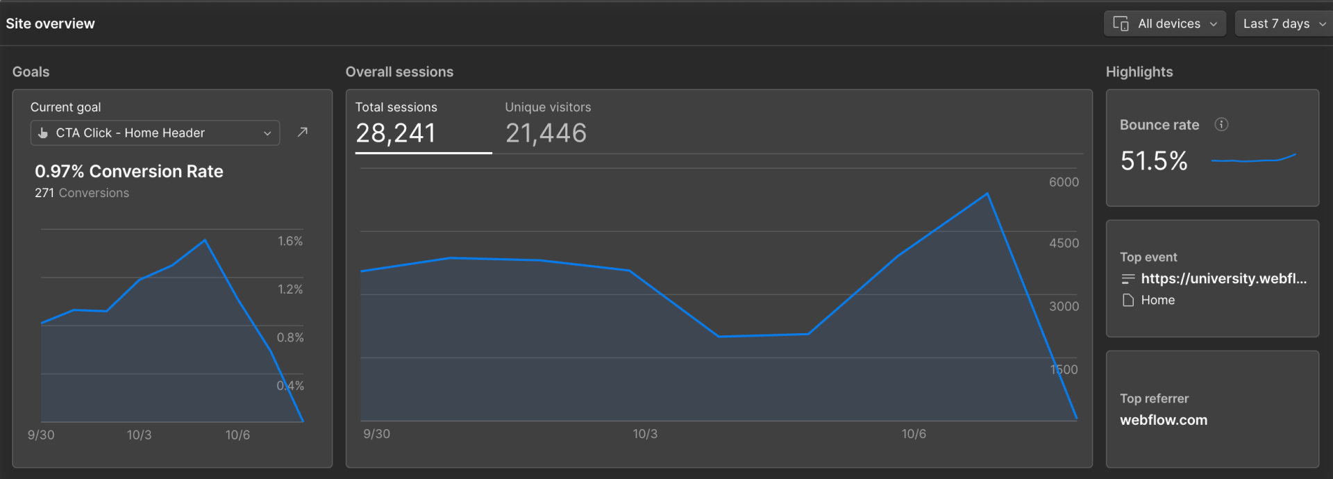
Top pages and events
See which pages are attracting the most visits and which buttons, links, or navigation items are getting the most clicks.

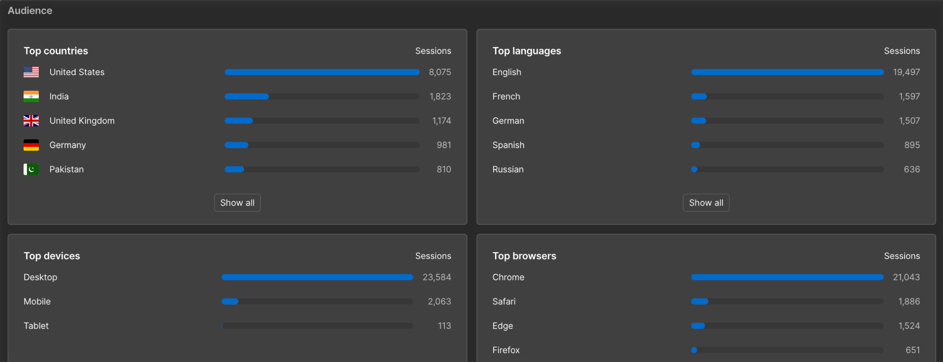
Audience insights
Break data down by device, browser language, and location.
Filter by device or date range
Filter by device to compare performance across screens, and use the date range (e.g. 7, 30, or 90 days) to spot trends over time. You can pick a custom date range by selecting dates on the calendar.

Page insights
Click into any page to get a more focused view of that page’s performance:
- Page views and unique visitors
- Bounce rate for sessions starting on that page
- Top 10 previous and next internal pages
- Top clicked elements on that page
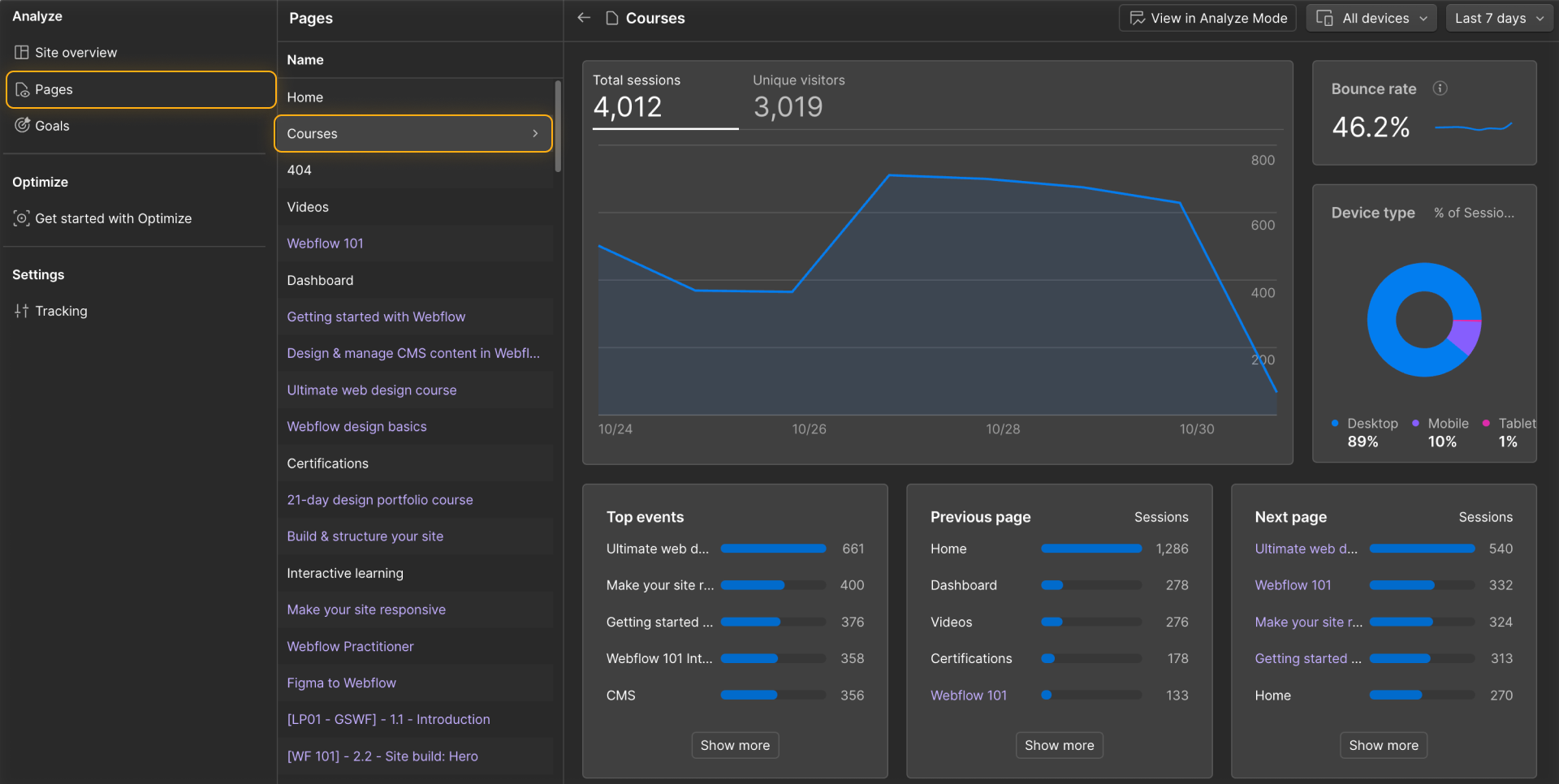
This helps you understand how users are flowing through your site — where they drop off, what draws clicks, and which paths they take.
Analyze mode: On-canvas visual analytics
Analyze Mode brings data directly into your site in Webflow so you can visualize engagement right on the canvas.
Here’s what you’ll see:
Clickmaps
See how many times each clickable element was clicked.
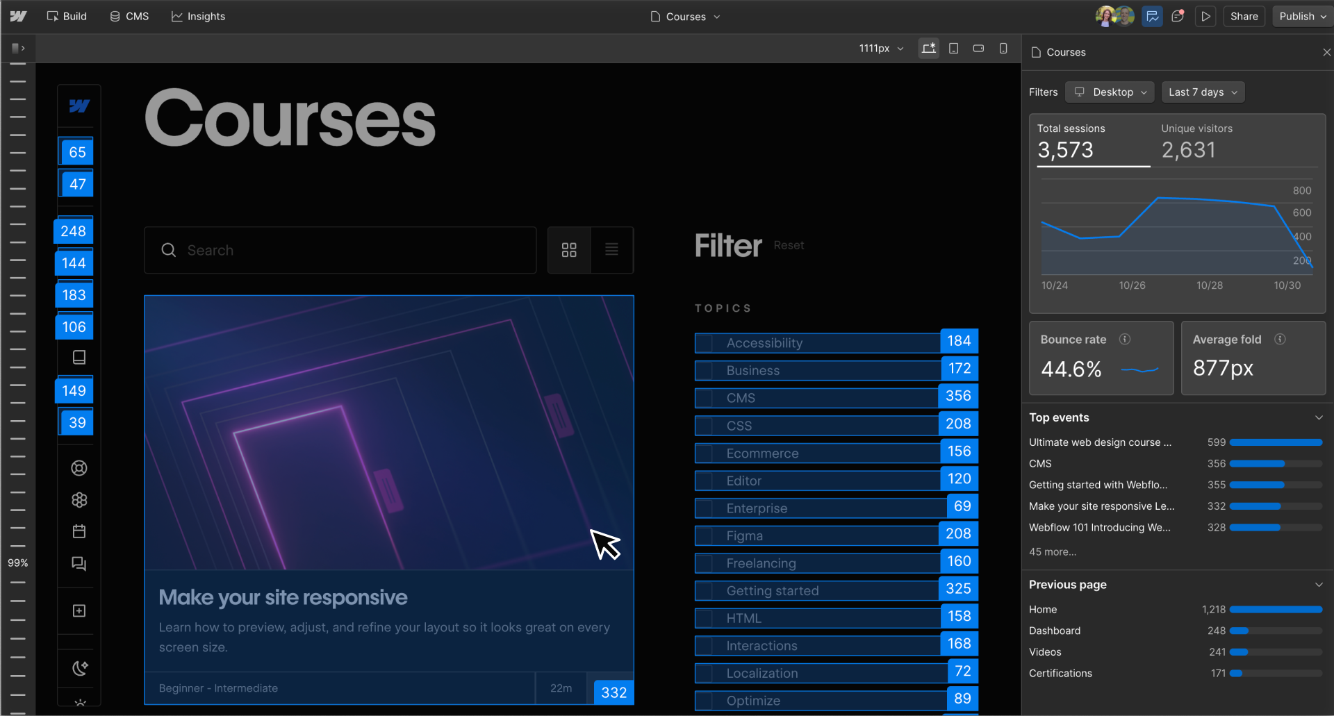
Scroll ruler
Hover along the vertical ruler to see what percentage of users reached each part of the page.
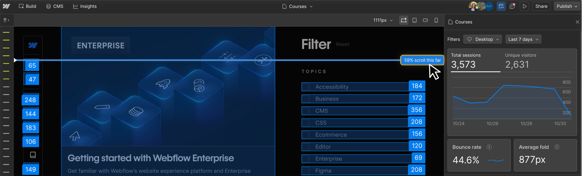
Tip: Hold Shift and hover the scroll ruler to see exactly what percentage of visitors made it to a specific section.
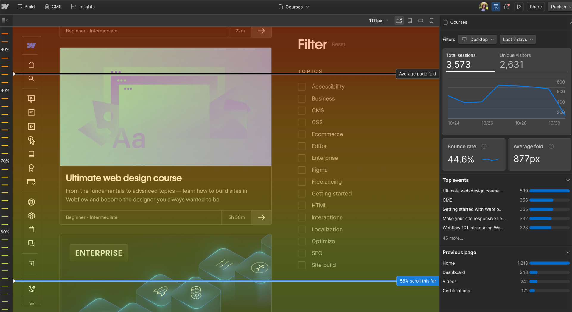
Average page fold
A horizontal line showing the typical point where a visitor’s screen ends when they first load the page. Think of this as your page’s “first impression.”
.png)
Gradient mode
A heatmap view where red = most seen, blue = least seen.
Take action
Whether you're reviewing metrics in the Insights dashboard or using Analyze Mode to see visual engagement on the canvas, the goal is the same: spot patterns, find opportunities, and take action.
Consider asking yourself:
- Are visitors clicking where I expect them to click?
- Is important content getting seen, or is it buried too low?
- Do mobile visitors engage differently than desktop users?
- Are users bouncing quickly, or progressing deeper into the site?
These insights can guide layout decisions, content placement, and design tweaks. You don’t have to guess what’s working — the data is right there in your workflow.
Got it down?
Now that you know how to explore visitor behavior, let’s focus on how to track specific actions that matter to your site’s success — like clicks on signup buttons or navigation links.
Click Complete & continue to dive into Goals in the next lesson.