Reusable building blocks
Build once, use everywhere
Reusable parts are critical to any design system, and there are several you can build in Webflow. The beauty of reusable parts? Build and share them once, and use them everywhere. Update them once, and apply changes anywhere they’re used. The result? A consistently on brand site created with the same building blocks across team members.
One way to think about these parts is through the atomic design approach. It starts with basic units like colors and text styles, which are combined into increasingly larger building blocks such as buttons, forms, or even entire layouts. This modular approach makes building easier and keeps everything organized and scalable — and you can take a similar approach to setting things up in Webflow.
Variables
Variables, also known as “design tokens,” are the smallest part of a design system in Webflow. They hold style values like color, typography, size, and spacing, and make them reusable throughout your styles.
Variables in action:
A lead web designer creates variables for the different font families their team uses on their site. Junior designers apply those variables to text elements for consistent styling when building pages. When the team decides to use a different font family for heading text, the lead web designer updates a variable and changes apply to every heading using that variable.
Check out a short demo of how variables can be applied to make quick, global changes below.
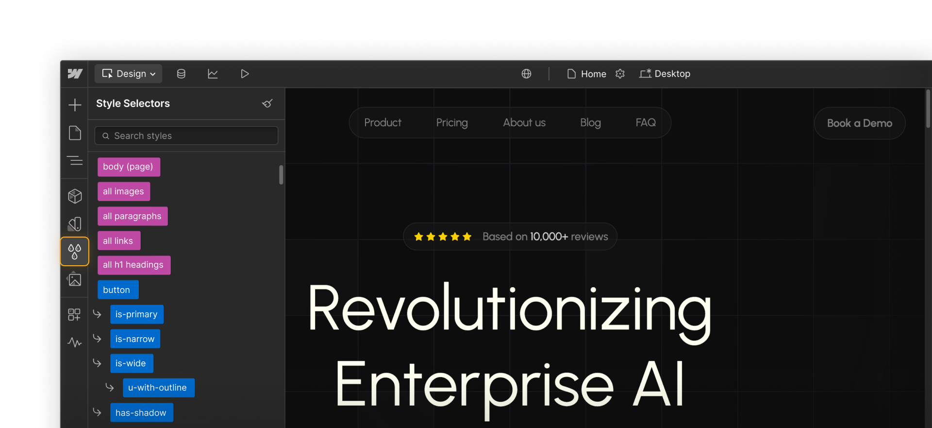
Styles
CSS styles and properties are reusable within a site through HTML tags, classes, and combo classes. When you create a class and apply it to multiple elements, a style change to any one of those elements impacts all of them. Naming your classes clearly and consistently is key to making them part of your design system.
Styles in action:
A junior designer adds an H1 heading to the hero section of a new page. It automatically inherits base styles set by the lead designer through the “All H1 Headings” HTML tag. They also apply a class called “hero-heading,” which they easily find thanks to consistent naming. With both the tag and class applied, the heading gets the right combination of default and specific styles, matching other hero banners across the site.
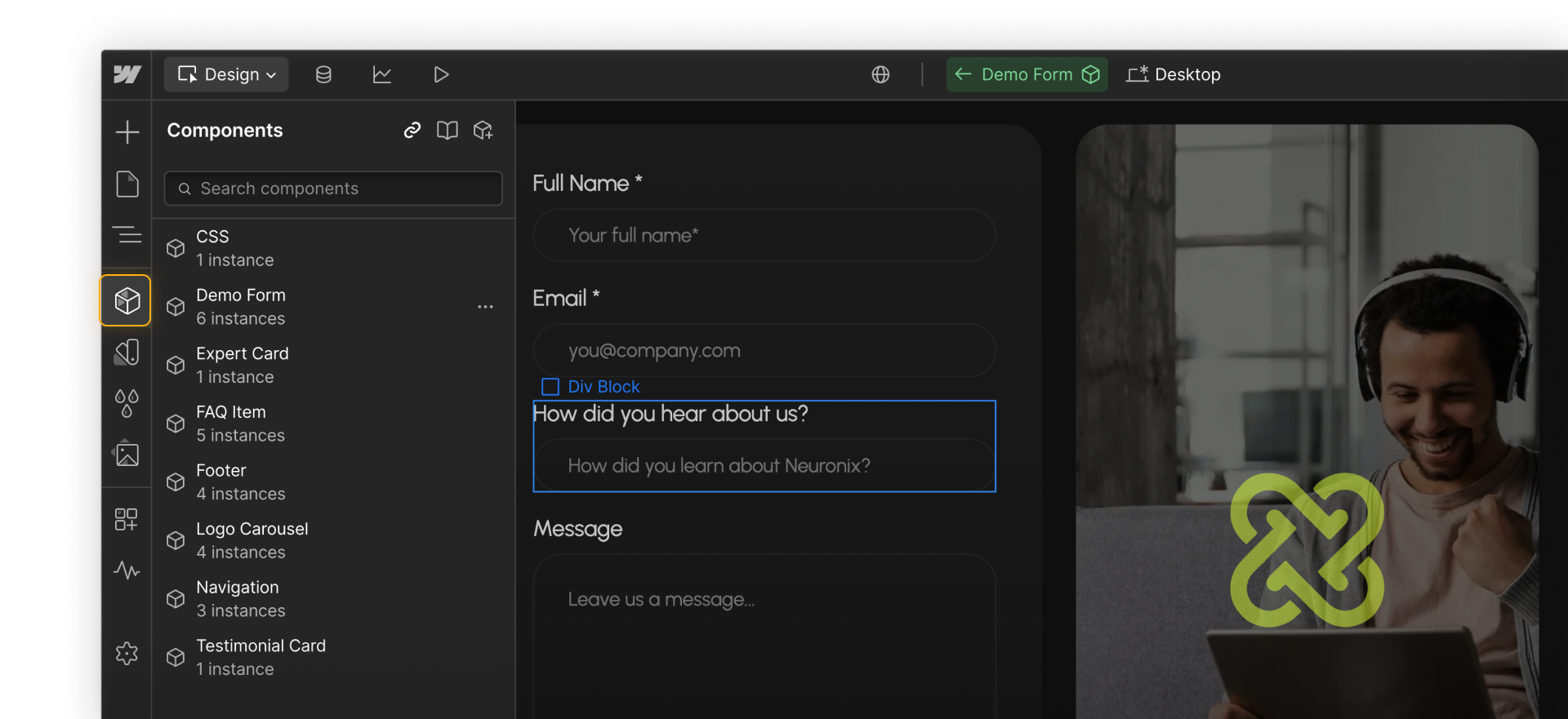
Components
Components are reusable elements and combinations of elements used to build essential parts of pages, such as nav bars, footers, cards, and more.
Components in action:
A designer creates a “Book a demo” form component from a styled form element. Other designers and marketers on the team add the form component to other pages and sites where the form is relevant. When the designer adds a new “How did you hear about us?” field to the form, they can push the change to all instances of that component to keep the experience consistent.
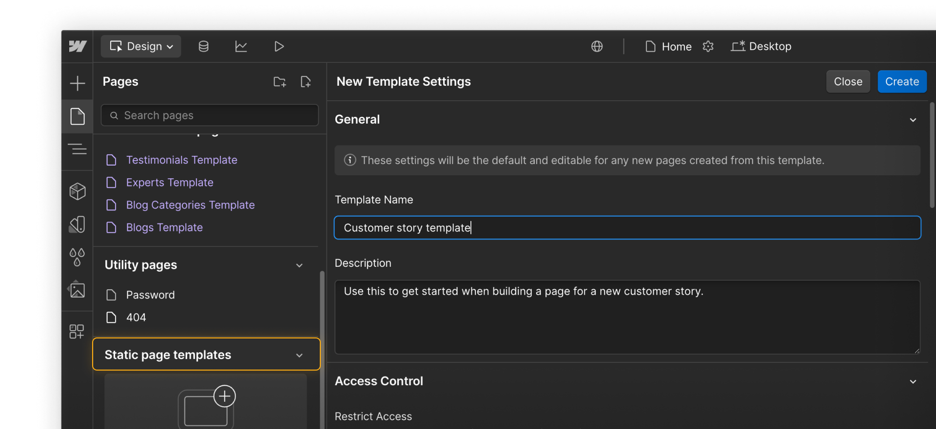
Page templates
Page templates combine elements and components to make prebuilt layouts that provide a consistent structure for common pages.
You can create Static page templates or Collection pages that work like templates for all of the same item type in a CMS Collection, like blog posts, help articles, or similar.
Page templates in action:
A software company offers different solutions and account plans depending on customer needs. So, their web designer creates a page template to help other designers and marketers get started building unique pages for each solution. The page template includes a nav bar component, a features and pricing card component, and a form component. Team members can also add additional components as needed.
Assets
The Webflow Assets panel holds media files like images, videos, SVGs, Lottie animations, and documents. With shared libraries, you can upload, manage, and use them across your Webflow projects. Asset libraries let teams organize and share approved files to keep designs consistent.
Assets in action:
A brand manager uploads a set of approved logos, background textures, and icons to a shared asset library. Designers build landing pages across multiple Webflow sites using the same library. When the brand team updates the logo, they replace it in the library. The updated version appears everywhere it's used, keeping every page aligned with the latest brand guidelines.

Ready for more?
Click Complete & continue in the Course progress box on the right to dig into components, an important part of your design system.