Review: Elements in Webflow
Remember, Elements are the building blocks of a page that you can drag and drop onto the canvas to design and structure your site. In Webflow, they’re organized by categories. Review common elements and examples of how you might use them.
The list below is not comprehensive and represents a selection of common elements. For additional details about any specific elements, visit the Webflow Help Center.
Structure
These elements define the structure and hierarchy of your content by organizing elements and content on the page.
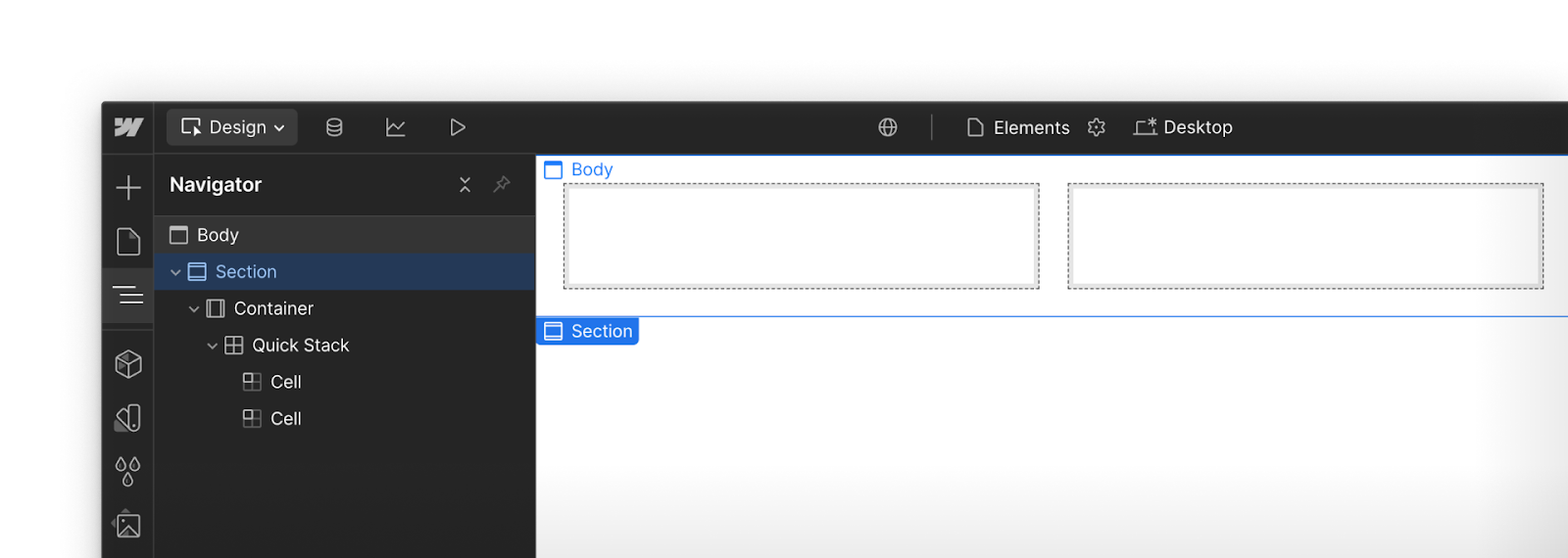
- Section: A top-level layout element that groups related content and helps structure your page.
- Container: A fixed-width wrapper that centers and constrains content for consistent alignment.
- Quick Stack: A fast way to create responsive grid-based layouts.
Structure elements in action
On your homepage, you might start with a Section that contains a Container. Inside it, you might add a Quick Stack so you can later add a heading and image side by side.
Basic
Basic elements are the building blocks used to add content and simple interactions to your site.
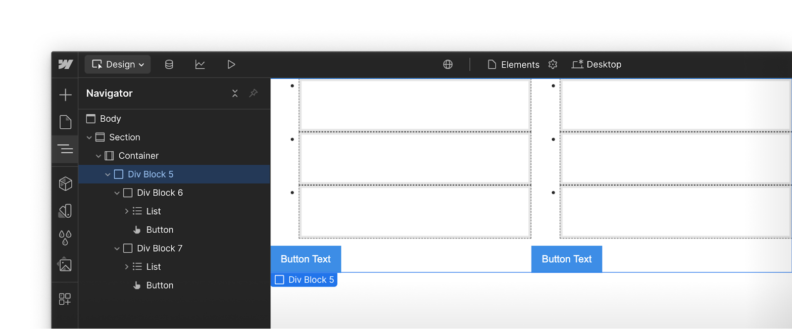
- Div Block: A versatile layout element used to group, align, or style content as needed.
- List: A bulleted or numbered list to organize items clearly.
- Button: A clickable element often used for calls to action, like “Submit” or “Learn More.”
Basic elements in action
In a pricing section, you might use Div Blocks to structure plan cards (styling Divs inside of, or alongside other Divs), add Lists for included features, and finish with Buttons to link to plan details.
Typography
Typography elements display and style all forms of text content on your site.
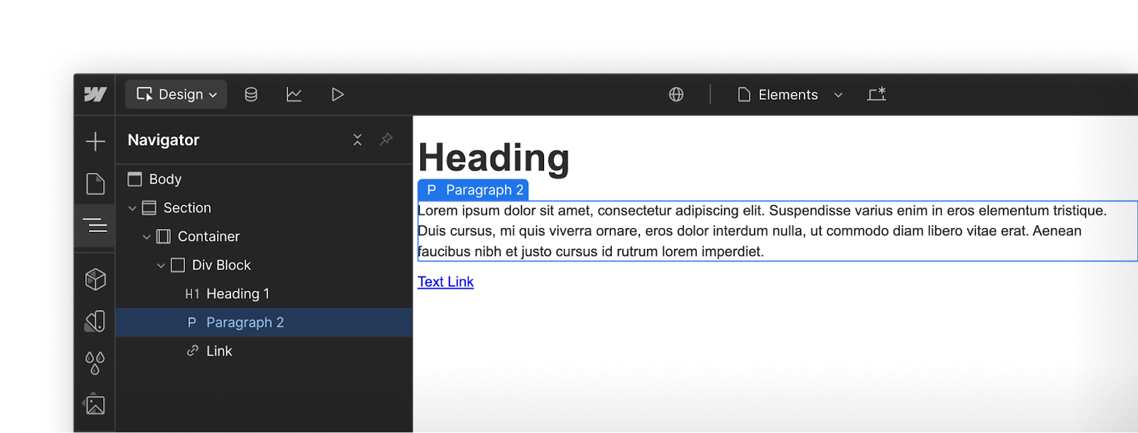
- Heading: Used to define page hierarchy (H1–H6), making content scannable and SEO-friendly.
- Paragraph: Standard body text for longer content like descriptions, explanations, or articles.
- Text Link: Inline text that functions as a hyperlink, often within a paragraph or sentence.
Typography elements in action
A product page might feature a large Heading for the product name, a Paragraph with its key value proposition, and a Text Link inviting users to view more details or return to the product list.
Media
These elements let you add and control visual and audio content.
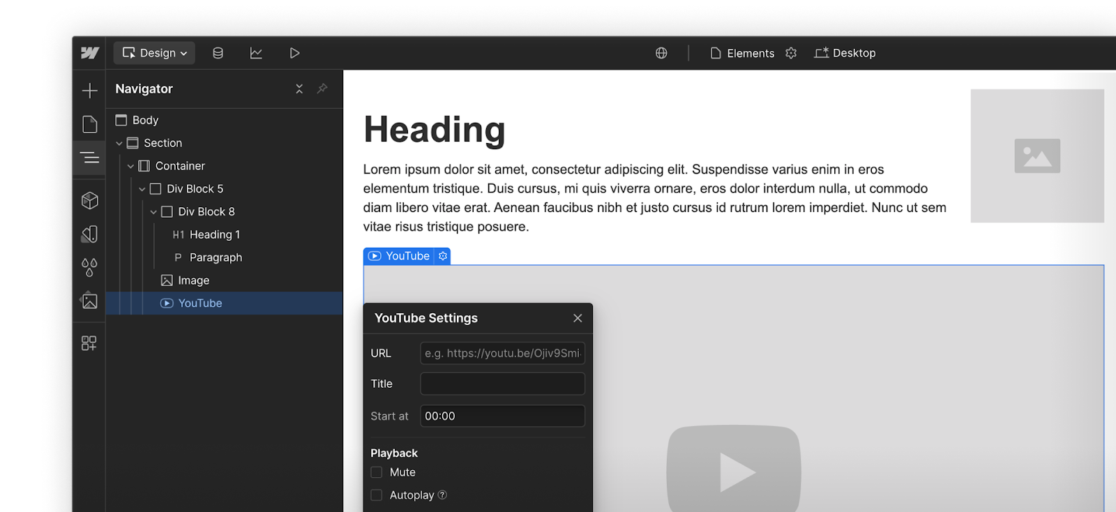
- Image: Displays a static visual file like a photo, logo, or illustration.
- Video: Embeds a third-party video (e.g. from Youtube, Vimeo or other source).
- YouTube: Embeds YouTube videos with the same display options offered by YouTube.
- Lottie Animation: Adds lightweight, scalable animations powered by JSON files.
Media elements in action
On a landing page, you might include an Image of your product or logo and a YouTube walkthrough with playback controls.
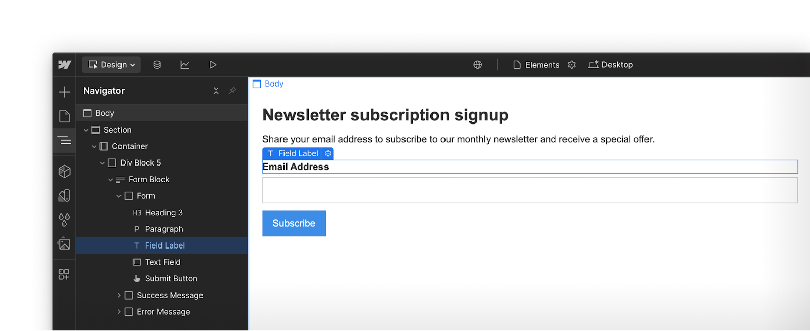
Forms
Form elements help you collect information from site visitors through interactive inputs.
- Form Block: Groups form elements, like fields and buttons.
- Label: Helps your visitors understand what a specific field is for.
- Input: Collects short responses from visitors, like name or email.
- Form Button: Sends the form data once a user has completed the required inputs.
Form elements in action
A newsletter signup form might use a Form Block that includes a Label for “Email,” an Input field for the address, and a Form Button labeled “Subscribe” to complete the action.
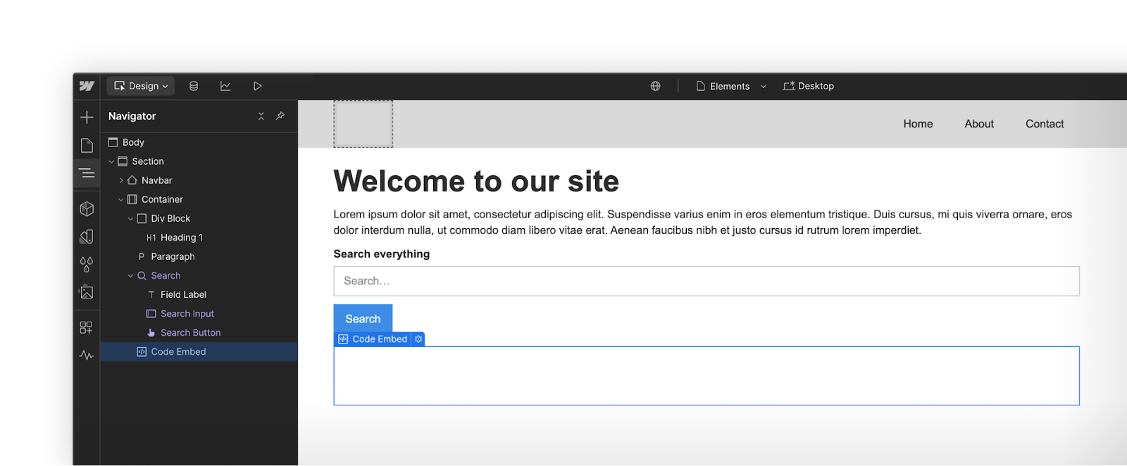
Advanced
Advanced elements offer added functionality or more complex structures.
- Search: Adds a search bar and results page so users can quickly find content.
- Code embed: Lets you insert custom HTML, CSS, or JavaScript for added flexibility.
- Navbar: A prebuilt navigation bar that includes links, a logo, and a mobile menu.
Advanced elements in action
In your site header, you could include a Navbar with a logo and menu links, a Search bar to help users find specific content, and a Code Embed to integrate a third-party chat widget.
You got this.
Click Complete & continue in the Course progress box on the right to move on.