Review: Breakpoints in Webflow
Review: Breakpoints
Breakpoints are screen widths where your layout might need to adapt. In Webflow, you start with the desktop layout and use breakpoints to preview and adjust your design for smaller (or larger) screens — like tablets and phones.
Each breakpoint gives you a chance to check how your layout looks and make changes if something doesn’t feel right — no need to rebuild your design from scratch.
Previewing your design
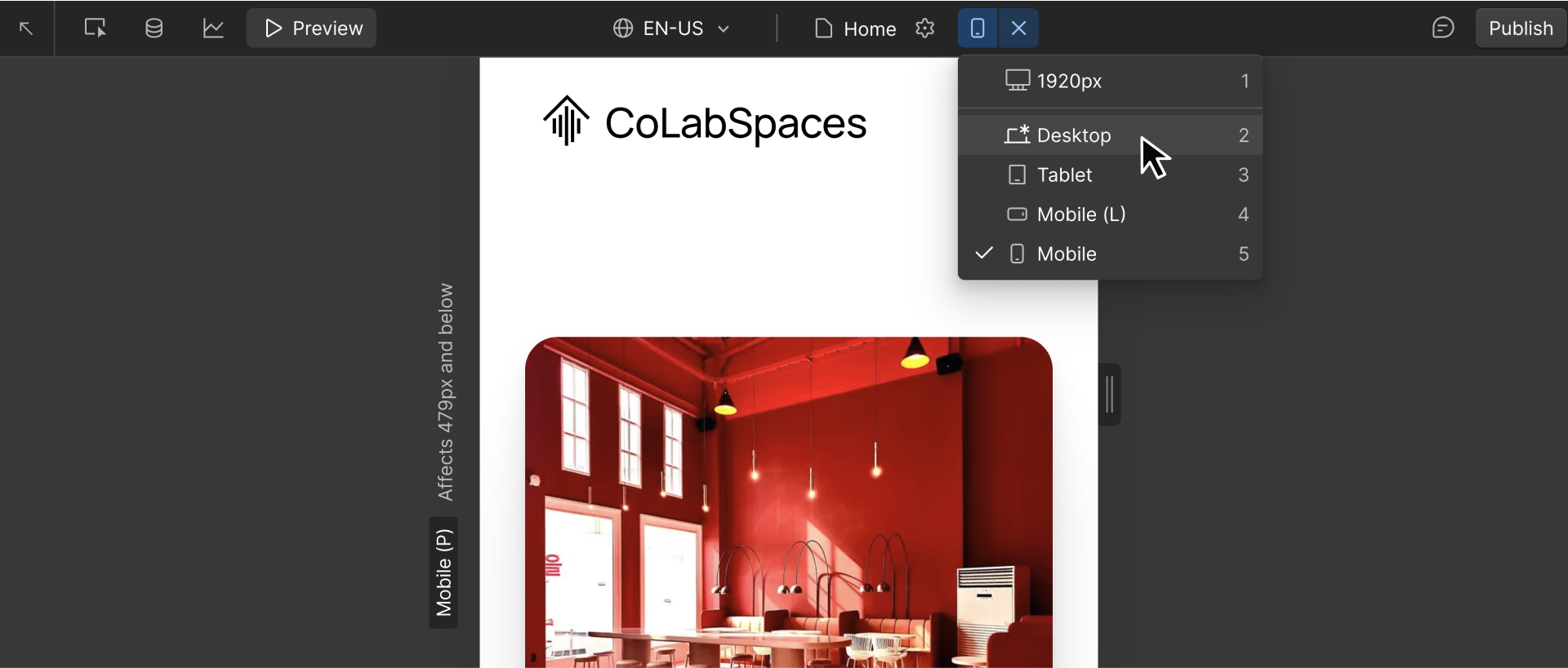
You can click the breakpoint icons at the top of the canvas to preview your layout at different screen sizes. Want to test everything in between? Just drag the edge of the canvas. As you drag, Webflow shows popular device widths, like iPhones, iPads, and smaller laptops, so you can see how your layout responds in real time.
.png)
This is one of the fastest ways to catch issues early. As you switch between breakpoints or resize the canvas, look for moments where your layout doesn’t feel right. Ask yourself:
- Is anything too tight or too spaced out?
- Does text feel too large (or too small)?
- Do side-by-side sections still work, or should they stack vertically?
- Are images cut off or overly stretched?
- Are buttons or links hard to tap on smaller screens?
Preview first, but don’t adjust immediately. Start by observing how your layout behaves.
Ready for more?
Now that you’ve previewed your layout across breakpoints, let’s see how to adjust styles and layouts in Webflow and what to watch for as you go.