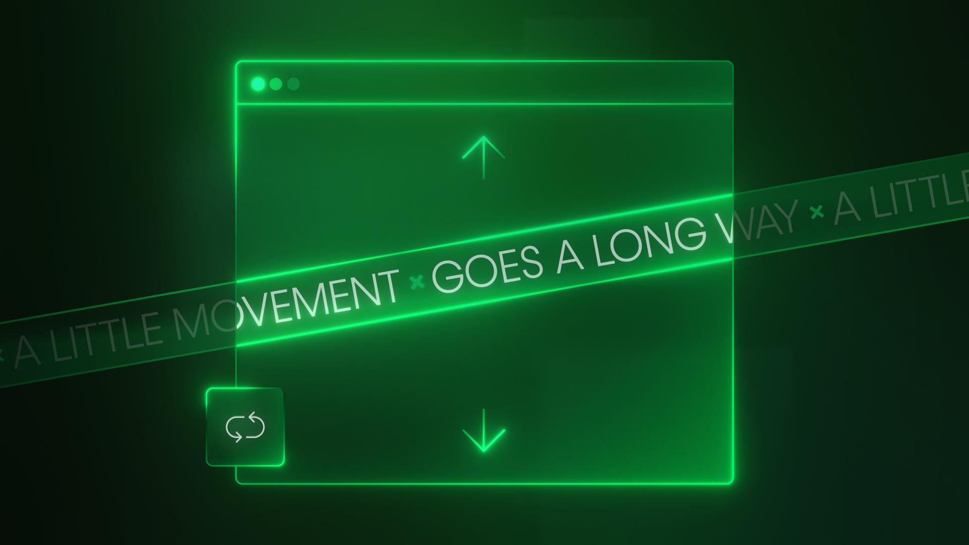
Text fills
With CSS text clipping, you can clip gradients and images to your site's typography, styling the inside of the actual glyphs, as featured on Apple's marketing pages (HomePod, Apple Card, iPad Pro, Apple M1 Chip).
Video transcript
Apple uses text fills for a lot of their marketing, and frankly, I’m a fan. So we’ll cover how to do exactly that, but we’ll also show how to put images behind any text.
Let’s do the gradient first. Here’s a heading. Nothing special. And with the heading selected, let’s set a gradient. Of course, we can set two stops, or three, or 15. Doesn’t matter. I can always change this later. And we want to pick the colors we want for each stop, so we can get the look and feel we want for our gradient. Of course, we're choosing three different colors so we can actually see the effect. After that, we can go in and change the angle however we want. Again, we can change this at any time.
Okay, now here’s all I have to do: go in? Under Clipping, we’ll clip the background to the text. That is it.
Second part? What about an image? Same deal here. Here’s some text. With the heading selected, I’ll set a background image. Again, I can always come back to this later, but I’m loading it up and placing the background...just how I want it to look.
And this time? I do, well, the same exact thing. And now the background is clipped to the text.
But wait. Secret third step! What happens if I set a background image...but I set it to fixed? Well, it’s magical. Because a fixed background set to cover will cover the whole viewport. So now if I scroll? The background stays fixed, and the text is basically a cutout (a window into an entire dimension). A dimension...called pink clouds. Dot JPG.
But that’s it. Gradient? Clip the background to text. Image? Clip the background to text. Image fixed to background? Clip the background to text.
hat’s clipping a background to text in the Webflow Designer.

.jpg)
.jpg)