Image magnification on hover
Your website or your ecommerce store might have images that contain intricate details — for instance, product photos or artwork. With a little custom code, you can give your visitors the power to hover over and magnify portions of these images — and they won’t even have to lift a finger to do it. Unless they're on a mobile device, in which case, there's a higher probability they'll lift their finger.
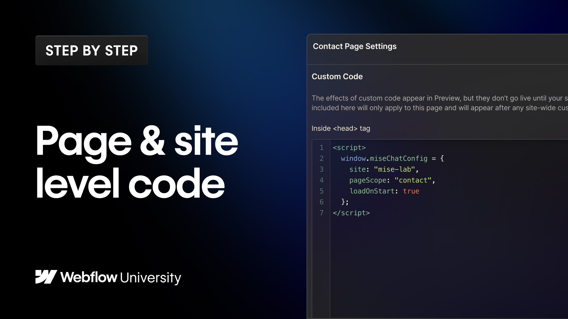
Copy the custom code here: https://image-magnification-code-snippet.webflow.io/
00:00 - Introduction 00:35 - Paste the custom code into your project 01:28 - Add a class to your images to identify the images with the magnification 02:22 - Style the magnifier (specifically the size, shape, and shadow)
Read about it: https://university.webflow.com/lesson/image-magnification-on-hover
Video transcript
Image magnification on hover in Webflow creates a zoom effect on an image when the user hovers over it — the image scales up smoothly, giving it a sense of depth and interactivity. It's a common pattern for image galleries, portfolio pieces, and product photography.
The typical implementation uses a combination of overflow hidden on a parent container and a CSS scale transform on the image inside it. Setting the parent to overflow: hidden clips the image to its original bounds as it scales up, so it looks like the image is zooming in rather than growing outside its container.
In Webflow, you can set this up using the hover state in the Style panel. Select the image, add a hover state, and apply a transform — scale to something like 1.1 or 1.15. Then set a transition on the non-hovered state so the scale animates smoothly when you hover in and out.
This is a clean, CSS-only approach that works well for static images and thumbnails. For more complex magnification behavior, Webflow's Interactions panel or custom JavaScript give you additional control.