
You can style the Button element in your projects in many different ways.
In this lesson
In this lesson, we'll cover four examples of advanced styling:
- Button Alignment
- Transparent Backgrounds
- Hover and transitions
- Box Shadows
Button Alignment
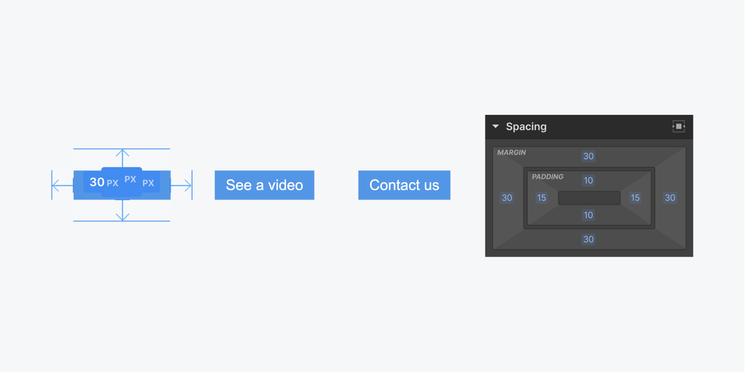
If you have multiple buttons occupying the same horizontal space they will appear pressed up against each other. You can add margin to both sides to create space between them. Holding the Alt key while dragging the margin arrows will increase margin on both sides of the button.
However, if other instances of this button are aligned to one side, like the left side for example, adding margin on both sides of the button will push them away from the left side alignment.

To counteract this you can take the following steps:
- Add a div block from the Add panel
- Move existing buttons into the div block
- Give the div block a class name
- Add a negative value to the left margin on the div block equal to the margin added to the buttons (e.g. if there is 20px of left and right margin on the button, you should add -20px left margin to the div block)
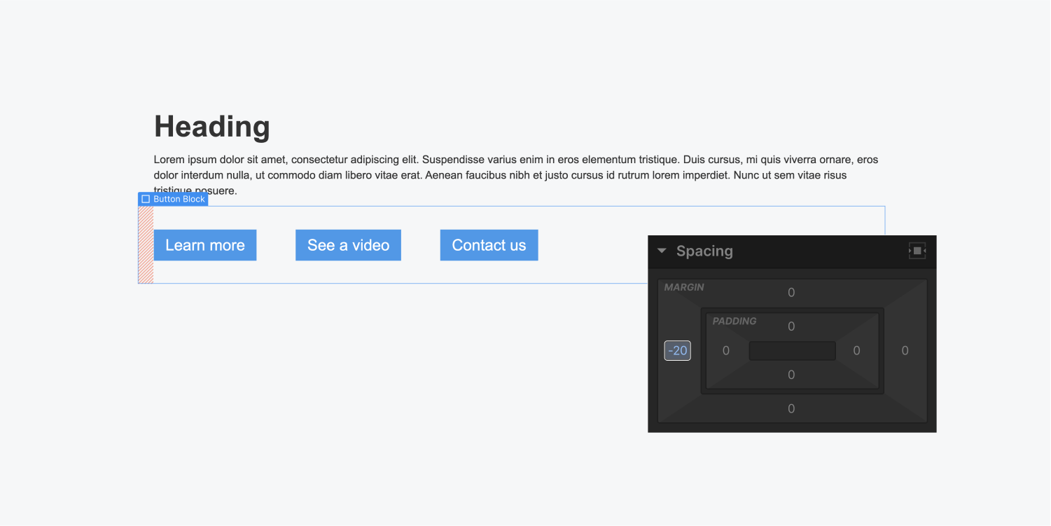
This will ensure the left aligned buttons are even along the left side. If there are instances of the same buttons that are centered the negative margin will not affect them.
Transparent Background
You can create a transparent background on buttons and make it stand out in other ways. For example, you can add a solid color border.
The background color by default is blue. You can edit the background color, opacity, and borders to look however you’d like. Here's how to create a button with transparent background and a border:
- Add a button and give it a class name
- Click the background color and adjust the opacity to 0%
- Add a 1px solid border and set the color to white
- Add border radius (large border radius, such as 500px, will result in a pill-shaped button)


Hover Controls
By default there is no hover styling on a button. If we go over to States and select the Hover state, we can set a completely different background color. For example we can even change the opacity of the background color.
You can set any other styles on hover like moving the button up by adding a transform - move.
Learn more:
Box Shadows
It’s common to add shadows when interacting with buttons. Box shadow styles provide a good range of control for these shadow effects.
Learn more: Using box shadows