
Use the slider to create slideshows to present images, text, videos — you name it.
In this lesson:
- Anatomy of a slider
- Creating and switching slides
- Adding background images to slides
- Adding additional content to slides
- Configuring settings
- Advanced customization

Anatomy of a slider
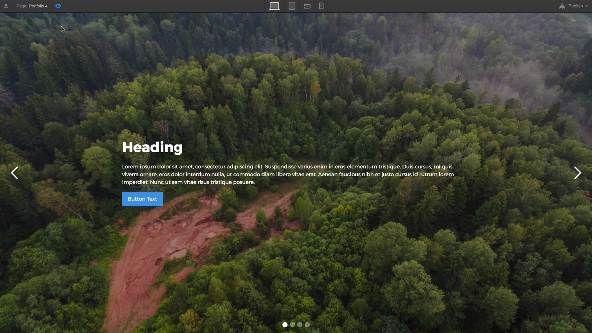
When a Slider is added to the canvas you’ll notice that it takes up the full width of whatever parent element it’s dropped into.
Once the Slider is on the page we can see that the component has 4 children.
- The Mask - which contains the two default slides
- The left arrow
- The right arrow
- The slide navigation

Creating and switching slides
The Slider comes with two slides by default. You can add more slides in a 3 ways:
- Select any slide element, go to Element Settings Panel (shortcut: D) and click + Add Slide
- Right click on a slide on the canvas and select duplicate
- Select the slide on the canvas or in the navigator and copy-paste to duplicate
You can move through our slides in four ways:
- Click on the arrows found in the Slider settings
- Click on the dots in the Slide Navigation directly on the canvas
- Clicking on the slide in the Navigator Panel
- With the slider selected, press the left and right arrows on your keyboard
You can also go to a specific slide using the slide menu in the slider settings.
Adding background images to slides
You can drag an image element into a slide. Or you can add a background image to the slide, so you can easily position extra content on top later.
- Select a slide and create a class
- Add a background image
- Set the background image size to contain and the position of the background image to center.
Re-use the same class for other slides if you want to share similar styles. You can also add a different combo class for each slide and override the background image.
Adding additional content to slides
Slides, like div blocks or sections, can contain other components as well. If we drop our slider in the body, we can add a container in the slide and then drop a heading and a paragraph in the container.
Configuring settings
From the Settings Panel (D) there are many settings to control the behavior of the slider, which include:
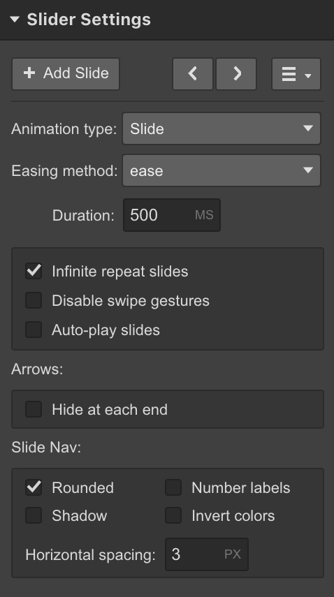
Animation type - set how the slides will look as they move between slides.
Easing method - change the easing method for how the slides transition between slides.
Duration - dictates how long the slide should take to transition to another slide.
Swipe gestures - enable or disable swipe gestures on touch devices. Especially useful if the specific timing of the slide is important in your design.
Auto play- set how long it should take for the first slide to change (autoplay) and how many slides it should go through before the slider stops changing slides entirely.
First and last slide arrows - turn off the left arrow on the first slide and the right arrow on the last slide.
Slide nav controls - choose the spacing, shape, and inverse colors for the nav buttons.
Advanced customization
You can style and customize the slider element in any way you’d like. Here are a few common ways to customize the slider.
Resizing the slider
You can adjust the slider size by selecting the Slider, and setting a different height in the Styles Panel. Notice when you do this the background image resizes accordingly if it’s set to cover.
The above example changes the slider height to a pixel-unit height. You can also set the height based on the viewport height (vh). Learn more about different width & height units.
If you need to adjust the width you can move the slider to a larger or smaller parent element. In this example the slider is placed just like a section so it takes up the full width of the page.
Customizing arrow icons
By default the arrows used in the slider will be centered vertically, and look like white arrow icons. You can adjust the look of these icons by following these steps:
- Select the left arrow or right arrow element
- Give it a class
- Edit the font size and font color styles in the style panel. The font size will affect the size of the icon and the font color will affect the color.
Do the same for the other arrow.
Replacing arrow icons
If you want custom arrow icons for your slider, you can simply delete the icon element inside the left arrow or right arrow elements. Then drag your own image into the left and right arrow elements.
Pro tips
You can apply flex settings to the arrow wrappers (left arrow and right arrow) to center your custom arrow icons vertically.
To style the hover state on the left and right arrow elements with a custom image, you can change the opacity or use filters. You can also use a background image which you can replace on hover.
Styling the slide nav dots
Styling the slide nav dots is a bit more complex. You can change the size of the dots and numbers for number labels by updating the font size. You can change the color of the number labels by applying a font color. However, to change the color of the actual dots or squares, you'll need to type some CSS in a custom embed element.
- The class of the dots = .w-slider-dot
- The class of the active dot = .w-slider-dot.w-active
Changing the color of the slide nav dots / squares
So, if you want to change the color of the dots, add the following in an embed element on your page:
<style>
.w-slider-dot {
background: blue !important;
}
.w-slider-dot.w-active {
background: navy !important;
}
</style>
You can toggle the the rounded setting off in the slider settings → slide nav section if you want to change the dots to squares.

Advanced styling of nav dots / squares
You can even create custom shapes using borders and other properties.
In this example, we'll create empty dots for the selected/active state by pasting in the following code:
<style>
.w-slider-dot {
background: #4353FF !important;
border: 3px solid #4353FF !important;
}
.w-slider-dot.w-active {
color: #4353FF !important;
background: none !important;
border: 3px solid #4353FF !important;
}
</style>

We apply the same border on both the active and none active states to maintain the same size for all icons.
We color styling affects the font color of the numbered label only. So, when there's no background, we want to make sure the number is still visible.
Hiding slide elements
Any part of the slide can be hidden if you don’t want to use it in your design. Here’s how to do that:
- Select the slide nav element or the arrows
- Set the display setting to none
Showing multiple slides at once
You can also customize the slider element to be a carousel slider—showing multiple slides at once. Here’s how to make a slider that shows 3 slides at a time:
- Add a slider
- Give all slides the same class
- Set the width on the class to 33.33% on desktop and 100% on mobile
If you need to edit the slides to differentiate them from one another (e.g. different background images), you can add a different combo class to each slide.
Populating a slider with collection items
At the moment, sliders can't be automatically populated with dynamic content. You can vote on this feature request on the Webflow Wishlist.
As a workaround, you can add a collection list to each slide. Then, limit the number of items shown for that list to only display one Collection item.
Each slide will need it's own collection list. Once you create the first collection list, you can duplicate the slide. Then, just change the "start at" number of the collection list for each slide to the item corresponding to the slide number (e.g. slide 1, item 1 / slide 2, item 2.)