
In this lesson:
- Pave the way for equity on the web
- Use clear, descriptive, sequential headings
- Apply recommended color contrast ratios
- Use clear, visible form field labels and help text
- Use meaningful button and link names
- Use thoughtful motion and animation
- Use unique element IDs
- Use responsive text sizes
- Include alt text for every important image
- Make accessibility a shared priority
The web should be accessible for everyone. This often isn’t the case for people who are Blind, low vision, visually disabled, Deaf, hard of hearing, or who have cognitive, learning, or mobility disabilities, to name a few.
About 15% of the world’s population has a disability — that’s more than 1 billion people who have a negative user experience when designs don’t consider accessibility.
Inaccessibility on the web isn’t caused by disabilities or a lack of tools, but by designs that interfere with assistive technology (AT). AT includes settings and devices that help people interact with the digital world.
Examples of AT include:
- Screen readers: converts text, buttons, images, and other page elements into speech or braille for people who are Blind, Deafblind, low vision, or who have cognitive or learning disabilities
- Magnification: increase the size of objects on the screen for people with low vision
- Keyboards: use keyboard commands (instead of a mouse) for people with limited mobility
- Voice dictation: use speech (instead of a mouse and keyboard) to browse the web for people with limited mobility
Pave the way for equity on the web with good design + assistive technology
Webflow has committed to building a better, more accessible web, and this effort relies on us working together as a community to be mindful of best practices, primarily those of the Web Content Accessibility Guidelines (WCAG).
WebAIM analyzed a million homepages and found 98% had preventable accessibility barriers. We recently made updates to make top components more accessible out of the box. We want to invite you to join us in making updates to remove barriers — starting today. Right now!
Let’s look at some changes you can make that will have an incredibly high impact toward making your sites and the web more accessible for everyone.
Use clear, descriptive, sequential headings
Unstructured web content is overwhelming and unusable for everyone, but especially for people with cognitive disabilities and those who use screen readers. Headings organize content and guide readers through your site.
Your headings should make it easy to skim a page and get a clear purpose and overview of content without having to read body copy.
Don’t:
- Use heading levels to show visual differences
- Use heading text just to be compliant — make sure it’s useful
Do:
- Use one H1 per page that describes its purpose (or only use multiple H1s when a page truly has more than one purpose)
- Nest headings in order (e.g., H3 under H2)
To learn more about the importance of organizing your content with headings and how to style headings in Webflow, check out this section on headings in Webflow University’s video lesson on Advanced web typography.
WCAG Reference: Success Criterion 2.4.6: Headings and Labels
Apply recommended color contrast ratios
Sufficient color contrast between text and background improves the experience and legibility on your site for everyone, especially for people with vision impairments. WCAG offers suggested ratios of the best contrast based on size of text. Contrast is the difference in brightness (or luminance) between 2 colors and ranges from 1:1 (e.g., white text on a white background) to 21:1 (e.g., black text on a white background).
Color contrast guidelines for AA (minimum)
- Text and images should have a ratio of 4.5:1
- Large text (18 point or 14 point bold) need a ratio of 3:1
Color contrast guidelines for AAA (enhanced)
- Text and images should have a ratio of 7:1
- Large text (18 point or 14 point bold) need a ratio of 4.5:1
Webflow’s built-in color contrast analyzer
You can check the contrast ratio of text on your site directly from the color picker in Webflow, which displays not only the contrast ratio of text but also the WCAG level rating that corresponds to that contrast ratio.
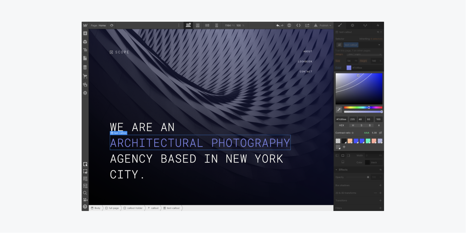
Contrast ratio curve patterns
You can toggle the preview icon (the eye) under the palette on the right to see the curves for AA, AAA, and a Fail rating on WCAG. The ratio curve patterns are calculated by testing every combination of saturation and brightness for hue and opacity — watch the curves move as you adjust hue or opacity. Light text over a dark background will show an AAA rating in the upper left of the palette to Fail in the lower right, and vice versa for dark text on a light background.
Interesting: The color contrast analyzer uses an algorithm to calculate the luminosity difference between 2 colors (contrast) and rates it against WCAG guidelines for text size. The algorithm makes adjustments for font weight since bold text can be smaller and still readable. Small text needs a higher luminosity difference to be readable.
The WCAG level rating is based on the color of the background and the font size, weight, and color, which is explained with helper text that opens when you click the “question mark” icon. (This contrast ratio section only appears when editing the typography color of text elements.)
Note: While WCAG contrast ratio guidelines don’t apply to images (including logos), it’s best practice to apply a 4.5:1 ratio for images with prominent text. But keep in mind that images of text can be hard and often impossible for visitors with visual impairments to understand — use styled text wherever possible.
WCAG References: Success Criterion 1.4.3: Contrast (Minimum), Success Criterion 1.4.6: Contrast (Enhanced), Success Criterion 1.4.5: Images of Text
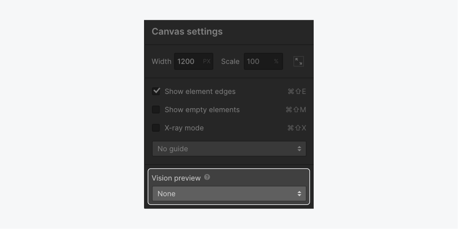
Webflow’s built-in Vision preview
Vision impairments affect a large percentage of the population. However, if you don’t experience vision impairments, it can be difficult to imagine how your design appears to someone who does.
With Webflow’s Vision preview you can simulate how visually impaired people view your website. Use this tool at the beginning of your design workflow to make sure important information in your design isn’t conveyed only through color.
Remember: Using Vision preview provides an approximate representation of vision impairments. Factors like your own vision, the lighting you use, your screen calibration, and your operating system settings can all affect the accuracy of the previews.
Access Vision preview options by clicking Canvas settings at the top of the Designer.
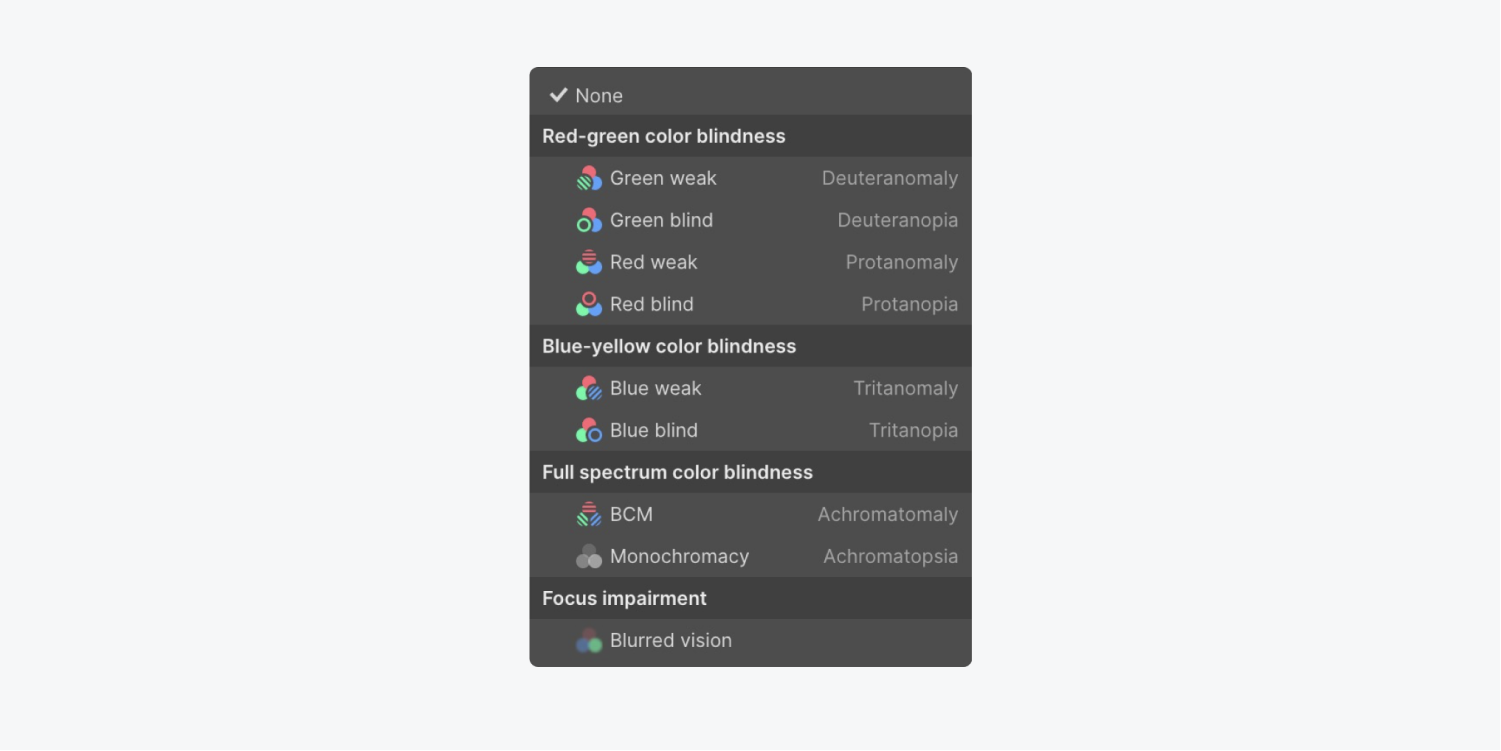
Choose the type of vision impairment to preview from the bottom of the Canvas settings modal menu.
You can choose from:
- Red-green color blindness (Green weak, Green blind, Red weak, and Red blind previews)
- Blue-yellow color blindness (Blue weak and Blue blind previews)
- Full spectrum color blindness (Color weak and Monochrome previews)
- Focus impairment (Blurred vision preview)
The vision impairment you’ve selected is indicated by an icon to the right of the Canvas settings.
To stop previewing your design from a vision impaired perspective, click Canvas settings again and change the Vision preview to None.
Note: Due to a Safari bug, Vision preview isn’t available in Apple’s browser. The bug specifically relates to Safari not applying CSS filters with url() values to iframes. Webflow has brought the bug to Apple’s attention, though no tracking number was provided. Alternatively, you can use Vision preview with Firefox and Chrome browsers.
Use clear, visible form field labels and help text
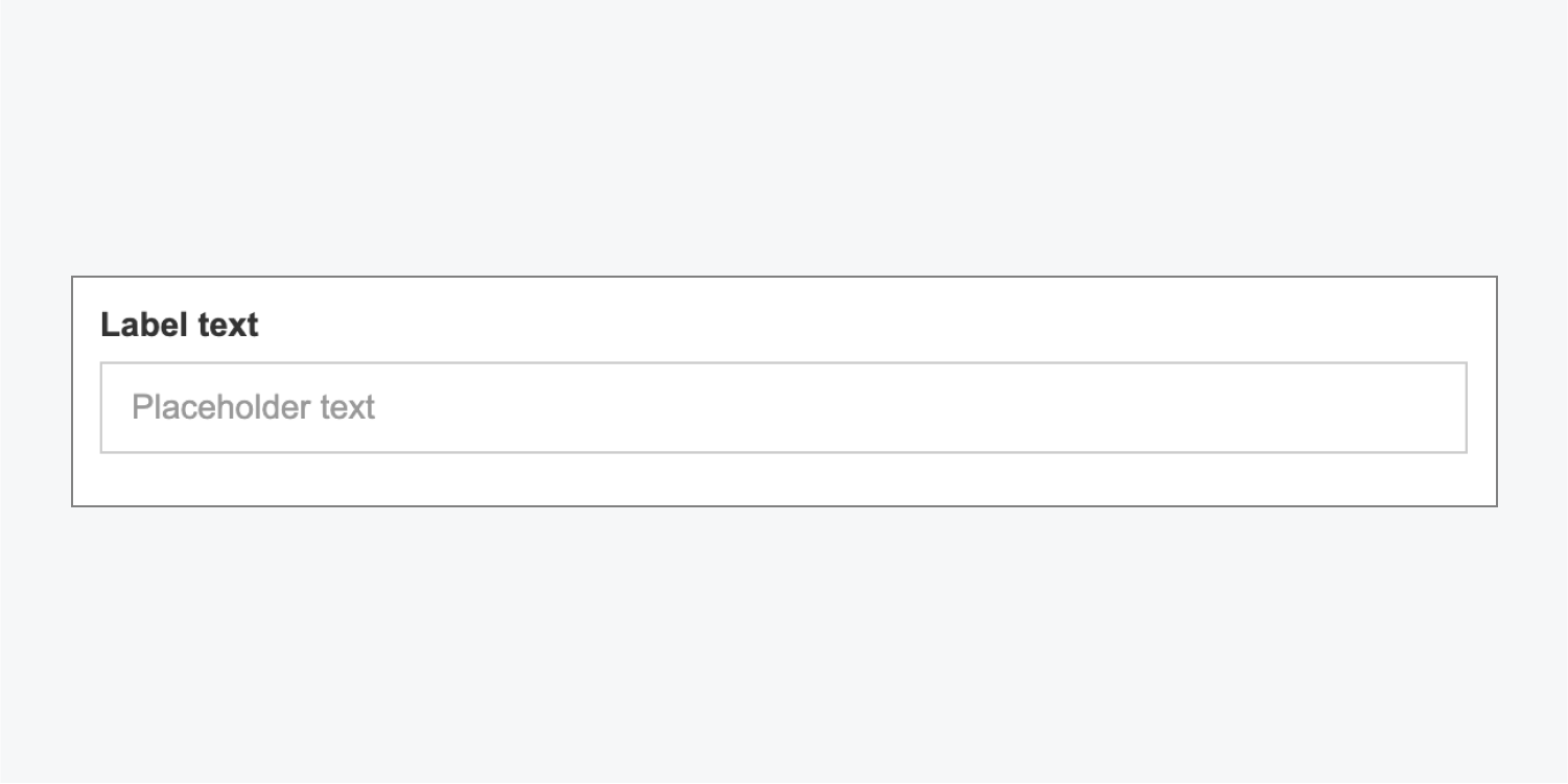
Form field labels are used to describe the function or purpose of a form field and are crucial for accessible navigation of your form. Form elements with in-field placeholder text that disappears when site visitors start typing in the field make it difficult for people with (and without) cognitive disabilities to remember what information belongs in the field. A simple solution is to always use form labels and help text that stays visible.
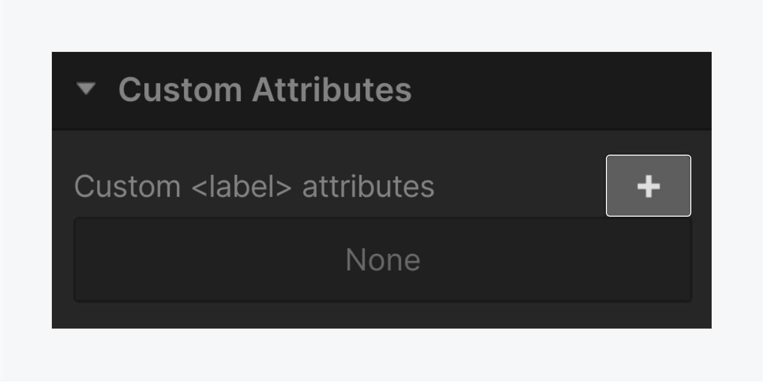
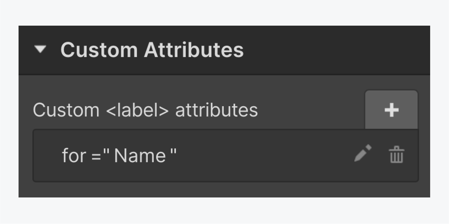
In Webflow, creating fully accessible forms currently requires a custom solution. You can use the Label element in the Designer with IDs and custom attributes to ensure that labels are properly grouped and associated with their related form fields.
To create accessible form labels:
- Select your form field (e.g., Input, Text area, Select, etc.)
- Open Element settings (press D on the keyboard)
- Give your form field an ID
- Select your Label and open Element settings > Custom attributes
- Click the “plus” icon
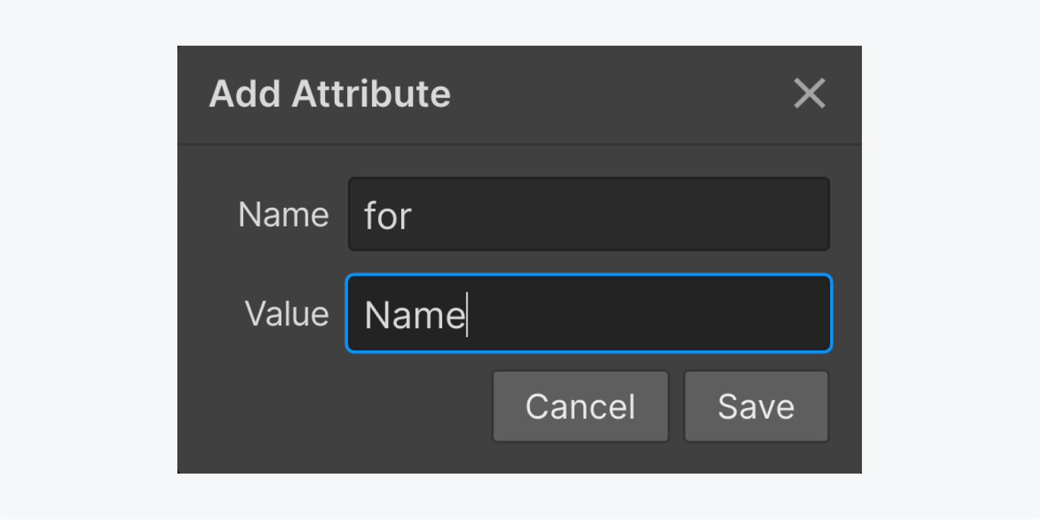
- Give your Label a custom attribute with the name “for” and value that matches the ID you gave the form field
- Click Save
Important: Make sure your form field IDs are unique (i.e., not used on more than one element).

You can also group your related labels and fields together to reuse your form elements.
To group your label and field together in Webflow:
- Open the Add panel (press A on the keyboard)
- Drag a Div block into your form element
- Drag your related label and field into the Div block (making sure to place the label above the field element)
Now you can copy the Div block (Command + C on Mac or Control + C on Windows) and paste it (Command + V on Mac or Control + V on Windows) in your form. Make sure to give the form field a new ID and update the label’s custom attribute to reuse them.
A clear label outside the input field will not only help site visitors recall the purpose of the field, but it will also better meet color contrast settings for visually disabled site visitors (since placeholder text is usually a light color). It also gives screen readers access to a proper label to announce.
WCAG Reference: Success Criterion 2.4.6: Headings and Labels
Use meaningful button and link names
Screen readers can give visitors an overview of all the links on a page. When links are read out of context in a list, it's important they tell readers:
- What the link is
- Where it’s taking them
Don’t
- Embed links in generic terms like “more,” “this page,” or “click here”
- Use raw URLs as hyperlinks
Do
- Embed links in clear, specific language that tells people where the link will take them and why they might want to go there
- Indicate if a link will open high-bandwidth media like a PDF or video within the linked text
For an example of a screen reader announcing unhelpful links on a page, check out the section on links on Webflow University’s video lesson on Advanced web typography.
For more, check out WebAIM's article on links.
WCAG Reference: Success Criterion 2.4.4: Link Purpose (In Context), Success Criterion 2.4.9: Link Purpose (Link Only)
Use thoughtful motion and animation
Certain webpage animations and flashing content can negatively affect the health and well-being of people with vestibular and photosensitivity disorders. This can include triggering motion sickness and seizures. When working on your designs, it’s best to think about accessibility from the start, and create safe animations that don’t cause harm from unexpected or excessive movement or flashing.
Don’t:
- Create animations with blinking or flashing that happens more than 3 times per second
- Include rapid or unexpected movement
- Use motion to convey critical or valuable information
Do:
- Remove any harmful flashing content
- Ensure your animation has a positive usability impact (e.g., the animation directs users to key content), but also provide alternatives for users who choose to remove or reduce animation (e.g., use static images rather than moving images)
- Ensure that no valuable information is lost for visitors who choose to disable motion
- Provide and show controls to pause and/or stop moving or blinking elements that start automatically and last more than 5 seconds in parallel to other content (e.g., a slide carousel)
Webflow’s built-in play/pause setting for background videos
While background videos can be helpful for grabbing attention or engaging site visitors, they can also be distracting or even harmful for people with cognitive disabilities, motion sickness, or vestibular disorders. With this in mind, you can use Webflow’s built-in play/pause button setting on background videos to ensure that site visitors have the controls they need to pause or play your background video content.
You can toggle Include play/pause button in your Background video settings to enable this feature, as well as customize the appearance of the play/pause button. For more information, check out our lesson on toggling play/pause on background videos.
Check your design
You can test what your designs look like with reduced motion by toggling the reduced-motion setting on your device or browser. Learn more about how to enable and disable reduced motion settings.
WCAG Reference: Success Criterion 2.2.2: Pause, Stop, Hide, Success Criterion 2.3.3: Animation from Interactions
Use unique element IDs
Designers and developers use unique identifiers (IDs) to optimize sites for accessibility and to extend site functionality with custom code. IDs can be useful for linking, scripting, or styling (with CSS).
Using the same ID on more than one element, however, may cause screen readers to malfunction, as they’ll only target the first element with the shared ID, preventing screen reader users from accessing the later elements and properly navigating the webpage.

To learn more about how to identify and fix duplicate element IDs, check out the duplicate element IDs section of our Intro to the Audit panel lesson.
WCAG Reference: Success Criterion 4.1.1: Parsing
Use responsive text sizes
Browsers provide a built-in way for site visitors to adjust the base text size for websites, zoom in to content, and enlarge sites to a more comfortable viewing size. However, text styled in pixel (px) units ignore the browser’s text size setting, preventing site visitors from enlarging text for more comfortable reading and creating a poor user experience. Adding a “viewport” meta tag with the values “user-scalable=no” or “maximum-scale=1.0” can also prevent users from zooming in to view content.
To create an accessible reading experience, use root ems (rem) units for text size. Rems are relative to the base text size defined by the site visitor and respect the site visitor’s browser preferences.
Don’t:
- Style text size with pixel (px) units
- Add the “user-scalable” or “maximum-scale” values to the “viewport” meta tag
Do:
- Style text size with rem units
Webflow’s built-in Text zoom preview
With Webflow’s Text zoom preview, you can simulate how your designs will look for site visitors using text zoom.
You can access Text zoom preview by clicking Canvas settings at the top of the Designer.
Select a preset text size (e.g., 9px, 24px, or 32px) or toggle between them. To preview other text sizes, you can click into or focus on the input and press the Up and Down arrow keys.

To stop previewing your design with text zoom, open Canvas settings again and click Reset.
Note: Text zoom preview will not work when a font-size property has been applied to the HTML tag using custom code. As a workaround, you can add a font size to the Body (All pages) tag instead. Learn more about designing with HTML tags.
WCAG Reference: Success Criterion 1.4.4: Resize Text
Include alt text for every important image
Alt text (or alternative text) is a short written description of an image that is read or displayed in place of images, which helps site visitors make sense of that image when it can’t be viewed. Alt text helps your image content to be understood by site visitors who are Blind or have visual disabilities. It will also be displayed in place of an image if the image file hasn’t loaded or when a user has chosen not to view images.
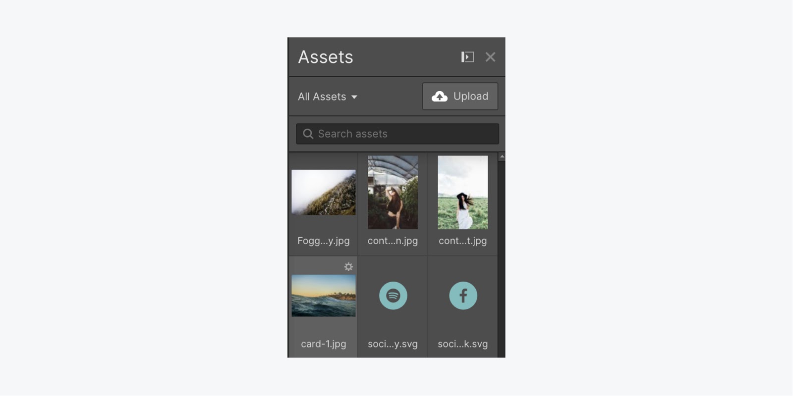
To add alt text to any image:
- Open the Assets panel (press J on the keyboard)
- Click the settings “cog” icon that appears when you hover over the image that needs alt text
- Write a description in the Descriptive field
This alt text will be used any time this asset is used in your site by default.
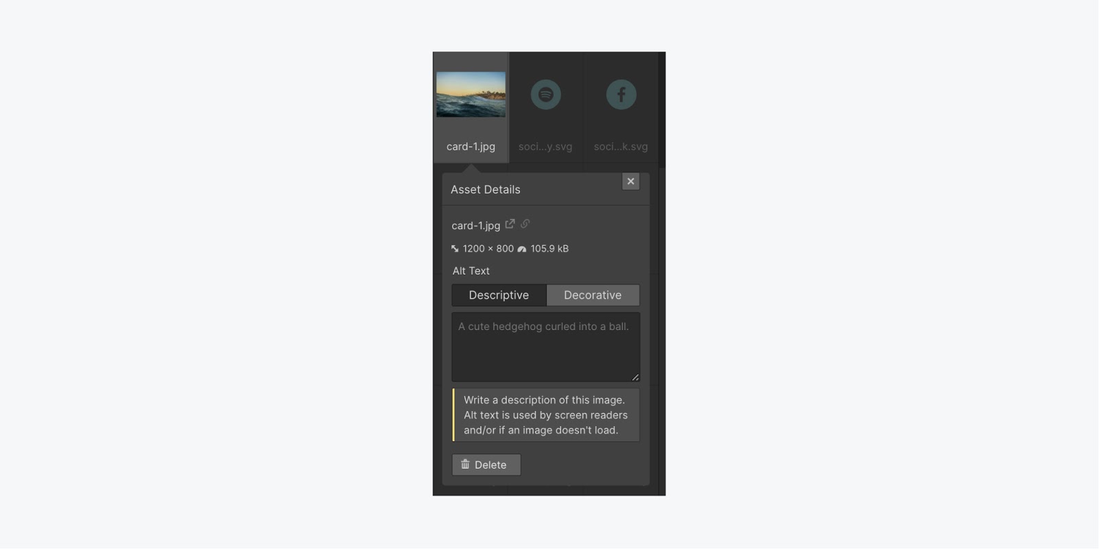
You can also mark purely decorative images (i.e., images that serve no specific purpose and don’t add any information or context to any part of the webpage) as decorative so that screen readers will ignore them.
To mark an image as decorative:
- Open the Asset panel (press J on the keyboard)
- Click the settings “cog” icon that appears when you hover over the image that needs alt text
- Click Decorative
General guidelines for alt text:
- Include alt text for every important image you upload (including logos)
- Write a concise description that calls out important visual features
- Avoid repeating surrounding text
- Leave out the words "image" or "picture"
- Add a space in the alt field for purely decorative images so the screen reader doesn't announce it
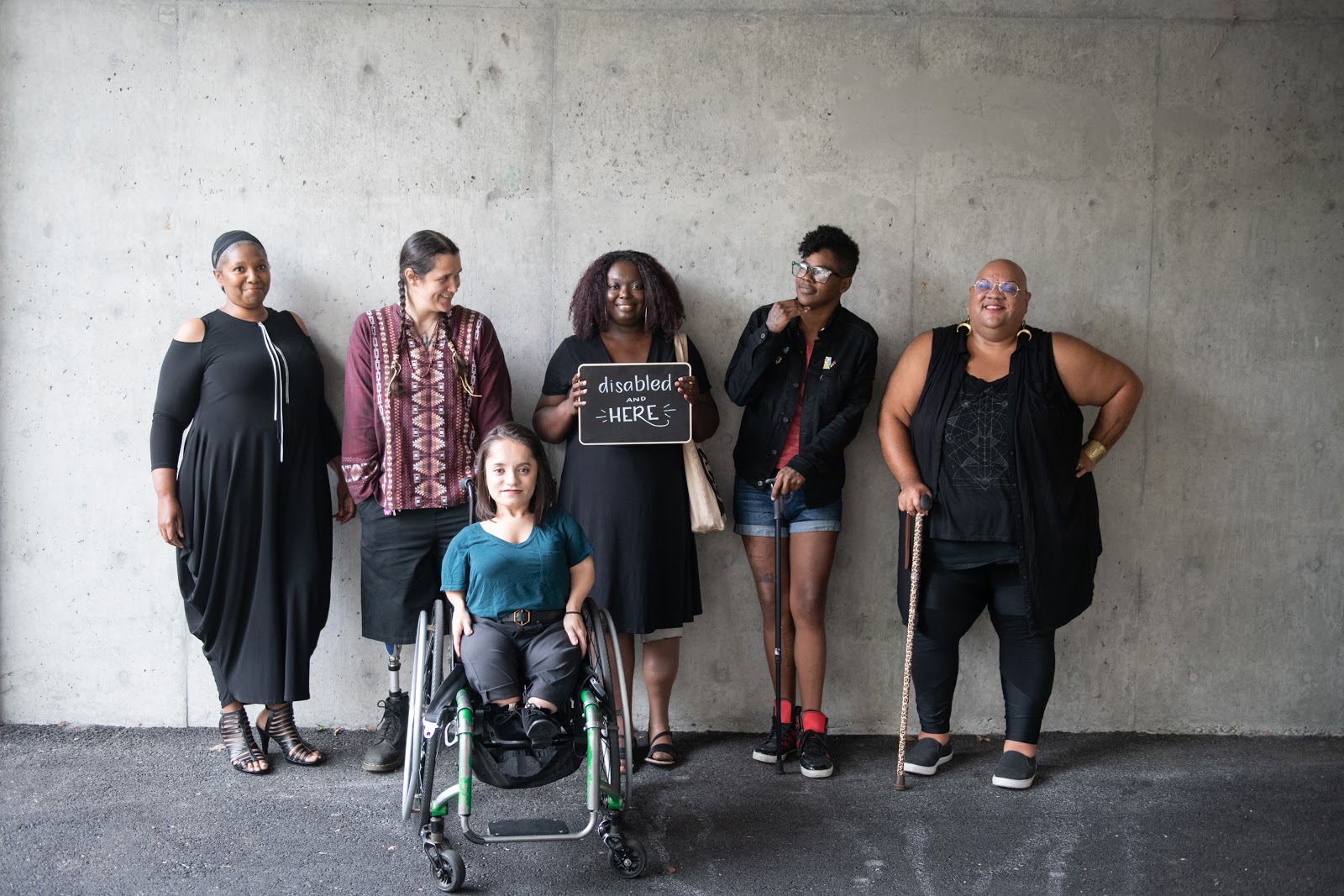
As an example, here’s the alt text photographers from “Disabled and Here” provide for the stock photo below: Six disabled people of color smile and pose in front of a concrete wall. Five people stand in the back, with the Black woman in the center holding up a chalkboard sign reading "disabled and here." A South Asian person in a wheelchair sits in front.
We recommend including alt text in the Asset manager to make sure text is always included on dynamic images, like in a Collection list. But you can also add alt text as you add images to your project in case the context of the image is different for a specific instance.
For more information and tips, check out WebAIM’s article on writing good alternative text.
WCAG Reference: Success Criterion 1.1.1: Non-text Content
Make accessibility a shared priority
Webflow will continue supporting your accessibility effort through courses, product updates, and a future auditing tool — we’ve got a lot of exciting projects we’ll be releasing very soon. While we’re researching, growing, and building, you can keep learning with the resources below. Let’s keep this going!
Resources to learn more:
- The World Wide Web Consortium’s Introduction to Web Accessibility course
- Web Content Accessibility Guidelines (WCAG) Quick Reference
- Microsoft Inclusive Design
- Heydon Pickering’s Inclusive Components
- WebAIM